List
What Does This Widget Do?
The List widget allows you to display any data set in a single column list view.
When Should I Use This Widget?
Use a List when you want to display the values for a particular property in a data set. For example, if you have a fleet of trucks and want to display the oil levels for all of the trucks, you could use the List widget and bind the OilLevel property of the thing that is shared among all of the trucks in the fleet.
Are There Any Special Properties, Services, Events, or Actions?
To view a list of common widget properties, services, and events, see Common Widget Properties, Services, and Events.
The following table is a list of properties that are specific to this widget.
|
Property
|
JavaScript
|
Type
|
Description
|
||
|---|---|---|---|---|---|
|
Enable State-Based Formatting
|
enableStateFormatting
|
boolean
|
Allows you to format the widget based on state definitions that have been defined in ThingWorx.
If the checkbox is selected the following properties appear:
• Dependent Field
• State Definition
For example, if a label has a State Definition value of error, the label turns red.
For more information about style and state definitions in ThingWorx, see Style and State Definitions in the ThingWorx Help Center.
|
||
|
Dependent Field
|
stateFormatValue
|
string
|
This property is visible if the Enable State-Based Formatting checkbox is selected. For more information about style and state definitions in ThingWorx, see Style and State Definitions in the ThingWorx Help Center.
|
||
|
State Definition
|
stateFormat
|
boolean
|
This property is visible if the Enable State-Based Formatting checkbox is selected. For more information about style and state definitions in ThingWorx, see Style and State Definitions in the ThingWorx Help Center.
|
||
|
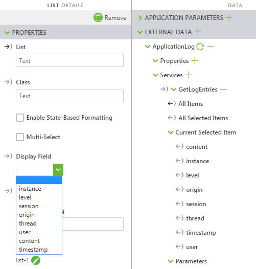
Display Field
|
label
|
string
|
Specifies the field that appears in the List widget. Typically this is the same as the Value Field, but can be different.
This field is automatically populated with options when the widget is bound to ThingWorx data.
|
||
|
List Item Padding
|
itempadding
|
string
|
The space between content and the border. Enter a number followed by one of the supported formats (for example, 10px):
• px
• %
• in
• mm
• cm
• ex
• em
• pt
• pc
|
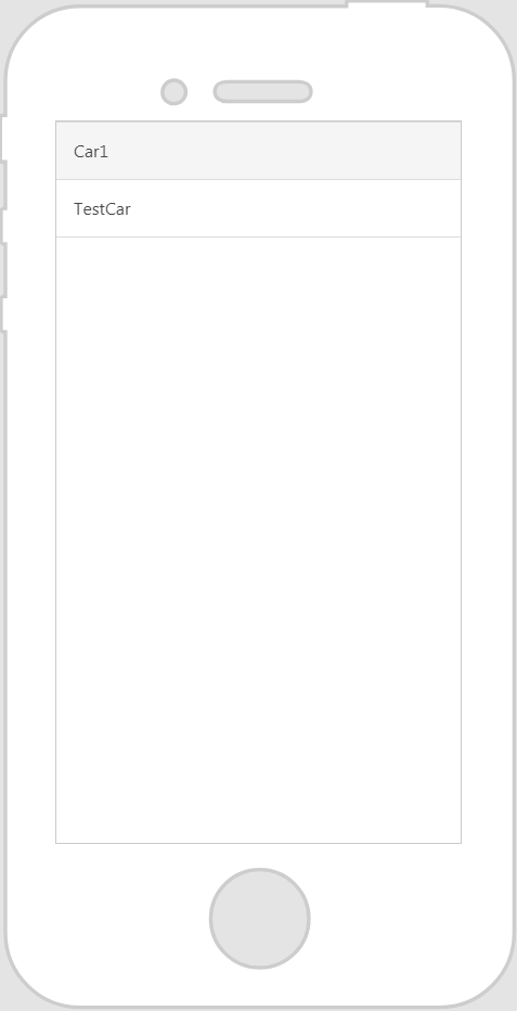
The Widget in Action
Here’s an example of what your widget might look like!
|
Minimum Steps Required for Use
|
What It Looks Like
|
|---|---|
|
1. Drag and drop a List widget onto the canvas.
2. From the Data pane, add a service from the entity you wish to retrieve the data from.
3. Once the service has been added, drag and drop All Items onto the widget and select List on the Select Binding Target window.
4. Under Display Field in the DETAILS pane, select the property you want displayed in your list.
|
 |
Assisted Configuration Fields After Binding ThingWorx Data
After you’ve bound ThingWorx data to the widget some fields are populated with options in a drop-down list. For example, if you bind All Items to the List widget and select List on the Select Binding Target window, the Display Field property populates with available options.