Gauge
What Does This Widget Do?
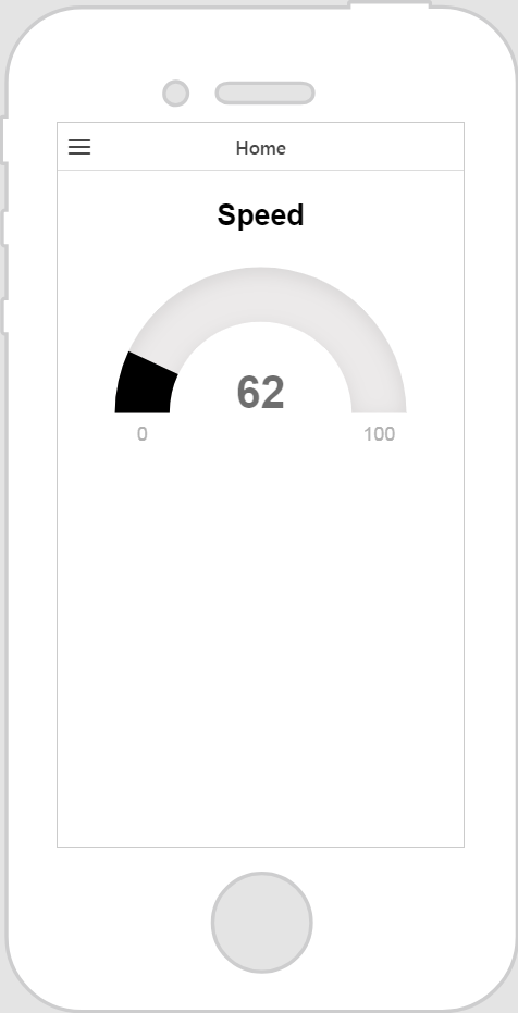
The Gauge widget is a single needle gauge. You can define how many sections, or intervals the gauge has, as well as different color schemes for each interval.
When Should I Use This Widget?
Use a Gauge when you want to display a property from a connected thing in a gauge. For example, if you want to display the engine temperature from a generator, simply bind the EngineTemp property to the gauge.
Are There Any Special Properties, Services, Events, or Actions?
To view a list of common widget properties, services, and events, see Common Widget Properties, Services, and Events.
The following tables list properties, services, and events that are specific to this widget.
|
Property
|
JavaScript
|
Type
|
Description
|
|---|---|---|---|
|
Enable State-Based Formatting
|
enableStateFormatting
|
boolean
|
Allows you to format the widget based on state definitions that have been defined in ThingWorx.
If the checkbox is selected the following properties appear:
• Dependent Field
• State Definition
For example, if a label has a State Definition value of error, the label turns red.
For more information about style and state definitions in ThingWorx, see Style and State Definitions in the ThingWorx Help Center.
|
|
Dependent Field
|
stateFormatValue
|
string
|
This property is visible if the Enable State-Based Formatting checkbox is selected. For more information about style and state definitions in ThingWorx, see Style and State Definitions in the ThingWorx Help Center.
|
|
State Definition
|
stateFormat
|
boolean
|
This property is visible if the Enable State-Based Formatting checkbox is selected. For more information about style and state definitions in ThingWorx, see Style and State Definitions in the ThingWorx Help Center.
|
|
Minimum Value
|
min
|
string
|
The minimum value that the gauge can reach. By default, this is set to 0.
|
|
Maximum Value
|
max
|
string
|
The maximum value that the gauge can reach. By default, this is set to 100.
|
|
Decimal Scale
|
humanFriendlyDecimal
|
number
|
How many numbers appear after the decimal separator.
|
|
Gauge Title
|
title
|
string
|
The title of the gauge.
|
|
Title Position
|
titleposition
|
string
|
Select one of the following for the title position:
• Above
• Below
|
|
Gauge Span
|
donut
|
number
|
Select one of the following for the gauge span:
• Half Circle
• Full Circle
If Full Circle is selected, the Start Angle property appears allowing you to enter a value for the angle at which the value fill should start.
|
|
Start Angle
|
donutstartangle
|
number
|
Starting angle for the effect.
|
|
Hide Inner Shadow
|
hideinnershadow
|
boolean
|
Select this checkbox to hide the inner shadow of the gauge.
|
|
Title Font Color
|
titlefontcolor
|
string
|
Enter a color for the title of the gauge. You can enter any of the following formats:
• red
• #FF0000
• rgba(255, 0, 0, 1)
|
|
Value Font Color
|
valuefontcolor
|
string
|
Enter a color for the value of the gauge. You can enter any of the following formats:
• red
• #FF0000
• rgba(255, 0, 0, 1)
|
|
Value Fill Color
|
valuecolor
|
string
|
Enter a color for the value fill of the gauge. You can enter any of the following formats:
• red
• #FF0000
• rgba(255, 0, 0, 1)
|
|
Value Background Color
|
backgroundcolor
|
string
|
Enter a color for the background of the value fill of the gauge. You can enter any of the following formats:
• red
• #FF0000
• rgba(255, 0, 0, 1)
|
The Widget in Action
Here’s an example of what your widget might look like!
|
Minimum Steps Required for Use
|
What It Looks Like
|
||
|---|---|---|---|
|
1. Drag and drop a Gauge widget onto the canvas.
2. Enter a title for the gauge in the Gauge Title field.
3. From the Data pane, search for an entity that has a service with a numeric property.
4. Once the service has been added, drag and drop a numeric property under Current Selected Item onto the widget and select Value on the Select Binding Target window.
|
 |