Card
What Does This Widget Do?
The Card widget allows you to organize data and information within a card in your experience.
When Should I Use This Widget?
Cards can be particularly useful in mobile experiences because they make it easy to display the same information across many different screens.
If you want a card to repeat, you must place the Card widget within a Repeater widget. You can also drag and drop other widgets onto a card directly.
Use a Card when:
• You want to display content that’s composed of different elements.
• You want to showcase elements whose size or supported actions vary, like photos with captions of variable length.
• You want a consistent theme for all views in an experience.
You can also use a card when you have a collection of content that includes multiple data types, such as images, buttons, and text.
Are There Any Special Properties, Services, Events, or Actions?
To view a list of common widget properties, services, and events, see Common Widget Properties, Services, and Events.
The following table is a list of properties that are specific to this widget.
|
Property
|
JavaScript
|
Type
|
Description
|
||
|---|---|---|---|---|---|
|
Footer
|
footer
|
string
|
Displays text at the bottom of the card.
|
||
|
Header
|
header
|
string
|
Displays text at the top of a card.
|
The Widget in Action
Here’s an example of what your widget might look like!
|
Minimum Steps Required for Use
|
What It Looks Like
|
|---|---|
|
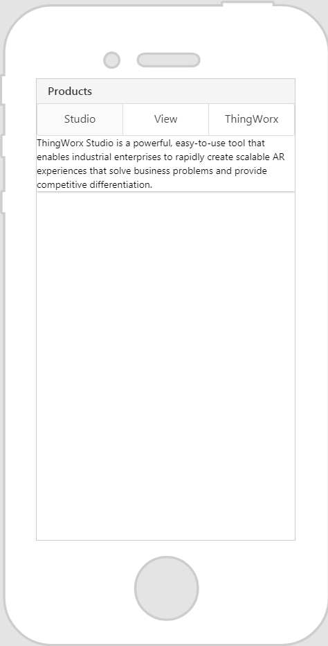
1. Drag and drop a Card widget onto the canvas.
2. Enter the title of the card in the Header field. For this example, we’ve entered Products.
3. Drag and drop the widgets you want displayed onto the card. For this example, we’ve dropped a Tabs widget onto the card, and added two more tabs.
|
 |