Property Display Widget (Themable)
You can use the Property Display widget to display a structured group of key-value pairs in the mashup.
 |
The Property Display widget is available as a standard widget in the platform and as a web component that you can import from an SDK.
|
The properties of the Property Display widget follow:
|
Property Name
|
Description
|
Base Type
|
Default Value
|
Bindable? (Y/N)
|
Localizable? (Y/N)
|
||
|---|---|---|---|---|---|---|---|
|
VerticalMode
|
Aligns the data along the vertical axis. It appears horizontally if not selected.
|
BOOLEAN
|
False
|
Y
|
N
|
||
|
HideGroupTitles
|
Hides the group title labels.
|
BOOLEAN
|
False
|
Y
|
N
|
||
|
ModalWidth
|
Sets a fixed width for the modal window.
|
NUMBER
|
n/a
|
Y
|
N
|
||
|
ModalHeight
|
Sets a fixed height for the modal window.
|
NUMBER
|
n/a
|
Y
|
N
|
||
|
CustomClass
|
Defines the CSS to the top div of the widget. When entering multiple classes, separate each class with a space.
|
STRING
|
n/a
|
Y
|
N
|
||
|
DisclosureControl
|
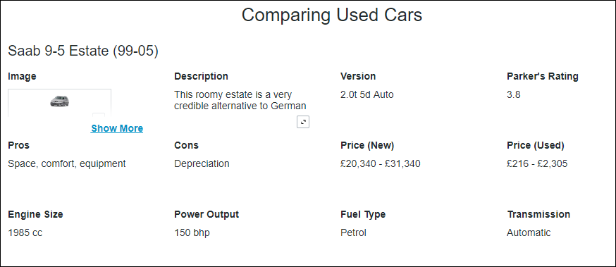
Specifies how to display the full value when it exceeds the specified dimensions for the widget. The full value appears in a modal window by default, or using a Show More link.
|
STRING
|
Display Info Button
|
N
|
N
|
||
|
MultiLine
|
Breaks the text across a new line when it exceeds the specified width.
|
BOOLEAN
|
False
|
||||
|
TextIfNoValue
|
Sets a text that appears when the widget data source does not contain a value.
|
STRING
|
n/a
|
Y
|
Y
|
||
|
Disabled
|
Disables the widget in the mashup. The widget appears but it is not available to use.
|
BOOLEAN
|
False
|
Y
|
N
|
||
|
TabSequence
|
Sets the sequence in which a widget is highlighted when you press a TAB.
|
NUMBER
|
n/a
|
N
|
N
|
||
|
Data
|
The data source for the Property Display.
The label for each entry is derived from the field name as defined by the infotable data shape.
• If the field has a friendly name defined in the data shape definition, this name is used.
• If the field does not have a friendly name defined in the data shape definition, the field name is selected from the current localization table.
• If neither of the above two scenarios work, the field name itself is used as the label.
The value of each field is used as the entry value. The type of this value is determined automatically by the field type as defined in the data shape. There is no need to configure these. For example, a field with the type IMAGE appears as an image.
|
INFOTABLE
|
n/a
|
Y
|
N
|
||
|
GroupNameField
|
The field that contains the group items.
This property selects one of the fields in the infotable to use as the group title. If this property is set, the value of this field is used as the group title and this field does not appear among other properties. If no field is selected for GroupNameField, the property display widget displays all fields and the groups do not get a title.
|
INFOTABLE
|
n/a
|
N
|
N
|
||
|
Label
|
Displays the label text for the Property Display widget.
|
STRING
|
n/a
|
Y
|
Y
|
||
|
LabelAlignment
|
Aligns the label to the Left, Right, or Center along the horizontal axis.
|
STRING
|
Left
|
N
|
N
|
||
|
LabelType
|
Sets the type for the label.as Header, Sub-Header, Label, or Body.
|
STRING
|
Label
|
N
|
N
|
||
|
HideLabel
|
Hides the label in the mashup.
|
BOOLEAN
|
False
|
N
|
N
|
||
|
GroupTitleAlignment
|
Aligns the group label to the Left, Right, or Center along the horizontal axis.
|
STRING
|
Left
|
N
|
N
|
||
|
GroupTitleType
|
Sets a type for the group titles asHeader, Sub-Header, Label, or Body
|
STRING
|
Label
|
N
|
N
|
||
|
ValueMaxWidth
|
Sets the maximum width for values.
|
NUMBER
|
n/a
|
Y
|
N
|
||
|
ValueMaxHeight
|
Sets the maximum height for values.
|
NUMBER
|
n/a
|
Y
|
N
|