List Widget (Themable)
 |
This themable widget was listed as Beta in the ThingWorx 8.4.X release.
|
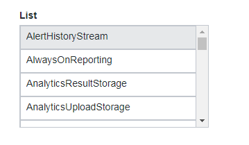
The List widget enables you to display the rows of data in a list.
|
|
The List widget is available as a standard widget in the platform and as a web component that can be imported from an SDK.
|
The properties of the List widget are listed below.
|
Property Name
|
Description
|
Base Type
|
Default Value
|
Bindable? (Y/N)
|
Localizable? (Y/N)
|
||
|---|---|---|---|---|---|---|---|
|
Label
|
The text that is displayed as the widget label.
|
STRING
|
List
|
Y
|
Y
|
||
|
LabelAlignment
|
Enables you to align the label to the left, right or center.
|
STRING
|
Left
|
Y
|
N
|
||
|
Alignment
|
Enables you to align the items in the list to the left, right or center.
|
STRING
|
Left
|
Y
|
N
|
||
|
ClearSelectionItem
|
Adds a blank selection item to the list. Enables the user to clear a selection.
|
BOOLEAN
|
True
|
Y
|
N
|
||
|
ClearSelectionLabel
|
Specifies a custom text for the clear selection item in the list. It is set to None by default.
|
STRING
|
None
|
Y
|
Y
|
||
|
MultiSelect
|
Enables the user to select multiple items in the list.
|
BOOLEAN
|
False
|
N
|
N
|
||
|
StateField
|
The infotable field that represents the state of the line items in the list.
This property can be used to enable or disable the line items in the list.
|
INFOTABLE
|
n/a
|
N
|
N
|
||
|
Disabled
|
Use this property to disable the widget in the mashup. The widget is displayed in the mashup but you cannot click it.
|
BOOLEAN
|
False
|
Y
|
N
|
||
|
ShowListFilter
|
Enables you to add a filter inside the list and allows you to filter the list items at runtime.
|
BOOLEAN
|
False
|
N
|
N
|
||
|
FilterHintText
|
Displays a hint text for the list filter.
|
STRING
|
n/a
|
N
|
Y
|
||
|
AutoSelectFirstRow
|
Enables you to set the first row as the selected option in the list.
|
BOOLEAN
|
n/a
|
N
|
N
|
||
|
RowHeight
|
Enables you to set the row height for the single line.
|
NUMBER
|
34
|
Y
|
N
|
||
|
CustomClass
|
Enables you to define the CSS to the top div of the widget. Multiple classes can be entered, separated by space.
|
STRING
|
n/a
|
Y
|
N
|
||
|
TabSequence
|
The sequence of the widgets in which they are highlighted when the user presses Tab key.
|
NUMBER
|
n/a
|
N
|
N
|
||
|
Data
|
The infotable or data source for the widget data.
|
INFOTABLE
|
n/a
|
Y
|
N
|
||
|
DisplayField
|
The infotable field that represents the data value.
|
n/a
|
n/a
|
N
|
N
|
||
|
ValueField
|
The field that is used for SelectedText.
|
n/a
|
n/a
|
N
|
N
|
||
|
SelectedText
|
Enables you to select an item in the list.
|
STRING
|
n/a
|
Y
|
Y
|
||
|
SelectedItems
|
The infotable source of selected items in the list.
|
INFOTABLE
|
n/a
|
Y
|
N
|
||
|
DoubleClicked
|
An event is triggered when you double click the widget.
|
n/a
|
n/a
|
Y
|
N
|
||
|
ListFormat
|
This property is used to apply a specific render for the data.
This property supports the following rendering formats: NUMBER, INTEGER, LONG, DATETIME, LOCATION, VEC2, VEC3, VEC4, THINGCODE, HYPERLINK, IMAGELINK, IMAGE, STRING, BOOLEAN, TAGS, HTML, THINGNAME, THINGSHAPENAME, THINGTEMPLATENAME, USERNAME, MASHUPS, INFOTABLE, PASSWORD, XML, JSON, VALUES.
|
n/a
|
n/a
|
n/a
|
n/a
|