Styling a Container
Advanced responsive mashups include containers that you can apply a style theme to. You can apply styling through the Mashup style theme, or directly on the Style Properties panel. By default, containers are styled using the Mashup style theme, but you can also use style definitions. The UseTheme property on the Properties panel controls theming mode for the container.
To display style theme properties for a container, do the following:
1. Select a container from the Explorer panel.
◦ Alternatively, click an empty area inside a container.
2. Click the Style Properties panel.
3. Expand the Base state. The style properties are listed under the flexcontainer element.
You can switch from style theme styling to style definitions. To use style definitions, do the following:
1. Select a container.
2. On the Properties panel, clear the UseTheme check box.
3. Click the Style Properties panel.
Style definitions for the container are now displayed instead of style properties.
Style Properties
You can specify the following style properties.
|
Property
|
Description
|
|---|---|
|
background
|
The background color of the container.
|
|
border-color
|
The color of the border lines.
|
|
border-radius
|
The radius of border corners. The property applies to all four corners of the container.
|
|
border-style
|
The style of border lines. You can set it to Dotted, Dashed, Solid, Double, Groove, Ridge, Inset, Outset, Inherit, or None.
|
|
border-width
|
The width of the border lines.
|
Customizing Container Style Properties
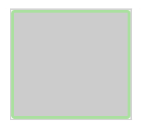
The following table lists the style property values for the flexcontainer element, compared to custom values for a styled container.
|
Style/Property
|
Default
|
Styled
|
|---|---|---|
|
Properties
|
• background—#ffffff
• border-color—inherit
• border-radius—None
• border-style—None
• border-width—None
|
• background—#cccccc
• border-color—#AAE09F
• border-radius—4px
• border-style—Solid
• border-width—4px
|
|
Preview
|
 |
 |
|
|
The default style property values are derived from the Mashup style theme.
|