Dygraph Widget
The Dygraph widget is useful for displaying any time series chart. In ThingWorx Apps, the widget is used in a number of places:
• In Trending and Troubleshooting, for the chart on a trend detail page (PTC.Factory.TrendTroubleshooting.TrendDetail)
• In Controls Advisor, for the Client Count and Tag Count Trend charts (PTC.Factory.KEPServerEX.DetailPage)
• In Production KPIs, for the Status History and KPI Trends charts on the Production History Data page (PTC.Factory.ProductionHistoricalData, PTC.Factory.C_ProductionHistoricalData_[ReleaseVersion])
• In Asset Advisor, for the Status This Week chart on the Performance page (PTC.SCA.SCO.AssetMonitor.AssetDetail.PerformanceMonitorContainerMashup)
These implementations can be referenced as examples.
The Dygraph widget implements a subset of features from the Dygraphs charting library, and has been customized for use in ThingWorx Apps. While the Dygraphs documentation (http://dygraphs.com/) can be a useful resource, only the features that are documented in this topic are supported for use with the Dygraph widget.
Utility Services for the Dygraph Widget
The PTC.SCA.SCO.DygraphUtils thing contains a service that helps generate data in the correct format for the JSONData property on the widget. The GenerateDygraphData service provides history data for a specified list of properties, either from the value stream for a thing, or from the database, in a format for the Dygraph widget to display. Given a valid set of input, this service returns data in CSV format that can be bound to the JSONData property in the widget. You can create new services that use the GenerateDygraphData service to generate specific data for the widget in individual mashups.
The PTC.SCA.SCO.DygraphUtils thing also contains services that are used by the widget in the PTC.Factory.ProductionHistoricalData, and PTC.Factory.C_ProductionHistoricalData_[ReleaseVersion] mashups:
• GenerateKPIPropertiesHistoryForDygraph—Retrieves the KPI properties history information displayed for the selected time range in the KPI Trends chart on the Production History Data page for a piece of equipment in Production KPIs. This service is an example of using the GenerateDygraphData service for getting history data for specific properties directly from the database.
• GenerateStatusHistoryForDygraph—Retrieves the status history information displayed in the Status History chart on the Production History Data page for a piece of equipment in Production KPIs. Also retrieves the information displayed on the Performance page of Asset Advisor. This service retrieves the status change information for the selected time range, and the data point immediately preceding the selected time range. This allows the status information applicable for the entire selected time range to be displayed, not only the status changes that occur during the selected time range.
Relevant Dygraph Widget Properties
These properties are found on the Properties tab for the widget, under Settings:
• annotationsDivName—The HTML div element where the annotation information is shown. This is an element displayed outside of the widget itself. In the mashup, using an HTML element and creating the div in that element allows you to place the div wherever you want it to be placed. An example is the annotations shown when a user clicks a change event box in the KPI Trends chart.
• ConnectSeparatedPoints—When the checkbox is selected, any gaps in the data are connected on the chart.
• CustomBars—When the checkbox is selected, each CSV cell is parsed as "low;middle;high". Error bars are drawn for each point between low and high, with the series itself going through the middle. This is mainly used as a way to show the range when an averaged value is shown on the chart. This allows display of fewer points, while still showing where a point was higher or lower than expected.
• dateFormat, useDateFormat—Allows you to format the X-axis date. The following function from the Moment.js Javascript library is used: moment(date).format(XXX)
• DisplayTagName—When the checkbox is selected, the full name of the tag or property displays in the chart legend, along with the value. For long tag or property names, this can result in data being truncated. When the checkbox is cleared, a colored dash coordinating to the colored square for the tag or property name as shown in the information panel to the right of the chart displays instead.
• DrawAxisX, DrawAxisY, DrawAxisY2—When the checkbox is selected, the horizontal axis line with values is shown on the chart for that axis.
• DrawGridX, DrawGridY, DrawGridY2—When the checkbox is selected, the vertical grid line is shown on the chart for that axis.
• DrawPoints—When the checkbox is selected, all points are permanently displayed on the chart, instead of only when hovering.
• DygraphSynchDefault—When the checkbox is selected, the synchronize feature from the Dygraphs charting library is called when the mashup is loaded, and all charts on the page are synchronized. This checkbox must be selected for all charts in the mashup for the feature to work properly. By default, this checkbox is cleared.
• FillArea—When the checkbox is selected, the area defined by line is filled with color. This property is not compatible with a custom bar.
• HideY-AxisValues—When the checkbox is selected, the numbers for the Y-axis are hidden, but the axis lines still display.
• LegendPosition—Determines the position of the legend over the chart. The default value is On Mouse Over.
• showDecimal—When the checkbox is selected, labels for decimal values display on the Y-axis.
• StackedGraph—When the checkbox is selected, the graph lines are stacked.
• Stepped—When the checkbox is selected, the chart line is stepped between points, rather than a straight line.
• useAnnotation—Select this checkbox to use annotationsJSON or annotationsDivName.
• UsePercentageFormat—When the checkbox is selected, the Y-axis values display as percentages. Applies to the left-side Y-axis only.
These properties are found on the Properties tab for the widget, under Bindings:
• annotationsJSON—The JSON that is parsed to add the annotation to the chart.
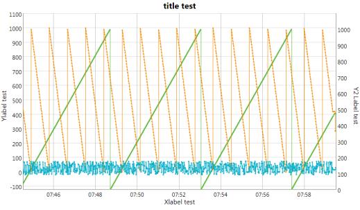
• ChartTitle, XLabel, YLabel, Y2Label—Labels for the chart and each axis. If nothing is specified, then no label displays. Padding is automatically added to the chart for the label text.
• DataLabel<#>—If specified, provides the label used for the series. If left blank, the JSONData can provide the data label. If DataLabel<#> is specified, the second Y-axis features cannot be used with that series.
• DateWindowEnd and DateWindowStart—The start and end time for the initial x-axis range when the chart displays.
• DisableVerticalZoom—When the checkbox is selected, vertical zoom for the chart is disabled.
• EnableZoomSynchronizing—When the checkbox is selected, the chart can synchronize its zoom with another chart.
• HexColors—Comma-separated list of hex color values used for the series data displayed in the chart, with one value for each series in the chart. For example: #a2a2a2,#f2b927,#3ec556,#09aec6,#ed684a,#a2a2a2. This property is used by services to dynamically set the series colors. If no value is specified for HexColors, the SeriesStyle<#> property value is used.
• HideSeries<#>InLegend—When the checkbox is selected, the series is hidden from the chart legend.
• isZoomed—Allows you to track if the chart is currently zoomed in or not. This is useful on the mashup or service side to handle the different zoom use cases (zoom when already zoomed, update data when zoomed and keeping the zoom.)
• JSONData—The data used in the chart is a JSON, sent in string format. A string is used to send the information, rather than an infotable, because infotables are passed to the widget line by line, requiring further manipulation of the data for it to be fed to the chart. Using a string allows the data to be sent all at once to the Dygraph library to render the chart. The format for this JSON is CSV. You can use the GenerateDygraphData service, or a service that calls GenerateDygraphData, to convert an infotable to CSV. For more information, see: http://dygraphs.com/data.html#csv.
An example of the data sent as a string to the GetJsonStringTrendHistory service:
{"isCustom":true,"trendType":"PerformanceHistory","displayId":
"Asset_CheeseCake_CleaningAndDryingMachine","endDate":1501819199000,
"startDate":1501732800000,"isZoomed":false,"zoomedMax":0,"zoomedMin":0}
"Asset_CheeseCake_CleaningAndDryingMachine","endDate":1501819199000,
"startDate":1501732800000,"isZoomed":false,"zoomedMax":0,"zoomedMin":0}
• SeriesVisibilities—Comma-separated list of visibility settings for the series in the chart. The format for each list entry is <series index>:<boolean>, where the boolean value specifies whether the series is visible. For example:
0:true,1:true,2:false,3:false,4:true,5:false
This property is used by services to dynamically set the visibility of the series. If no value is specified for SeriesVisibilities, then the SeriesVisibility<#> property value is used.
• SeriesVisibility<#>—Determines whether the series data displays in the chart. This property maps to the visibility selection for the series in the information panel to the right of the chart.
• useValueRange, valueRangeMin, and valueRangeMax—When useValueRange is selected, you can set a minimum (valueRangeMin) and maximum (valueRangeMax) value for the Y-axis to be rendered.
• zoomMax and zoomMin—When a zoom is performed on the chart, these properties get a new value indicating the minimum and maximum taken from the X-axis, using the JSON data. If using a date-time data format, the time is usually returned in milliseconds.
These properties are found on the Style Properties tab for the widget:
• SeriesStyle<#>—The color used for the series data displayed in the chart, and as the colored square in the information panel to the right of the chart. This property appears on the Style Properties tab.
• SeriesSecondAxis<#>—Determines whether the Y-axis display for the series displays on the left or the right side of the chart. When the checkbox is selected, the Y-axis displays on the right. When the checkbox is cleared, the Y-axis displays on the left. This property maps to the left or right Y-axis display selection for the series in the information panel to the right of the chart.
The following graphic shows an example of values specified for ChartTitle, XLabel, YLabel, and Y2Label, as well as ConnectSeparatedPoints set to true.

Dygraph Widget Events
These events are available on the Properties tab for the widget, in the Bindings section:
• DoubleClicked—This event is fired with a double-click is performed. Double-clicking on a chart zooms out using the original zoomMin and zoomMax values provided with the data.
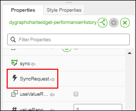
• SyncRequest—If the EnableZoomSynchronizing property is enabled, this event is fired when a zoom-in or zoom-out is performed. Use this event to synchronize the zoom feature with another graph. This event must be bound to the sync service of the target graph to be synchronized.
• Zoomed—This event is fired when a zoom is performed. Use this event with zoomMin and zoomMax to go deeper into the original data.
Dygraph Widget Services
These services are available on the Properties tab for the widget, in the Bindings section:
• detach—When called, all charts in the current mashup are unsynchronized.
• dygraphSynchronize—When called, all charts in the current mashup are synchronized. No additional configuration is necessary.
• resetZoom—Manually reset the zoom back to the default state.
• sync—Receptor for the SyncRequest event to synchronize the graph’s zoom with the calling graph.
Using CustomBars to Add More Information when Zooming
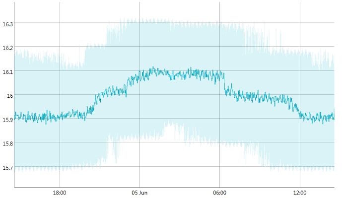
When averaging a large data set, some information can be lost. One strategy to address this is to add the custom range on top of averaging. This shows a transparent colored range behind the lines on the chart, indicating the range in which values are situated. For an example, select Show Value Range on a trend detail chart to see a display similar to the following:

If the average is 5 and values go from 1 to 10, then the lines are at 5 and the transparent range shows from 1 to 10. To use this feature, the CustomBars property needs to be enabled, and the data needs to be changed accordingly.
Example of the JSON data without CustomBars enabled:
Date,point1,point2
For example:
Date,trend1,trend2
2017-03-21,1,9
2017-03-22,2,2
2017-03-23,7,0
2017-03-24,3,5
2017-03-21,1,9
2017-03-22,2,2
2017-03-23,7,0
2017-03-24,3,5
Example of the JSON data with CustomBars enabled:
Date,minPoint1;point1,maxPoint1,minPoint2;point2,maxPoint2;
For example:
Date,trend1,trend2
2017-03-21,0;1;8,4;9;9
2017-03-22,1;2;6,0;2;8
2017-03-23,5;7;9,0;0;4
2017-03-24,2;3;4,4;5;6
2017-03-21,0;1;8,4;9;9
2017-03-22,1;2;6,0;2;8
2017-03-23,5;7;9,0;0;4
2017-03-24,2;3;4,4;5;6
Synchronizing the Zoom Level Between Multiple Graphs
There are two methods of synchronizing the zoom between multiple graphs, one using functionality from the Dygraphs charting library, and one using functionality within ThingWorx:
• Using the Dygraphs charting library functionality (Recommended)—
This zoom synchronization uses the full library features and built-in capabilities from the Dygraphs charting library. For more information, see http://dygraphs.com/gallery/#g/synchronize.
To use this zoom synchronization method:
◦ To synchronize all charts on the page when the mashup is loaded, select the DygraphSynchDefault checkbox on all charts in the mashup. By default, this checkbox is cleared.
◦ Use the dygraphSynchronize and detachservices to synchronize and unsynchronize all the graphs in the current page as needed.
• Using the ThingWorx functionality—
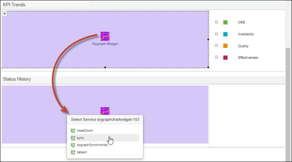
To synchronize the zooms between multiple graphs, use the SyncRequest event of the source graph, and bind it to the sync service of the target graph.

Select the source widget, drag-and-drop the SyncRequest onto the target widget, and select the sync service.

For bi-directional zoom synchronization, repeat these steps in the opposite direction.
Making an Interactive Zoom
The following steps describe the flow for implementing interactive zoom for the Dygraph Widget in ThingWorx Composer. The chart on a trend detail page is an example of this implementation.
1. Start with an original large data set.
2. If the data set is determined to be too large, average or reduce the number of points on the chart.
3. When the user zooms in, take the zoomMin and zoomMax, and recalculate the data using this new range, validating as in step 2. If the number of points is small enough, show the raw data instead of averaging or reducing the number of data points.
4. When the user zooms out, return to the original data set with its start time and end time.
Using CSS for the Legend and Labels
The display of the chart legend and labels is formatted using CSS, which can be overridden by providing your custom CSS on the mashup. The default CSS for the chart legend and labels is provided here for your reference. For more information, see Custom CSS in the ThingWorx Help Center.
Default CSS for the chart legend:
.dygraph-legend {
position: absolute;
z-index: 10;
font-family: Arial;
font-size: 10px;
opacity: 0.75;
border: 1px solid black
border-radius: 2px;
padding: 6px;
width: 300px; /* labelsDivWidth */
/*
dygraphs determines these based on the presence of chart labels.
It might make more sense to create a wrapper div around the chart proper.
top: 0px;
right: 2px;
*/
background: white;
line-height: normal;
text-align: left;
overflow: overlay;
left: 600px !important
}
.dygraph-legend-line {
display: inline-block;
position: relative;
bottom: .5ex;
padding-left: 1em;
height: 1px;
border-bottom-width: 2px;
border-bottom-style: solid;
/* border-bottom-color is set based on the series color */
}
Default CSS for labels:
.dygraph-legend {
position: absolute;
z-index: 10;
font-family: Arial;
font-size: 10px;
opacity: 0.75;
border: 1px solid black
border-radius: 2px;
padding: 6px;
width: 300px; /* labelsDivWidth */
/*
dygraphs determines these based on the presence of chart labels.
It might make more sense to create a wrapper div around the chart proper.
top: 0px;
right: 2px;
*/
background: white;
line-height: normal;
text-align: left;
overflow: overlay;
left: 600px !important
}
.dygraph-legend-line {
display: inline-block;
position: relative;
bottom: .5ex;
padding-left: 1em;
height: 1px;
border-bottom-width: 2px;
border-bottom-style: solid;
/* border-bottom-color is set based on the series color */
}
position: absolute;
z-index: 10;
font-family: Arial;
font-size: 10px;
opacity: 0.75;
border: 1px solid black
border-radius: 2px;
padding: 6px;
width: 300px; /* labelsDivWidth */
/*
dygraphs determines these based on the presence of chart labels.
It might make more sense to create a wrapper div around the chart proper.
top: 0px;
right: 2px;
*/
background: white;
line-height: normal;
text-align: left;
overflow: overlay;
left: 600px !important
}
.dygraph-legend-line {
display: inline-block;
position: relative;
bottom: .5ex;
padding-left: 1em;
height: 1px;
border-bottom-width: 2px;
border-bottom-style: solid;
/* border-bottom-color is set based on the series color */
}