將自訂 CSS 樣式套用至 Web 元件小器具
我們建議您透過建立自訂樣式主題或使用 Mashup Builder 中「樣式內容」面板上提供的樣式內容,來設定元件小器具的樣式。我們不建議將自訂 CSS 樣式套用至 web 元件小器具。如需詳細資訊,請參閱樣式主題與使用樣式內容面板。
將 CSS 套用至 web 元件小器具時,您應考慮下列指導原則:
• 如果 web 元件的 DOM 結構在 ThingWorx 的未來版本中發生變更,自訂 CSS 可能會停止運作。您必須在升級後手動審核及更新您的自訂 CSS 規則。
• 與舊有小器具不同,web 元件功能、行為與樣式會封裝在附加至主 DOM 的隱藏樹內。隱藏樹的名稱為「陰影 DOM」。當為包含子元件的複雜小器具設定樣式時,一般 CSS 可能無法運作。如需有關「陰影 DOM」概念的詳細資訊,請參閱下列文章:Using shadow DOM - Web Components | MDN (mozilla.org)。
• 欲套用自訂 CSS,您應該熟悉 web 元件結構,包括子元件、部份名稱、可用狀態以及樣式內容。如需有關 web 元件及其樣式內容、變體與狀態的詳細資訊,請參閱 ThingWorx Web 元件 SDK文件集。
• 欲為使用 part 屬性顯示的子元件部份設定樣式,請使用 CSS ::part() 虛擬選取器。
• 為了支援「陰影 DOM」內的樣式設定元素,大多數複雜的 web 元件都支援將外部樣式模組新增至元件。這些樣式模組可使用 CSS 選取器來以元件的子部份及其任何狀態為目標。
• 並非所有瀏覽器都一致支援 CSS 功能,因此這可能會導致針對使用不同瀏覽器的使用者,樣式顯示不同。當一般或陰影部份 CSS 語法未正確套用至 web 元件時,您可以新增 ptcs-style-unit。
使用一般 CSS
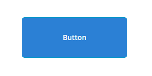
您可以使用一般 CSS 來為「陰影 DOM」樹附加至的元素設定樣式。以下範例顯示了使用一般 CSS 將 ptcs-button 樣式設定為大按鈕:
ptcs-button
{
color: #FAFAFA;
background-color: #2B80D5;
padding: 0px 60px;
font-size: 24px;
font-weight: bold;
height: 80px;
border-radius: 6px;
}
{
color: #FAFAFA;
background-color: #2B80D5;
padding: 0px 60px;
font-size: 24px;
font-weight: bold;
height: 80px;
border-radius: 6px;
}
預覽
您只能使用一般 CSS 來為主 web 元件設樣式,或指定可繼承的內容。當為包含多個子元件的元件設定樣式時,此方法不適用。接下來幾部份內容描述如何在「陰影 DOM」內使用 ptcs-style-unit 為子元件設定樣式。
新增 ptcs-style-unit 元素
當一般或陰影部份 CSS 無法運作時,您可以使用標準 @supports CSS 規則來在 web 元件中新增 ptcs-style-unit 元素。此元素可讓您將 CSS 套用至「陰影 DOM」樹內的子元件。您可使用 part 屬性,在「陰影 DOM」階層中指定要設定樣式的元素。例如:
@supports (ptcs-style-unit: "PTCS-DATEPICKER") {
[part=date-field] {
background-color: red;
}
}
[part=date-field] {
background-color: red;
}
}
您也可以新增變體與狀態選取器。下面會為您提供使用 ptcs-style-unit 來將自訂 CSS 套用至 Mashup Builder 中不同小器具的範例。
 | 您可以使用樣式內容來實現下列某些樣式。我們建議您在可能的情況下使用樣式內容,而不要使用 CSS。 |
如需有關 ptcs-style-unit 與可用選取器的詳細資訊,請參閱 ptcs-style-unit - ThingWorx Web 元件 SDK。
範例:設定按鈕小器具的樣式
CSS | 描述 | 預覽 |
|---|---|---|
@supports (ptcs-style-unit: "PTCS-BUTTON.primary") { :host { background-color: red !important; border-color: blue; border-width: 2px; } } | 將按鈕的背景顏色設定為紅色,並套用藍色邊框。 | 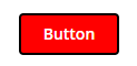 |
@supports (ptcs-style-unit: "PTCS-BUTTON.danger") { [part=label] { color: Blue; font-style: Italic; } } | 將按鈕危險變體的標籤顏色設為藍色,並將字型樣式設定為斜體。 | 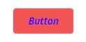 |
@supports (ptcs-style-unit: "PTCS-BUTTON.primary") { :host(:not([disabled]):hover) { border-color: red; border-width: 2px; } } | 當暫留狀態為使用中時,在按鈕周圍顯示紅色邊框。 | 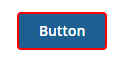 |
範例:設定文字欄位的樣式
CSS | 描述 | 預覽 |
|---|---|---|
@supports (ptcs-style-unit: "PTCS-TEXTFIELD") { [part=clear-button] { color: red; } } | 將清除按鈕的顏色設定為紅色。 | 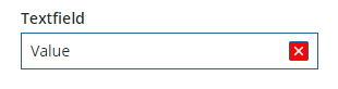 |
@supports (ptcs-style-unit: "PTCS-TEXTFIELD") { [part=text-box] { border-color: red; } } | 將文字方塊邊框的顏色設定為紅色。 | 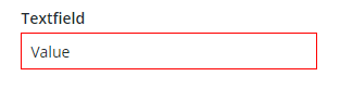 |
@supports (ptcs-style-unit: "PTCS-TEXTFIELD") { [part=counter] { color: red; } } | 將字元計數器的顏色設定為紅色。 | 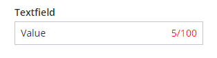 |
範例:設定下拉清單小器具的樣式
CSS | 描述 | 預覽 |
|---|---|---|
@supports (ptcs-style-unit: "PTCS-DROPDOWN") { [part=label] { color: red; } } | 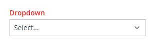 | |
@supports (ptcs-style-unit: "PTCS-DROPDOWN") { [part=icon] { color: red; } } | 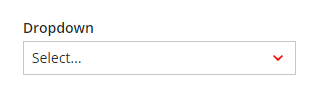 | |
@supports (ptcs-style-unit: "PTCS-DROPDOWN") { [part~=selected-item-value] { color: red; } } | 將所選項目值的顏色設定為紅色。 | 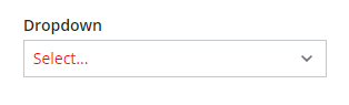 |
@supports (ptcs-style-unit: "PTCS-DROPDOWN") { [part=select-box] { background-color: red; border-color: blue; border-width: 2px; } } | 將下拉清單的背景顏色設定為紅色,並將邊框設為藍色。 | 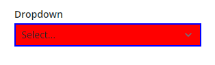 |
範例:設定橫條圖的樣式
CSS | 描述 | 預覽 |
|---|---|---|
@supports (ptcs-style-unit: "PTCS-CHART-AXIS") { [part=label] { color: red; } } | 將圖表軸的顏色設定為紅色。 | 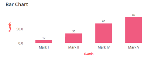 |
@supports (ptcs-style-unit: "PTCS-CHART-CORE-BAR") { [part=bar] { border-top-left-radius:15px; border-top-right-radius:15px; } } | 使柱的右上角與左上角圓角化。 | 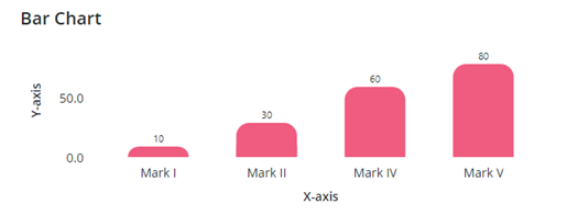 |
@supports (ptcs-style-unit: "PTCS-CHART-CORE-BAR") { [part=value] { color: red; font-style:bold; font-size:16px; } } | 設定柱資料標籤的顏色與字型樣式。 | 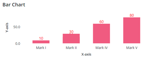 |