Tree Selector Widget (Themable)
 |
The Tree Selector is available as a widget in Mashup Builder and as a web component in the Web Component SDK Library.
|
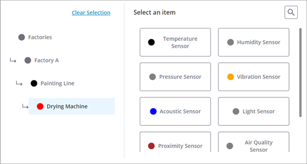
The Tree Selector widget enables you to provide hierarchical data navigation and selection of a single item that is stored in an infotable property. For example, you can use the widget to allow users to select products from different families and categories, remote machines that are deployed across different sites, or inventory parts that are stored in a maintenance warehouse. You can bind the selected item to other widgets like Grid, or Property Display to show more information about a specific object. The widget is divided into two areas:
• A tree view that shows the path to the selected item and enables you to navigate the tree structure.
• A selection view that lists all children of the current item.
In addition, a search button allows users to search the entire hierarchy of the tree selector. When the Tree Selector is loaded at runtime, it displays the top-level items in the selection area. When an item is selected, its children are displayed and the tree is updated to highlight the path to the item. You can use the tree to navigate to higher levels in the data hierarchy. To view the children of an item, you must select it in the selection area. When an item does not have any children, a message is displayed. You can customize this message using the widget NoChildrenMessage property.
Anatomy
The tree selector is divided into two views. A tree view that shows the path to the current item and a selection view that lists the available children for the selected item.
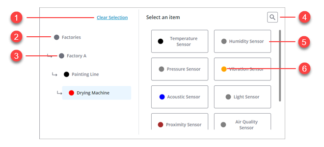
1. Clear current selection. Clicking this button resets the tree selector to the top level item.
2. Top-level item
3. Child item of Factories and a parent of Painting Line.
4. Item search button
5. Item
6. Item highlight color
Data Format
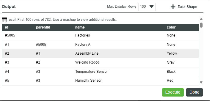
To configure the list items for Tree Selector widget, you must create a service that returns an infotable with the following field definitions:
ID Field | Parent ID Field | Name Field | Color Field | |
|---|---|---|---|---|
Base Type | STRING | STRING | STRING | STRING |
Description | A unique identifier for each item in the tree selector. | The ID of the parent item in the tree selector. | The label to display for the item in the tree selector. | An optional field that specifies the color used to highlight the item. Supported formats: CSS color names 'red', RGB values 'rgb(255, 0, 0)', or hexadecimal values '#ff0000”. |
Row Example | #2 | #1 | Factory | Red |
Each row in the infotable defines an item in the tree selector. You can configure your data service to generate items statically, or in a dynamic way based on input from other widgets or services.
Creating a Data Service for the Tree Selector
1. In Composer, open a Thing, Thing Template, or any other type of entity, and then open the Services tab.
2. Click Add to create a new service for the tree selector.
3. Under Service Info, type a name for the service, and then click Save and Continue.
4. In the code editor, define a new infotable using the tree selector data format.
5. Define the tree items by adding rows with values for each infotable field using the data shape. The syntax to define a row is as follows:
<infotable_name>.AddRow(<Row_Object>);
6. When you finish defining your service, click Done, then Save to save the changes to the entity.
 | Click Execute to preview the returned output infotable from the data service. |
The following image shows the infotable output after the data service is executed:
Binding Data to the Tree Selector
To bind data to the Tree Selector widget, perform the following steps:
1. In Mashup Builder, add a Thing that contains a data service for the tree selector items using the Data panel.
2. Bind the All Data property of a service to the widget Data property.
3. Bind the service to the Loaded mashup event.
4. On the Properties panel, specify which infotable columns to use to configure the tree selector items:
◦ IDField—The unique identifier column for the items.
◦ NameField—The column label to display for the item.
◦ ParentIDField—The column used to specify the parent ID for items.
◦ ColorField—The column that contains the color used to highlight each item.
5. Click Save, then View Mashup.
At run time, the top-level item is displayed when you open the tree selector.
Searching for Items
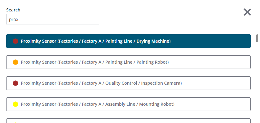
The search shows a list of matching items from the entire tree data. Items that are closer to the current selection are listed higher in the search results. Each item name is followed by the full path in the tree structure. In addition, highlight colors are displayed to make it easier to identify related items. To disable search, set the HideSearchButton property to false.
Passing the Selected Items to other Widgets or Services
You can pass the selected item using one of the following properties
• SelectedData
• SelectedItem—Contains the name of the selected item.
Use the SelectedData property The SelectedItem property does not provide a unique value.
The INFOTABLE, a data structure, contains a single row that corresponds to the SelectedItem from the original input INFOTABLE. This design choice was made to address a specific issue: the inability to distinguish between items with identical names based solely on the SelectedItem.
For instance, consider the example provided in the Figma specification. The term “Apple” appears in three different sections: “Computer companies”, “Record company”, and “Fruit”. Each instance of “Apple” is a separate item. If we were to rely solely on the SelectedItem, it would be impossible to determine which of the three instances of “Apple” was selected by the user.
However, by using SelectedData, we can overcome this limitation. SelectedData provides comprehensive information about the selected item, allowing us to identify the exact item that was selected, regardless of whether other items share the same name. This ensures accurate and precise item selection, enhancing the functionality and user experience of the system.
Widget Properties
Property Name | Description | Base Type | Default Value | Bindable (<-, ->) | Localizable (Y/N) |
|---|---|---|---|---|---|
Data | The infotable data source used to define the items to display within the widget. | INFOTABLE | Y | N | |
IDField | The infotable column in the data which contains the ID of each item. | Infotable field | N | N | |
ParentIDField | The infotable column in the data which contains the parent ID of each item. | Infotable field | N | N | |
NameField | The infotable column in the data which contains the display name of each item. | Infotable field | N | N | |
ColorField | The infotable column in the data which contains the color for each item. Supported formats: CSS color names 'red', RGB values 'rgb(255, 0, 0)', or hexadecimal values '#ff0000”. | Infotable field | N | N | |
SelectedData | An infotable that contains the row data with a unique identifier for the selected item. Use this property when the SelectedItem property does not provide a unique value. For example, when an item with the same name is displayed under multiple parents. | INFOTABLE | Y | N | |
SelectedItem | The name of the selected item. Specifies the selected item in the tree selector. | STRING | Empty | Y | N |
SelectedItemChanged | A bindable event that triggers when the selected item is changed. | Event | Y | N | |
HideSearchButton | Hides the search button. When using search, items that are closest to the selected item are listed first, followed by the rest of the search results. | BOOLEAN | False | Y | N |
NoSelectionMessage | The message to display on the right side of the widget when there is no selection made in the tree structure selector. | STRING | Widgets.NoSelectionMessage | Y | Y |
EndOfSelectionMessage | The message to display on the right side of the widget when the selected item does not have any children. | STRING | Widgets.EndOfSelectionMessage | Y | Y |
NoSearchResultsMessage | The message to display on the right side of the widget when there are no search results. | STRING | Widgets.NoResultsMessage | Y | Y |
Label | Specifies the text of the tree selector label. | STRING | Empty | Y | Y |
SelectionLabel | Specifies the label to display above the selection section on the right side. | STRING | Widgets.ChooseBelowMessage | Y | Y |
ClearSelectionLabel | Defines the label text for the Clear Selection button. | STRING | Widgets.ClearSelectionMessage | Y | Y |
Disabled | Use this property to disable the widget in the mashup | BOOLEAN | False | Y | N |