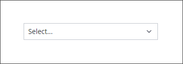
Dropdown Widget (Themable)
 |
This widget replaces the Combo Box view of the legacy List widget.
|
The Dropdown widget enables you to add a drop-down menu that opens a list of items at run time. You can configure the widget for single or multiple selection. The selected items are stored in the widget SelectedText property that you can bind as input for other widgets, functions, or data services. You can define items and their state by creating a data a service that returns an infotable. The following are examples of configurations that you can perform using widget properties:
• Align item labels to the left, right or center of the drop-down list
• Enable single or multiple selection
• Add a filter box to enable users to find items more quickly in long lists
• Apply style formatting to the list items
|
|
The Dropdown is available as a standard widget in the platform and as a web component that can be imported from an SDK.
|
Data Format
To configure the list items for Dropdown widget, you must create a data service that returns an infotable with the following field definitions:
|
Display Field
|
Value Field
|
State Field
|
|
|---|---|---|---|
|
Base Type
|
STRING
|
STRING
|
STRING
|
|
Description
|
The label to display for the items in the drop-down list.
|
The actual value to use for each item. This value is used in the widget SelectedItems property when binding to other widgets or data services.
|
An optional field that specifies whether an item is enabled or disabled. Supported values: Enabled or Disabled
|
|
Row Example
|
English
|
en
|
Enabled
|
Each row in the infotable defines an item in the drop-down list. You can configure your data service to generate items statically, or in a dynamic way based on input from other widgets or data services.
Binding List Items Data
To bind the configuration data to the drop-down widget, perform the following steps:
1. Add a Thing that contains a data service for the list items using the Data panel.
2. Bind the All Data property of a service to the widget Data property.
3. Bind the service to the Loaded mashup event.
4. On the Properties panel, specify which infotable columns to use to configure the drop-down list items:
◦ DisplayField—Select the column to use for the item labels.
◦ ValueField—Select the column to use for the actual values of the items.
◦ StateField—Select the column to use for the state of the items.
5. Click Save, then View Mashup.
At run time, the list items are displayed when you open the drop-down list.
Setting the Space between the List and the Dropdown
Use the widget ListMarginTop property to specify the space between the Dropdown and items list. By default, the space is set to 8 pixels. To remove the space, set the property value to 0.
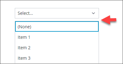
Adding an Item to Clear the Selection
By default, the Dropdown widget does not allow users to clear a list selections at run time. To allow users to clear selections at run time, enable the ClearSelectionItem property. An additional item that has a default label of (None) is added to the list. Users can select this item to avoid making a choice in the drop-down list.
Widget Properties
|
Property Name
|
Description
|
Base Type
|
Default Value
|
Bindable? (Y/N)
|
Localizable? (Y/N)
|
||
|---|---|---|---|---|---|---|---|
|
HintText
|
Displays placeholder text that explains what should be entered in the field.
|
STRING
|
Select..
|
Y
|
Y
|
||
|
Label
|
The text that is displayed as the widget label.
|
STRING
|
n/a
|
Y
|
Y
|
||
|
LabelAlignment
|
Enables you to align the label to the left, right, or center.
|
STRING
|
Left
|
Y
|
N
|
||
|
Alignment
|
Enables you to align the text items to the left, right or center in the drop-down list.
|
STRING
|
Left
|
Y
|
|||
|
ClearSelectionItem
|
Adds a blank selection item to the drop-down list. Enables the user to clear a selection.
|
BOOLEAN
|
True
|
Y
|
|||
|
ClearSelectionLabel
|
Specifies a custom text for the clear selection item in the drop-down list. It is set to None by default.
|
STRING
|
None
|
Y
|
Y
|
||
|
Disabled
|
Use this property to disable the widget in the mashup. The widget is displayed in the mashup but you cannot click it.
|
BOOLEAN
|
False
|
Y
|
N
|
||
|
ShowListFilter
|
Enables you to add a filter inside the dropdown list and allows you to filter the list items at run time.
|
BOOLEAN
|
False
|
N
|
N
|
||
|
FilterHintText
|
Displays a hint text for the dropdown list filter.
|
STRING
|
n/a
|
Y
|
Y
|
||
|
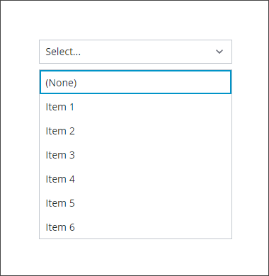
ListMaxHeight
|
Enables you to set a maximum height for the drop-down list that is displayed.
A scroll bar is added in the display if the number of items in the drop-down list is more than the list height that is set.
|
NUMBER
|
n/a
|
Y
|
N
|
||
|
ListMaxWidth
|
Enables you to set a maximum width for the drop-down list. This value must be equal to or higher than the text field width.
|
NUMBER
|
n/a
|
Y
|
N
|
||
|
StateField
|
The infotable that represents the state of the line items in the dropdown list.
This property can be used to enable or disable the line items in a dropdown list.
|
INFOTABLE
|
n/a
|
N
|
N
|
||
|
MultiSelect
|
Enables the user to select multiple items in the dropdown list.
|
BOOLEAN
|
False
|
N
|
N
|
||
|
AutoSelectFirstRow
|
Enables you to set the first row as the selected option in the dropdown list.
|
BOOLEAN
|
False
|
N
|
N
|
||
|
RowHeight
|
Enables you to set the row height for the single line.
|
NUMBER
|
34
|
Y
|
N
|
||
|
CustomClass
|
Enables you to define the CSS class to apply to the top div of the widget. Multiple classes can be entered, separated by space.
|
STRING
|
n/a
|
Y
|
N
|
||
|
TabSequence
|
The sequence of the widgets in which they are highlighted when the user presses Tab key.
|
NUMBER
|
n/a
|
N
|
N
|
||
|
Data
|
The infotable source.
|
INFOTABLE
|
n/a
|
Y
|
N
|
||
|
DisplayField
|
The infotable field that represents the data value.
|
n/a
|
n/a
|
N
|
N
|
||
|
ValueField
|
The field that is used for SelectedText.
|
n/a
|
n/a
|
N
|
N
|
||
|
SelectedText
|
This property functions in two ways, depending on its binding direction when using single selection mode:
• In—Selects the item with a label that matches the property value.
• Out—Retrieves the text of the selected item on the list.
|
STRING
|
n/a
|
Y
|
Y
|
||
|
SelectedItems
|
The infotable source for the selected items in the list.
|
INFOTABLE
|
n/a
|
Y
|
N
|
||
|
ListFormat
|
Opens a dialog box that enables you to specify the rendered and the formatting rules for the widget data.
|
Renderer and State Formatting
|
n/a
|
N
|
N
|
||
|
ListMarginTop
|
Sets the space between the Dropdown and the items list.
|
NUMBER
|
8
|
N
|
N
|
||
|
TooltipField
|
Displays a tooltip text when you hover over the label associated with the dropdown and the currently selected value in the dropdown.
|
STRING
|
n/a
|
Y
|
Y
|
||
|
TooltipIcon
|
Sets an icon image for the tooltip of the dropdown widget.
|
MEDIA ENTITY
|
n/a
|
N
|
N
|
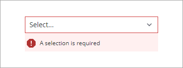
Validating Dropdown Widget Data
You can use validation properties to validate the selection of items at run time. For example, you can require a selection in the drop-down list and display an error message when no items are selected.
For more information about the validation properties, see Applying Validation to Widgets.
The following table lists validation properties that are available on the Validation panel.
|
Property
|
Description
|
Base Type
|
Default Value
|
Bindable (Y/N)
|
Localizable (Y/N)
|
|---|---|---|---|---|---|
|
CriteriaMessage
|
The message to display for the validation criteria and when the validation fails.
|
STRING
|
n/a
|
Y
|
Y
|
|
CriteriaMessageDetails
|
The details to display for the validation criteria and failure message.
|
STRING
|
n/a
|
Y
|
Y
|
|
RequiredMessage
|
The message to display when value required is set to true and item is not selected.
|
STRING
|
A selection is required
|
Y
|
Y
|
|
ShowValidationCriteria
|
Shows a hint message about the required input when selecting items from the drop-down list.
|
BOOLEAN
|
False
|
Y
|
N
|
|
ShowValidationFailure
|
Show a failure message when the entered value fails the validation.
|
BOOLEAN
|
False
|
Y
|
N
|
|
ShowValidationState
|
A bindable service that enables you to display the validation state before a user interacts with the widget at run time. By default, the validation state is only displayed after user interaction.
|
Service
|
n/a
|
In
|
N
|
|
ShowValidationSuccess
|
Show a success message when the entered value is validated as successful.
|
BOOLEAN
|
False
|
Y
|
N
|
|
SuccessMessage
|
The message to display when the validation is successful.
|
STRING
|
n/a
|
Y
|
Y
|
|
SuccessMessageDetails
|
A secondary message that displays more information about the validation success message.
|
STRING
|
n/a
|
Y
|
Y
|
|
Validate
|
A bindable event that is triggered when the widget value is changed. Bind this event to service or function to apply a validation pattern or expression.
|
event
|
n/a
|
Y
|
N
|
|
ValidationCriteriaIcon
|
Sets the SVG icon to display within the hint message for the validation criteria.
|
IMAGELINK
|
info
|
N
|
N
|
|
ValidationFailureIcon
|
Sets the SVG icon to display within the status message when the validation fails.
|
IMAGELINK
|
error
|
N
|
N
|
|
ValidationOutput
|
Retrieves the output of the widget validation. Returned values are Undefined,Unvalidated ,Valid , orInvalid.
|
STRING
|
n/a
|
Y
|
N
|
|
ValidationState
|
A bindable property that sets the validation state. You can set this property to Undefined, Unvalidated, Valid, and Invalid.
|
STRING
|
Undefined
|
Y
|
N
|
|
ValidationSuccessIcon
|
Select an SVG icon to display within the message when the validation succeeds.
|
IMAGELINK
|
success
|
N
|
N
|
|
ValueRequired
|
Require an item in the list to be selected.
|
BOOLEAN
|
False
|
Y
|
N
|