KPI Dial Widget (Themable)
Displays Key Performance Indicator (KPI) values using one of several layouts like a dial, a horizontal bar, or a vertical column. You can apply state formatting to highlight one or multiple KPI value targets.
 |
This widget is also available as a Web Component in the ThingWorx Web Component SDK library.
|
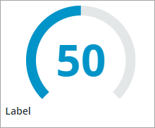
Anatomy
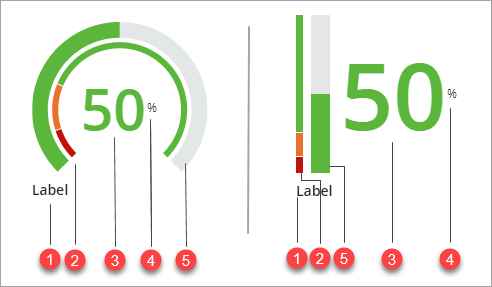
1. Widget label
2. State formatting tracker
3. KPI value
4. Unit of measure label
5. Value tracker
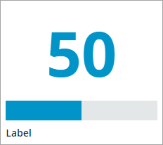
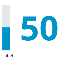
Widget Layouts
In addition to the Dial layout, you can configure the widget to show the KPI value using one of the following layouts:
Horizontal Bar
Vertical Column
Applying State Formatting
You can apply state formatting to the widget to show a target values arc. The arc is divided into segments, each representing a different state or range of the KPI values. You can apply state formatting rules to style the widget based on the current KPI value. To apply state formatting, perform the following steps:
1. In Composer, create a State Definition entity that applies style definitions based on a range of numeric values.
2. In Mashup Builder, select the widget, then open the Properties panel.
3. Configure the TargetFormat property by clicking State Formatting.
4. In the State Formatting dialog, select State-based Style Definitions.
5. Under Dependent Field, select Value.
6. Select the state definition that you created in Step 1, then click Done.
7. Save then view the mashup.
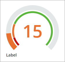
At runtime, the state formatting rules are applied to the widget based on the applied style definitions and the current value. The following example shows a dial with state formatting applied to the widget. The state formatting arc is split into three KPI value ranges.
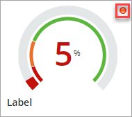
Optionally, you can show a status icon for each state that is defined within the state definition. The icon is displayed to the right of the widget by default. You can use the IconPosition property set the icon position to the left. To set a maximum size for the icon, use the MaxIconSize property.
For more information about applying state formatting to widgets, see Applying State Formatting to Widgets.
Setting the Dial Start and End Angles
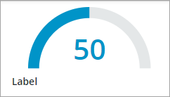
You can configure the start and end angle of the dial arc using the StartAngle and EndAngle properties. The StartAngle property specifies the starting point of the tracker arc. The two properties support a value between 0 and 360 degrees. The arc is calculated from the 6 o'clock position in a clockwise direction between 45 and 315 degrees by default. You can change the direction of the arc using the Direction property of the widget. The following example shows a dial tracker with the start angle set to 90 degrees and the end angle set to 270 degrees.
Formatting the KPI Value
Multiple configuration properties enable you to format the KPI value. You can specify the unit of measurement for the KPI value using the UnitOfMeasure configuration. This unit of measurement appears in the tooltip when a user hovers over the KPI value. When you set the ShowUOMLabel property to true, the widget displays the unit of measurement (UOM) next to the KPI value. The ValueFormat configuration allows you to set the decimal format for the KPI numeric value, using a 0.000 syntax.
Widget Properties
|
Property Name
|
Description
|
Base Type
|
Default Value
|
Binding
|
Localization
|
|---|---|---|---|---|---|
|
Clicked
|
A bindable event that triggers when the widget is clicked.
|
Event
|
Y
|
N
|
|
|
ValueFormat
|
Applies state formatting to the widget and the KPI value using State Definition entities.
|
State Definition
|
0000
|
Y
|
N
|
|
Label
|
Specifies the text of the widget label.
|
STRING
|
Label
|
Y
|
Y
|
|
Layout
|
Controls the type of layout used to display the KPI value on the widget. Options: Dial,.Horizontal Bar, Vertical Column
|
STRING
|
Dial
|
N
|
N
|
|
StartAngle
|
Sets the start angle of the value and target trackers on the dial relative to zero, starting at the 6 o'clock position. You can enter positive angles between 0 and 360. Use the Direction property to set the angle direction.
|
NUMBER
|
45
|
N
|
N
|
|
EndAngle
|
Sets the end angle of the value and target trackers on the dial relative to zero, starting at the 6 o'clock position. You can enter positive angles between 0 and 360. Use the Direction property to set the angle direction.
|
NUMBER
|
315
|
N
|
N
|
|
Direction
|
Specifies the direction of the value tracker on the dial, vertical column, or a horizontal bar.
Options
Dial: Clockwise/Counter-clockwise
Horizontal: Left to right/Right to left
Vertical: Bottom to top/Top to bottom
|
STRING
|
Dial: Clockwise
Horizontal: Left to right
Vertical: Bottom to top
|
N
|
N
|
|
IconPosition
|
Specifies the position of the KPI status icon relative to the value label. You can specify the icons to display using state formatting.
|
STRING
|
Right
|
Y
|
N
|
|
LabelAlignment
|
Controls the alignment of the widget label. Options: Left, Center, Right
|
STRING
|
Left
|
Y
|
N
|
|
IconSize
|
Sets the size of the KPI status icon. Options: Small, Medium, Large, XLarge
|
STRING
|
Small
|
Y
|
N
|
|
LabelType
|
Sets the label type. Options: Caption, Body, Label, Title, Large Title, Sub-Header, Header, Large Header
|
STRING
|
Label
|
N
|
N
|
|
MinimumValue
|
Sets the minimum KPI value to display on the widget.
|
NUMBER
|
0
|
Y
|
N
|
|
MaximumValue
|
Sets the maximum KPI value to display on the widget.
|
NUMBER
|
100
|
Y
|
N
|
|
UnitOfMeasure
|
Specifies the unit of measurement for the KPI value. The unit of measurement is displayed in the tooltip.
|
STRING
|
Empty
|
Y
|
Y
|
|
ShowUOMLabel
|
Displays the unit of measurement next to the KPI value.
|
BOOLEAN
|
False
|
Y
|
N
|
|
Value
|
Sets the KPI value.
|
NUMBER
|
Empty
|
Y
|
N
|
Validation Properties
|
Property Name
|
Description
|
Base Type
|
Default Value
|
Bindable (Y/N)
|
Localizable (Y/N)
|
|---|---|---|---|---|---|
|
ValidationState
|
A bindable property that sets the validation state. You can set this property to Undefined, Unvalidated, Valid, or Invalid.
|
STRING
|
Undefined
|
Y
|
N
|
|
ValidationOutput
|
Retrieves the output of the widget validation. Returned values are Undefined,Unvalidated,Valid, orInvalid.
|
STRING
|
Y
|
N
|
|
|
Validate
|
A bindable event that is triggered when the widget value is changed. Bind this event to a service or a function to apply a validation pattern or expression.
|
Event
|
Y
|
N
|
|
|
CriteriaMessage
|
The message to display when the validation fails.
|
STRING
|
Empty
|
Y
|
|
|
CriteriaMessageDetails
|
A secondary message that displays more information about the validation failure message.
|
STRING
|
Empty
|
Y
|
Y
|
|
ShowValidationSuccess
|
Show a success message when the validation is successful.
|
BOOLEAN
|
False
|
Y
|
N
|
|
SuccessMessage
|
The message to display when the validation is successful.
|
STRING
|
Y
|
Y
|
|
|
SuccessMessageDetails
|
A secondary message that displays more information about the validation success message.
|
STRING
|
Y
|
Y
|
|
|
ValidationSuccessIcon
|
Select an SVG icon to display within the status message when the validation succeeds.
|
List of SVG icons
|
PTC Success
|
N
|
N
|
|
ShowValidationFailure
|
Sets the failure message to show when the validation fails.
|
BOOLEAN
|
False
|
Y
|
N
|
|
ValidationFailureIcon
|
Select an SVG icon to display within the status message when the validation fails.
|
List of SVG icons
|
PTC error
|
N
|
N
|
|
MinValueFailureMessage
|
The message to display when the KPI value is lower than the value set in the MinimumValue property.
|
Text Field
|
<MinValue> is the minimum value.
|
Y
|
Y
|
|
MaxValueFailureMessage
|
The message to display when the KPI value is higher than the value set in the MaximumValue property.
|
Text Field
|
<MaxValue> is the maximum value
|
Y
|
Y
|