Defining Toolbar Actions Using an Infotable
Use the ToolbarAction data shape to create an infotable that defines the actions to display on the toolbar. Each row in the infotable is an action on the toolbar. You can create an infotable to configure the widget in the following ways:
• Set the number and type of actions to display.
• Control the order and position of the actions.
• Control the visibility of each action based on a condition or an event.
• Set the maximum width for each action.
The following procedure outlines the steps to add and configure a Toolbar widget.
1. Set the functional requirements, and then design the actions to display on the toolbar.
2. In Composer, create a toolbar configuration service that is formatted using the ToolbarAction data shape.
3. In Mashup Builder, add the Toolbar widget to the mashup, and then add the entity with the toolbar configuration service.
4. Bind the All Data property of the toolbar service to the widget ActionsData property.
|
|
Bindable properties for each action on the toolbar are displayed on the Properties panel in the following format:
• <ActionID>_<PropertyName>
|
5. On the Properties panel, configure the widget, and then create bindings to other widgets or functions.
For more information about the widget properties, see Toolbar Widget (Themable).
Common Field Definitions
• actionID—The ID of the action in the infotable. This value is used to identity each action when configuring the widget on the Properties panel in Mashup Builder.
• actionMaxWidth—The field definition to specify a custom maximum width for an action. By default, each action on the toolbar is displayed using a maximum width of 100 pixels.
• actionTooltip—Defines the content of a tooltip message. You can also add an icon to the tooltip using the actionTooltipIcon property.

• actionVisible—Controls the visibility of an action on the toolbar.
• actionDisabled—Disables an action. You can control this value programmatically to enable or disable an action based on a condition in the mashup.
• actionLabel—The label to display for an action on the toolbar. For button and toggle button actions, the label is displayed within the action.
• alignRight—Aligns the action to the right region.
In addition to the common properties, the data shape contains field definitions that enable you to configure the Button, Toggle Button, Link, and Dropdown actions. The following section lists the available properties for each action type with an example.
Button
buttonIcon—Specifies the icon to display within the button by referencing a media entity name.
You can display SVG icons from the SVG icons library using the following syntax cds:<icon_name>
For more information about the available icons, see Using SVG Icons.
buttonType—Specifies the visual styling to use for the button. Options: primary, secondary, tertiary, danger, transparent.

Toggle Button
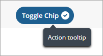
toggleChipIcon—Specifies whether to display an icon that indicates the toggle button state. Options: true, false.

toggleLabelPosition—Controls the position of the label relative to the icon. Options: left, right.
Link

linkTargetWindow—Specifies how the linked URL opens. Options: new, same, popup.
linkType—The link type.
Dropdown

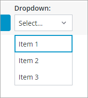
• dropdownData—The data used to define the list items. For example:
[{label:"Item 1", value: "value1"}, {label:"Item 2", value: "value2"}, {label:"Item 3", value: "value3"}]
• dropdownSeelctedText—Enables you to select an item from the drop-down list by default using the value text. For example, use the following expression to select Item 2 by default:
dropdownSeelctedText: "value2";
• dropdownLabelPosition—Specifies the position of the drop-down list label. Options: top, left
Adding a Data Filter
You can use the widget properties to add and configure a filter on the left or right side of the toolbar. For more information, see Toolbar Widget (Themable).
Arranging Actions on the Toolbar
Use the widget data service infotable to arrange actions on the toolbar. Actions are sorted based on their order in the infotable. In addition, you can align actions to the right of the toolbar using the alignRight option.
ToolbarAction Data Shape
The following table lists the field definitions of the ToolbarAction data shape.
Field Definition | Description | Base Type | ||
|---|---|---|---|---|
actionMaxWidth | The maximum width of the action on the toolbar. | NUMBER | ||
toggleState | The state of the toggle switch. | BOOLEAN | ||
toggleChipIcon | Shows or hides the chip icon, which is used to indicate selection. | BOOLEAN | ||
actionTooltip | The action tooltip. | STRING | ||
Visible | Controls the action visibility. | BOOLEAN | ||
alignRight | Aligns the action to the right side of the toolbar. To align the action to the left side, set the value to false or empty. | BOOLEAN | ||
actionLabel | The action label. | STRING | ||
actionTooltipIcon | The icon displayed within the action tooltip. | IMAGELINK | ||
actionType | The type of element to display for the toolbar action (button, link, drop-down, or toggle button). | STRING | ||
linkDestination | The URL for the link. | STRING | ||
buttonIcon | The icon to display on thebutton. | IMAGELINK | ||
actionDisabled | Controls whether the action is interactive or disabled. | BOOLEAN | ||
buttonType | The button variant to display. You can select Primary (default), Secondary, Tertiary, Danger, or Transparent. | STRING | ||
dropdownData | A JSON value that contains data for each drop-down list item. Each item is represented by a JSON object that contains the item label, value, and state (optional). | JSON | ||
actionId
| A unique identifier for each row in the infotable. Each ID is used as a prefix for the bindable action properties on the Properties panel in Mashup Builder. | STRING | ||
linkTargetWindow | Controls how the link target window opens. You can open the link in a new window, current window, or a popup dialog box (New, Same, or Popup). | STRING | ||
linkType | The link type. | STRING | ||
dropdownSeelctedText | The string value of the item to select in the drop-down list. | STRING | ||
toggleLabelPosition | Controls the position of the toggle button label relative to the state icon. Options: left,right | STRING |