Style Themes
A style theme is a set of properties you apply to elements in a mashup such as text, colors, and lines. You can manage styles for multiple mashups more easily with style themes. Style themes apply on a mashup level. When you apply a style theme to a top-level mashup, it is also applied to all embedded widgets and mashups. You can perform the following tasks:
• Create and modify style themes
• Apply a style theme to one or more mashups
• Reuse a style theme using Import/Export
• Preview a style theme by clicking the  icon
icon
• Define custom Cascade Style Sheets (CSS) rules for a style theme. CSS rules apply to all mashups that use the style theme
• Specify style settings for items that support style themes by using the Style Properties panel
For more information about applying CSS rules to style themes, refer to the SDK documentation.
You can use style themes to style the following types of entities:
• Widgets under the themeable category
• Containers in responsive layouts
• Visual elements that are driven by functions during run time, such as status messages and confirmation dialogs.
PTC Convergence Theme
The PTC Convergence Theme is a system entity with predefined styling settings that cannot be modified. The PTC Convergence Theme is applied to mashups by default, unless you create and apply a different style theme. When a mashup style theme is deleted or is inaccessible, the PTC Convergence Theme is applied to the mashup.
To display the Base Theme and PTC Convergence Theme, do the following:
1. From Composer, click > . A list of style themes appears.
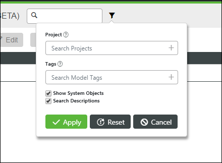
2. On the search toolbar, click the  icon, and then select the Show System Objects check box.

3. Click Apply.
Modifying Style Themes
You can use style themes to style a mashup in multiple ways. There are three levels of control that affect the display of entities to which themes can be applied:
• Global—Sets general settings for all items that support style themes in a mashup.
• Element—Sets specific style settings for elements within widgets.
• Settings on the Style Properties panel—Sets style properties for individual items in a mashup.
When applying style changes in your mashup, you should consider the hierarchy of styling. In general, use style themes to create consistent designs in your mashup. To customize specific items and override the style theme, use the Style Properties panel.
For more information about the Style Properties panel, see Using the Style Properties Panel.