Toolbar Widget (Themable)
Introduction
 |
The widget is available as a standard inclusion in the platform and as a web component that you can import from an SDK.
|
The Toolbar widget displays a responsive toolbar in your mashup. The widget combines common elements that you can configure to display frequently used functions in a compact form. You can use toolbars to create filters, trigger services, and modify the view when working with widgets that deal with data such as Grids, Lists, and Charts.
Watch the following video on how to configure the widget and bind actions to a Grid widget. To open the video in a new tab, click the title on the player.
The Toolbar widget consists of the following:
• Data Filter — It has either a simple filter box or a Chip Based Data Filter.
|
|
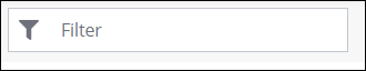
The simple filter is enabled by default when you drag the widget to your workspace.
|
|
Simple Filter
|
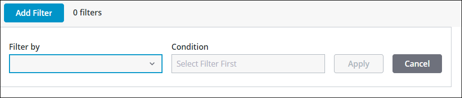
Chip Based Data Filter
|
 |
 |
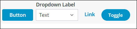
• Actions — It contains the user defined actions
Toolbar Actions
You can use the Toolbar widget to perform the following actions, on other widgets such as Grids, Lists, and Charts.
• Button
• Dropdown
• Link
• Toggle
The following image shows sample actions.
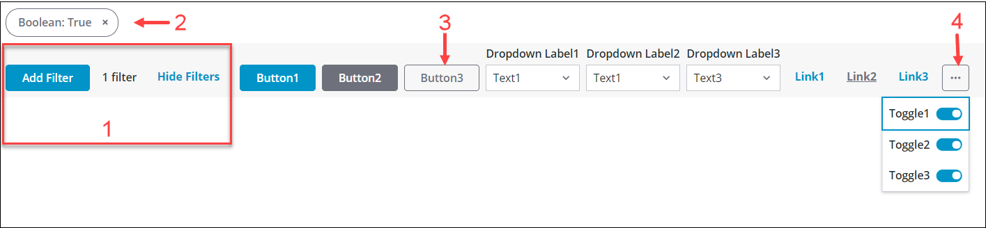
These actions combined with the filter work as an effective toolbar on your data in the mashup. The toolbar can contain many buttons, dropdowns, links, or toggle buttons as per your requirement. The toolbar is responsive enough to display the user defined actions in a dropdown list if there is an overflow in the space occupied by the actions. A overflow control icon appears that you can click to view the dropdown list of actions.
The following image shows an example of Toolbar widget with Chip Based Data Filter and actions.
1. Data filter — Chip Based Data Filter. You can set the filter using the FilterType property.
2. Chips — This region displays the filter chips that are set by the Chip Based Data Filter.
3. Actions — This region contains buttons, dropdown lists, links, and toggle buttons.
4. Overflow control icon
The data filter can be configured using the properties described in the Property Table below. For information on configuring the actions, see Defining Toolbar Actions Using an Infotable.
Data Format
• FilterData:
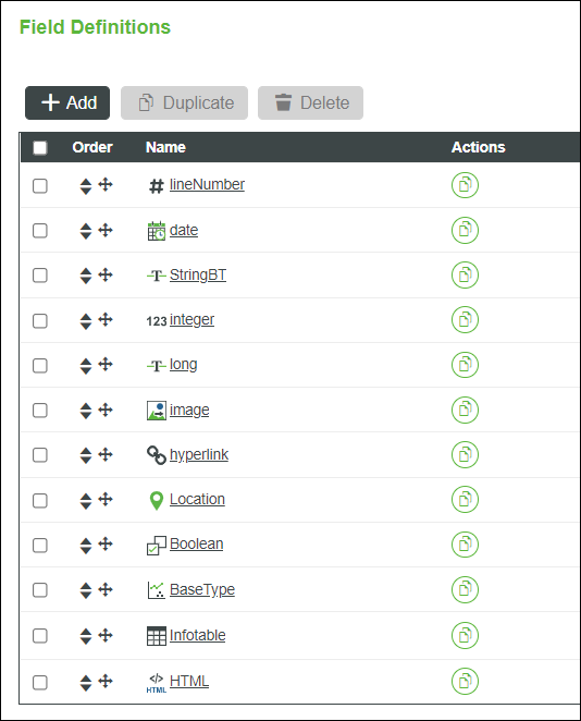
When you use a Chip Based Data Filter instead of a simple filter box in the toolbar, you must create a Data Shape with the Field Definitions that are used as filter categories for the data in your mashup. These field definitions need to be mapped and each field represents a category that appears in the filter drop-down.
The following image shows an example of field definitions in the data shape.
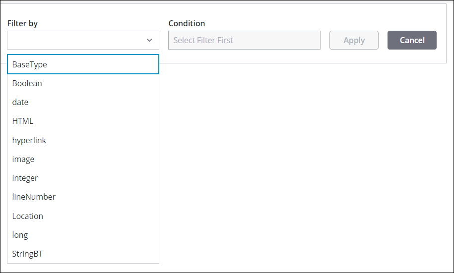
The following image shows an example filter category drop-down list in the widget based on the field definitions.
• ActionsData:
To create the actions in the toolbar, you must use the ToolbarAction data shape that is available as a system entity in the Platform. Use this pre-defined data shape when you create a service to format the infotable output, and bind the service in your mashup to create actions in the toolbar. For more information, see Defining Toolbar Actions Using an Infotable.
Binding a Data Source
• For Data Filter — To bind the Toolbar widget to a data filter source, perform the following steps:
a. On the Data panel, add a data service that returns an infotable with the correct data format for the data filter.
b. Bind the All Data property of the data service to the FilterData property of the widget.
c. Select the Toolbar widget, then on the Properties panel, use the properties to configure the data filter.
d. Click Save, then View Mashup.
• For Actions — To bind the Toolbar widget to actions data source, perform the following steps:
a. On the Data panel, add a data service that returns an infotable with the correct data format for the actions.
b. Bind the All Data property of the data service to the ActionsData property of the widget.
c. When you bind the data source, a set of new properties and events appear on the Properties panel for each action that you define in your service.
d. Select the Toolbar widget, then on the Properties panel, use the following properties to configure the actions on other widgets like grids, lists, and the charts in your mashup.
|
|
The property name appears based on your value for the actionId in your service.
|
|
Action
|
Property/Event Name
|
Description
|
Example
|
|---|---|---|---|
|
Button
|
<actionId>_Clicked
|
Triggers a bindable event when you click on the button.
|
Button1_Clicked
|
|
<actionId>_Disabled
|
Disables the button action on the toolbar.
|
Button1_Disabled
|
|
|
<actionId>_Visible
|
Controls the visibility of the action on the toolbar.
|
Button1_Visible
|
|
|
Dropdown
|
<actionId>_Disabled
|
Disables the dropdown action on the toolbar.
|
Dropdown1_Disabled
|
|
<actionId>_SelectedText
|
This bindable property enables you to set and retrieve the value of the selected text in the dropdown action.
|
Dropdown1_SelectedText
|
|
|
<actionId>_SelectedTextChanged
|
Triggers a bindable event when you change the selected text in the dropdown.
|
Dropdown1_SelectedTextChanged
|
|
|
<actionId>_Visible
|
Controls the visibility of the dropdown action on the toolbar.
|
Dropdown1_Visible
|
|
|
Link
|
<actionId>_Disabled
|
Disables the link action on the toolbar.
|
Link1_Disabled
|
|
<actionId>_Visible
|
Controls the visibility of the link action on the toolbar.
|
Link1_Visible
|
|
|
Toggle
|
<actionId>_Disabled
|
Disables the toggle action on the toolbar.
|
Toggle1_Disabled
|
|
<actionId>_State
|
This bindable property enables you to set and retrieve the state of the toggle button action.
|
Toggle1_State
|
|
|
<actionId>_StateChanged
|
Triggers a bindable event when you change the state of the toggle action.
|
Toggle1_StateChanged
|
|
|
<actionId>_Visible
|
Controls the visibility of the toggle button action on the toolbar.
|
Toggle1_Visible
|
f. Click Save, then View Mashup.
Property Table
The properties of the Toolbar widget are listed below.
|
Property Name
|
Description
|
Base Type
|
Default Value
|
Bindable? (Y/N)
|
Localizable? (Y/N)
|
||
|---|---|---|---|---|---|---|---|
|
ActionsData
|
The infotable data source that is formatted using the ToolbarActionData Shape to display and configure the toolbar action items.
|
INFOTABLE
|
n/a
|
Y
|
N
|
||
|
CategoryLabel
|
The text that is displayed above the drop-down list for the filter categories.
|
STRING
|
Filter by
|
N
|
Y
|
||
|
ConditionLabel
|
The text that is displayed above the filter conditions drop-down list.
|
STRING
|
Condition
|
N
|
Y
|
||
|
CustomClass
|
The user defined CSS class to apply to the top div of the widget.
Multiple classes can be entered, separated by space.
|
STRING
|
n/a
|
Y
|
N
|
||
|
Disabled
|
Disables the widget in the mashup.
The widget is displayed in the mashup but you cannot click or select it.
|
BOOLEAN
|
False
|
Y
|
N
|
||
|
FilterChipPosition
|
Sets the position of the chip container for the data filter. You can display the chips at the top or at the bottom of the widget.
|
STRING
|
Bottom
|
N
|
N
|
||
|
FilterData
|
The infotable source that contains data for the items to display in the dropdown of the chip filter.
|
INFOTABLE
|
n/a
|
Y
|
N
|
||
|
FilterDateOrder
|
Sets the order of the day, month, and the year for dates that are displayed in the chip filter.
The options are Auto, Day-Month-Year, Month-Day-Year, and Year-Month-Day.
|
STRING
|
Auto
|
N
|
N
|
||
|
FilterDisclosureType
|
Sets the type of element used to show and hide the filter chips as Show Link or Button.
|
STRING
|
Show Link
|
N
|
N
|
||
|
FilterFormatToken
|
Formats the chip filter dates using the “DD-MM-YY” pattern. The format is case sensitive and overrides the FilterDateOrder property.
This syntax follows the ISO format.
|
STRING
|
n/a
|
N
|
Y
|
||
|
FilterType
|
Sets the filter type.
You can display a simple filter box or use the chip based data filter widget. Select None to hide the filter.
|
STRING
|
Filter Box
|
N
|
N
|
||
|
HideFilterSeparator
|
Hides the vertical line used to separate the data filter on the toolbar.
|
BOOLEAN
|
False
|
N
|
N
|
||
|
LatitudeLabel
|
The text that is displayed above the input box for latitude when you filter by location using the chip filter.
|
STRING
|
Latitude
|
N
|
Y
|
||
|
LongitudeLabel
|
The text that is displayed above the input box for longitude when you filter by location using the chip filter.
|
STRING
|
Longitude
|
N
|
Y
|
||
|
Query
|
The JSON query used to retrieve the filtered data set.
|
QUERY
|
n/a
|
Y
|
N
|
||
|
QueryChanged
|
Triggers an event when the filter widget query is changed.
|
n/a
|
n/a
|
Y
|
N
|
||
|
RangeEndValueLabel
|
The text that is displayed above the second input box when you filter a range of values using the chip filter.
|
STRING
|
Value 2
|
N
|
Y
|
||
|
RangeStartValueLabel
|
The text that is displayed above the first input box when you filter a range of values using the chip filter.
|
STRING
|
Value 1
|
N
|
Y
|
||
|
ResetToDefaultValue
|
Resets the inputs for this widget to their default values.
|
n/a
|
n/a
|
Y
|
N
|
||
|
ShowCategoryListFilter
|
Adds a filter box to the drop-down list for the filter categories.
|
BOOLEAN
|
False
|
Y
|
N
|
||
|
ShowHideFilters
|
Hides the disclosure controls and expands the chip container for the data filter widget.
|
BOOLEAN
|
True
|
N
|
N
|
||
|
SortFilter
|
Sorts the list of options for the data filter categories in alphabetical order.
|
BOOLEAN
|
True
|
N
|
N
|
||
|
SimpleFilterChanged
|
Triggers an event when the string in the filter box is modified.
|
n/a
|
n/a
|
Y
|
N
|
||
|
SimpleFilterHintText
|
Sets the hint text for the filter box.
|
STRING
|
Filter
|
N
|
Y
|
||
|
SimpleFilterLabel
|
Sets the label of the filter box.
|
STRING
|
n/a
|
Y
|
Y
|
||
|
SimpleFilterPosition
|
Sets the position of the filter box on the toolbar. You can place the box in the Left, Right, or Center regions.
When you set the position at Center, a SimpleFilterAlignment property appears in the list.
|
STRING
|
Left
|
N
|
N
|
||
|
SimpleFilterAlignment
|
Sets the alignment of the filter box when it is placed at the center region on the toolbar. You can align the box to the Left, Right, or the Center.
|
STRING
|
Left
|
Y
|
N
|
||
|
SimpleFilterString
|
Allows you to set or retrieve the string within the simple filter box.
|
STRING
|
n/a
|
Y
|
N
|
||
|
SimpleFilterWidth
|
Sets the width of the filter box.
|
NUMBER
|
273
|
Y
|
N
|
||
|
TabSequence
|
Sets the sequence number of the widget when you press the TAB key.
|
NUMBER
|
0
|
N
|
N
|
||
|
UnitsLabel
|
The text that is displayed above the drop-down list to set the units when filtering by location or date using the chip filter.
|
STRING
|
Units
|
N
|
Y
|
||
|
ValueLabel
|
The text that is displayed above the input box which contains the value for the condition in the chip filter.
|
STRING
|
Value
|
N
|
Y
|