Progress Tracker (Themable)
The Progress Tracker widget enables you split complex layouts into multiple views. You can use the widget to simplify a complex process by splitting the workflow into linear steps. Each step in the progress tracker can display a contained mashup that shows separate widgets. You can use the Contained Mashup widget to display a specific mashup for the current step number. The current step is highlighted and users can navigate between steps, which makes it easier to understand the progression of a form or a process.
Data Format
You must create an infotable with field definitions that represent the data structure for the steps. The infotable must include a field definition for the step number, label, and associated mashup. The following table lists the data format for the infotable:
|
Step Number
|
Step Label
|
Step Mashup Name
|
Step Interactive
|
Step State
|
|
|---|---|---|---|---|---|
|
Field Definition
|
StepNumber: {name: 'StepNumber', baseType: 'NUMBER'}
|
StepLabel: {name: 'StepLabel', baseType: 'STRING'}
|
StepMashupName: {name: 'StepMashupName', baseType: MASHUPNAME'}
|
StepInteracive: {name: 'StepInteracive', baseType: 'BOOLEAN'}
|
StepState: {name: 'StepState', baseType: 'STRING'}
|
|
Use
|
Defines the step number.
|
Defines the step label.
|
Defines the mashup name that is associated with the step.
|
Defines the interaction state for the step.
|
Defines the state of the step. Options: Complete, Inactive, Current, Error
|
|
Base Type
|
NUMBER
|
STRING
|
NUMBER
|
BOOLEAN
|
STRING
|
|
Row Example
|
StepNumber: 1
|
StepLabel: 'Step 1'
|
StepMashupName: 'Mashup1'
|
StepInteractive: true
|
StepLabel: 'current'
|
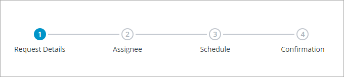
The following image shows an example of returned data from an infotable with four field definitions for the y-axis:
Adding a Progress Tracker Widget to a Mashup
1. Add the Progress Tracker to an empty container in the layout.
2. Add the Contained Mashup to a second container.
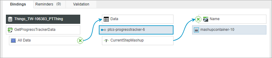
3. On the Data panel, bind the All Data property of the returned infotable to the Data property of the widget.
4. On the Properties panel, configure the following properties:
◦ StepNumberField—Select the infotable column for the step number.
◦ StepLabelField—Select the infotable column for the step label.
◦ StepMashupNameField—Select the infotable column for the mashup name. Make sure that the mashup names exist.
◦ StepInteractiveField—Select the infotable column used to specify wether a step is interactive.
◦ StepStateField—Select the infotable column used to specify the current step.
5. Optionally, set the IsInteractive widget property to True to allow users to navigate between steps by clicking on a step label.
6. Bind the CurrentStepMashup widget property to the Name property of the Contained Mashup widget.
7. Click, Save, then View Mashup.
At runtime, the mashup that is associated with the current step is displayed.
Enabling Interactive Steps
By default, support for user interaction with steps is disabled at runtime. To add support for navigating between steps, you must use events from widgets or services in the mashup. For example, you can add Buttons that allow users to move to the next or previous step.
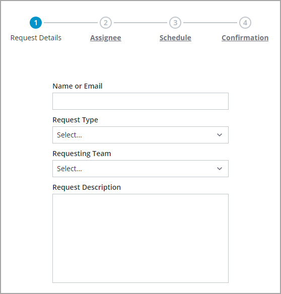
You can enable the IsInteractive property to enable users to navigate between steps at runtime by clicking on a step label. This allows also users to navigate between steps in random order. The following image shows an interactive progress tracker.
Widget Properties
|
Property Name
|
Description
|
Base Type
|
Default Value
|
Binding
|
Localization
|
|---|---|---|---|---|---|
|
CurrentStepMashup
|
Retrieves the mashup name for the current step.
|
STRING
|
N/A
|
Y
|
N
|
|
CurrentStepNumber
|
Sets or retrieves the current step number at run time.
|
NUMBER
|
N/A
|
Y
|
N
|
|
Data
|
The infortable data source used to define steps to display on the widget.
|
INFOTABLE
|
Y
|
N
|
|
|
ErrorStateIcon
|
Specifies the icon to display when the progress tracker data cannot be loaded.
|
MEDIALINK
|
error
|
Y
|
N
|
|
ErrorStateText
|
Specifies the text to display when the progress tracker data cannot be loaded.
|
STRING
|
[[ProgressTracker.unableToLoadData]]
|
Y
|
Y
|
|
IsInteractive
|
Specifies whether steps can be interactive.
|
BOOLEAN
|
False
|
Y
|
N
|
|
MinStepSpacing
|
Sets the minimum length of the horizontal line separating steps on the progress tracker.
|
NUMBER
|
90
|
N
|
N
|
|
NoBindingIcon
|
Specifies the icon to display when the progress tracker is not bound to a data source.
|
MEDIALINK
|
bind
|
N
|
N
|
|
NoBindingText
|
Specifies the text to display when the progress tracker is not bound to a data source.
|
STRING
|
[[ProgressTracker.noDataToDisplay]]
|
N
|
Y
|
|
NoDataIcon
|
Specifies the icon to display when the progress tracker data does not contain any steps.
|
MEDIALINK
|
not visible
|
Y
|
N
|
|
NoDataText
|
Specifies the text to display when the progress tracker data does not contain any steps.
|
STRING
|
[[ProgressTracker.noStepData]]
|
Y
|
Y
|
|
SelectedData
|
An infotable that represents the data of the selected step.
|
INFOTABLE
|
Y
|
N
|
|
|
StepClicked
|
A bindable event that triggers when a step is clicked.
|
Event
|
Y
|
N
|
|
|
StepInteractiveField
|
Specifies the infotable field that defines whether a step is interactive.
|
Infotable Field
|
N
|
N
|
|
|
StepLabelField
|
Specifies the infotable field that contains the step labels.
|
Infotable Field
|
N
|
N
|
|
|
StepMashupNameField
|
Specifies the infotable field that defines the mashup to display for each step.
|
Infotable Field
|
N
|
N
|
|
|
StepNumberField
|
Specifies the infotable field that contains the step numbers.
|
Infotable Field
|
N
|
N
|
|
|
StepSize
|
Sets the size of the step icons. Options: Small, Medium, Large
|
STRING
|
Medium
|
Y
|
N
|
|
StepStateField
|
Specifies the infotable field that defines the step state.
|
Infotable Field
|
N
|
N
|
|
|
TabSequence
|
Sets the sequence in which a widget is highlighted when the user presses Tab key.
|
NUMBER
|
0
|
N
|
N
|
|
Height
|
Sets the widget height when it is added to a container with fixed sizing.
|
NUMBER
|
90
|
N
|
N
|
|
Width
|
Sets the widget width when it is added to a container with fixed sizing.
|
NUMBER
|
600
|
N
|
N
|