Button Widget (Themable)
Watch the following video on how to add the widget to a mashup and bind it to a data service. To open the video in a new tab, click the title on the player.
The Button widget enables you to add a button in a mashup and raise an event when it is clicked.
 |
The Button widget is available as a standard widget in the platform and as a web component that can be imported from an SDK.
|
Button Variants
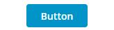
• Primary—Primary actions that users can perform in a mashup, such as Delete button. Typically, a mashup or a dialog should contain a single primary action that users can perform, such as an Apply button in a confirmation dialog.
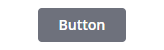
• Secondary—Secondary actions that users can perform on a mashup in addition to the primary action, such as a Cancel button in a confirmation dialog.
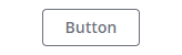
• Tertiary—Use for independent actions that are not required in a workflow.
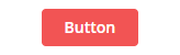
• Danger—Use for critical actions that can affect stored data or cause irreversible changes. Avoid adding more than one danger button to a mashup.
• Transparent— Use for actions that are not relevant for all users and are not in the main focus area of the mashup. Transparent buttons are similar in appearance to links.
You can customize the default style for these button types on the Styles tab of the mashup style themes.
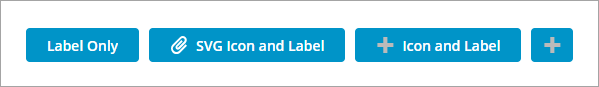
Configuring the Button Content
You can display labels and multiple types of icons within the widget.
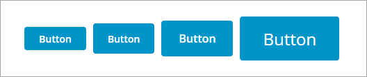
Configuring the Button Size
You can configure sizing for buttons in one of the following ways:
• As a responsive widget that adjusts based on its content.
Select one of the predefined sizes using the widget ButtonSize property. Options: Standard, Medium, Large, and X-Large. Changing the button size affects the label font size and the padding around the button label and icon. When designing mashups for touchscreen devices, we recommend using a Medium button size or larger.
• As a responsive widget that fills its container.
Add a button to a Flexbox container with responsive positioning in a layout, then set the widget ButtonSize property to Fill. The button fills the available space when it is the only widget in the container. You can use this option when designing mashups for touch-screen devices. To configure the button size when it is set to fill, use the layout options that are available for its parent container on the Layout panel. For example, you can set the padding or margin values for the button container to add spacing between the buttons.
The following example shows a standard button on the left expanding to fill its container at design time when changing the ButtonSize property to Fill.
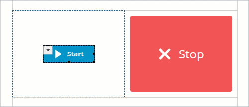
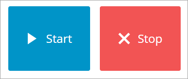
The layout has two containers with responsive positioning and a 10 pixel padding value is set for both containers to add spacing between the buttons. At run time, the button widgets adjust their size based on the available space for the container.
|
|
When you select X-Large or Fill, the default icon size increases from 18 by 18 pixels to 24 by 24 pixels.
|
• As a fixed size widget.
Use the widget properties and style properties to set the button to a fixed size. By default, the button size adjusts to fit its content. When fixed sizing is applied, the button content is truncated when its content exceeds the available space.
The properties of the Button widget are listed below:
|
Property Name
|
Description
|
Base Type
|
Default Value
|
Bindable? (Y/N)
|
Localizable? (Y/N)
|
||
|---|---|---|---|---|---|---|---|
|
Icon
|
Enables you to set an icon image in the button widget.
|
n/a
|
n/a
|
N
|
N
|
||
|
IconPosition
|
Sets the icon position relative to the label. Options: Left, Right, Top, Bottom
|
STRING
|
Left
|
N
|
N
|
||
|
Label
|
The text that is displayed in the label of button widget
|
STRING
|
Button
|
Y
|
Y
|
||
|
Disabled
|
Use this property to disable the widget in the mashup. The widget is displayed in the mashup but you cannot click it.
|
BOOLEAN
|
False
|
Y
|
N
|
||
|
CustomClass
|
Enables you to define the CSS to the top div of the widget. Multiple classes can be entered, separated by space.
|
STRING
|
n/a
|
Y
|
N
|
||
|
ContextID
|
Enables you to set an ID for the widget.
|
STRING
|
n/a
|
Y
|
N
|
||
|
LabelAlignment
|
Enables you to align the label in the widget to the left, right or center.
|
STRING
|
Center
|
N
|
N
|
||
|
MaxWidth
|
Enables you to set a maximum width for the button widget.
The button label is truncated if it is longer than the maximum width.
|
NUMBER
|
n/a
|
N
|
N
|
||
|
MaxHeight
|
Sets the maximum height for the button when the MultiLine property is set to True.
|
NUMBER
|
n/a
|
Y
|
N
|
||
|
MultiLine
|
Sets the label text to continue onto another line.
|
BOOLEAN
|
False
|
N
|
N
|
||
|
SVGIcon
|
Enables you to select an SVG icon to display within the Button widget. To display a media entity, use the standard Icon property.
|
MEDIA ENTITY
|
n/a
|
N
|
N
|
||
|
Size
|
Sets the size of the button widget. Options: Standard, Medium, Large, X-Large, and Fill. When this property is set to Fill, the button size grows or shrinks to fit within its container in the layout.
|
STRING
|
Standard
|
N
|
N
|
||
|
ButtonType
|
Enables you to set a button type.
The button types are Primary, Secondary, Tertiary, Danger and Transparent. Each button type has different styling.
|
STRING
|
Primary
|
Y
|
N
|
||
|
TabSequence
|
The sequence in which widgets are highlighted when a user presses TAB.
|
NUMBER
|
n/a
|
N
|
N
|
||
|
Clicked
|
Triggers an event when the button widget is clicked.
|
n/a
|
n/a
|
Y
|
N
|
||
|
TriggerClick
|
A bindable service that triggers the button click.
|
n/a
|
n/a
|
Y
|
N
|
||
|
Width
|
The width of the widget. The width is set to the width of the label by default. Enter a value in the property panel or resize the widget in the canvas to set a fixed width.
|
NUMBER
|
n/a
|
N
|
N
|
||
|
Height
|
The height of the widget. The height is set to the maximum width of the label by default. Enter a value in the property panel or resize the widget in the canvas to set a fixed height.
|
NUMBER
|
n/a
|
N
|
N
|
||
|
TooltipField
|
Sets a tooltip text that is displayed when you hover over the widget.
|
STRING
|
n/a
|
Y
|
Y
|
||
|
TooltipIcon
|
Sets an icon image for the tooltip of the widget.
You can add an image or specify an image URL path.
|
MEDIA ENTITY
|
n/a
|
N
|
N
|