Web コンポーネントウィジェットへのカスタム CSS スタイルの適用
コンポーネントウィジェットのスタイルを設定するには、カスタムスタイルテーマを作成するか、Mashup Builder の「スタイルプロパティ」パネルにあるスタイルプロパティを使用することをお勧めします。Web コンポーネントウィジェットにカスタム CSS スタイルを適用することはお勧めしません。詳細については、スタイルテーマおよびスタイルプロパティパネルの使用を参照してください。
Web コンポーネントウィジェットに CSS を適用する場合、次のガイドラインを考慮する必要があります。
• ThingWorx の将来のバージョンで Web コンポーネントの DOM 構造が変更された場合、カスタム CSS が機能しなくなることがあります。アップグレード後に、カスタム CSS 規則を手動で確認および更新する必要があります。
• レガシーウィジェットとは異なり、Web コンポーネントの機能、動作、スタイルは、メイン DOM に付属する非表示ツリー内にカプセル化されています。この非表示ツリーにはシャドウ DOM という名前が付いています。サブコンポーネントが含まれている複雑なウィジェットをスタイル設定する場合、プレーン CSS は機能しないことがあります。シャドウ DOM の概念については、「シャドウ DOM の使用 - ウェブコンポーネント | MDN (mozilla.org)」のアーティクルを参照してください。
• カスタム CSS を適用するには、サブコンポーネント、パーツ名、使用可能な状態、スタイルプロパティなど、Web コンポーネントの構造に精通している必要があります。Web コンポーネントとそのスタイルプロパティ、バリエーション、状態の詳細については、ThingWorx Web Component SDK のドキュメンテーションを参照してください。
• part 属性を使用して公開されているサブコンポーネントの各パーツのスタイルを設定するには、CSS ::part() 擬似セレクタを使用します。
• シャドウ DOM 内のスタイル設定エレメントをサポートするため、複雑な Web コンポーネントのほとんどがコンポーネントへの外部スタイルモジュールの追加をサポートしています。これらのスタイルモジュールは、CSS セレクタを使用して、コンポーネントのサブパーツとそれらの状態をターゲットにできます。
• CSS 機能はすべてのブラウザで一貫してサポートされているわけではないので、異なるブラウザを使用しているユーザーにはスタイルが異なって表示される場合があります。プレーンパーツ CSS 構文またはシャドウパーツ CSS 構文が Web コンポーネントに正しく適用されていない場合、ptcs-style-unit を追加できます。
• 外部ドメインからのカスタム CSS スタイルシートのロードはサポートされていません。一部のブラウザには、複数の異なるサーバーからのカスタム CSS ファイルのインポートをブロックするセキュリティ対策が実装されています。
• 単一のウィジェットまたはマッシュアップをカスタム CSS でターゲットにするには、ウィジェットまたはマッシュアップの CustomClass プロパティを使用して一意のクラスを適用します。
プレーン CSS の使用
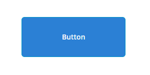
プレーン CSS を使用して、シャドウ DOM ツリーが付属しているエレメントのスタイルを設定できます。次の例では、プレーン CSS を使用して ptcs-button を大きいボタンとしてスタイル設定しています。
ptcs-button
{
  color: #FAFAFA;
  background-color: #2B80D5;
  padding: 0px 60px;
  font-size: 24px;
  font-weight: bold;
  height: 80px;
  border-radius: 6px;
}
プレビュー
プレーン CSS は、メイン Web コンポーネントのスタイル設定または継承可能プロパティの指定にのみ使用できます。複数のサブコンポーネントが含まれているコンポーネントをスタイル設定する場合、この方法は機能しません。以降の各セクションでは、ptcs-style-unit を使用してシャドウ DOM の内のサブコンポーネントのスタイルを設定する方法について説明します。
ptcs-style-unit エレメントの追加
プレーンパーツ CSS またはシャドウパーツ CSS が機能しない場合、標準 @supports CSS 規則を使用して Web コンポーネント内に ptcs-style-unit エレメントを追加できます。このエレメントにより、シャドウ DOM ツリー内のサブコンポーネントに CSS を適用できるようになります。part 属性を使用して、シャドウ DOM 階層内のスタイル設定するエレメントを指定します。たとえば、以下のようになります。
@supports (ptcs-style-unit: "PTCS-DATEPICKER") {
  [part=date-field] {
    background-color: red;
  }
}
バリエーションセレクタや状態セレクタを追加することもできます。以降の各セクションでは、ptcs-style-unit を使用して Mashup Builder の各種ウィジェットにカスタム CSS を適用する例を示します。
 |
次のスタイルの一部はスタイルプロパティを使用して設定できます。可能な場合は CSS の代わりにスタイルプロパティを使用することをお勧めします。
|
ptcs-style-unit および使用可能なセレクタの詳細については、ptcs-style-unit - ThingWorx Web Component SDK を参照してください。
例: ボタンウィジェットのスタイル設定
|
CSS
|
説明
|
プレビュー
|
||
|---|---|---|---|---|
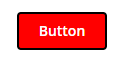
@supports (ptcs-style-unit: "PTCS-BUTTON.primary") {
|
ボタンの背景色を赤色に設定し、青色の境界を適用します。
|
 |
||
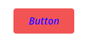
@supports (ptcs-style-unit: "PTCS-BUTTON.danger") {
|
ボタンの危険バリエーションのラベル色を青色に設定し、フォントスタイルを斜体に設定します。
|
 |
||
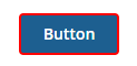
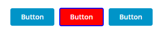
@supports (ptcs-style-unit: "PTCS-BUTTON.primary") {
|
マウスポインタを合わせた状態になるとボタンの周囲に赤色の境界が表示されます。
|
 |
||
@supports (ptcs-style-unit: "PTCS-BUTTON.primary") {
|
CustomClass の値が custom-button であるボタンの背景色を赤色に設定し、青色の境界を適用します。この例では、中央のボタンにのみカスタム CSS クラスが設定されています。
|
 |
例: テキストフィールドのスタイル設定
|
CSS
|
説明
|
プレビュー
|
|---|---|---|
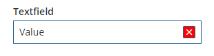
@supports (ptcs-style-unit: "PTCS-TEXTFIELD") {
|
クリアボタンの色を赤色に設定します。
|
 |
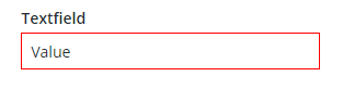
@supports (ptcs-style-unit: "PTCS-TEXTFIELD") {
|
テキストボックスの境界の色を赤色に設定します。
|
 |
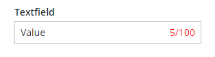
@supports (ptcs-style-unit: "PTCS-TEXTFIELD") {
|
文字カウンタの色を赤色に設定します。
|
 |
例: ドロップダウンウィジェットのスタイル設定
|
CSS
|
説明
|
プレビュー
|
|---|---|---|
@supports (ptcs-style-unit: "PTCS-DROPDOWN") {
|
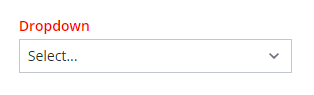 |
|
@supports (ptcs-style-unit: "PTCS-DROPDOWN") {
|
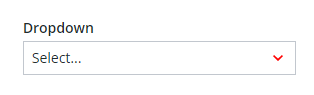 |
|
@supports (ptcs-style-unit: "PTCS-DROPDOWN") {
|
選択したアイテムの値の色を赤色に設定します。
|
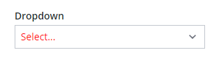 |
@supports (ptcs-style-unit: "PTCS-DROPDOWN") {
|
ドロップダウンの背景色を赤色に設定し、境界を青色に設定します。
|
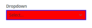 |
例: 棒グラフのスタイル設定
|
CSS
|
説明
|
プレビュー
|
|---|---|---|
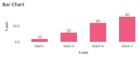
@supports (ptcs-style-unit: "PTCS-CHART-AXIS") {
|
チャートの軸の色を赤色に設定します。
|
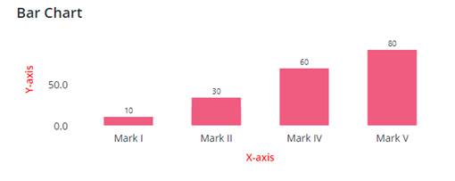 |
@supports (ptcs-style-unit: "PTCS-CHART-CORE-BAR") {
|
棒の右上隅と左上隅にラウンドを適用します。
|
 |
@supports (ptcs-style-unit: "PTCS-CHART-CORE-BAR") {
|
棒のデータラベルの色とフォントスタイルを設定します。
|
 |