Video Player Widget (Themable)
The Video Player Widget (Themable) enables you to embed and play videos in your mashups. The video player supports multiple options, including autoplay, adding thumbnail images, controlling the appearance of the controls, and more. It is a responsive widget that supports theming for a consistent user experience.
 |
The Video Player is available as a widget and as web component that you can customize and import from the ThingWorx Web Component SDK.
|
Anatomy
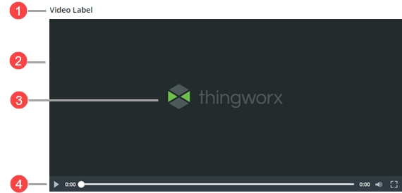
1. Video player label
2. Video area
3. Preview thumbnail
4. Player controls
Keyboard Shortcuts
The following table lists keyboard shortcuts that you can use to interact with this widget, grouped by component.
|
Component
|
Button/Control
|
Keys
|
Description
|
|---|---|---|---|
|
Navigation
|
Controls navigation between the different components on the widget.
|
TAB and SHIFT+TAB
|
Move forward or backward between subcomponents in the player.
|
|
Player
|
Play/Stop Control
|
SPACE or ENTER
|
Play or stop the video
|
|
Timeline bar
|
UP or RIGHT ARROW
|
Fast forward by 10 seconds
|
|
|
DOWN or LEFT ARROW
|
Rewind by 10 seconds
|
||
|
PAGE UP
|
Fast forward by 1 minute
|
||
|
PAGE DOWN
|
Rewind by 1 minute
|
||
|
HOME
|
Go to the start of the video
|
||
|
END
|
Go to the end of the video
|
||
|
Audio
|
Mute Button
|
SPACE or ENTER
|
Mute or unmute the video
|
|
Volume Slider
|
UP or RIGHT ARROW
|
Increase the volume by 5%
|
|
|
DOWN or LEFT ARROW
|
Decrease the volume by 5%
|
||
|
HOME
|
Set the volume to 0%
|
||
|
END
|
Set volume to 100%
|
||
|
Download
|
Download Button
|
SPACE or ENTER
|
Download the video file
|
|
Fullscreen
|
Fullscreen Button
|
SPACE or ENTER
|
Enter fullscreen
|
|
ESCAPE
|
Exit fullscreen and return to windowed mode
|
Configuring the Layout of the Player Controls
Use the OverlayControls property to configure the position of the video player controls. When this property is set to true, the controls appear over the video content. When set to false, the controls appear below the video. Overlaying the controls reduces the amount of vertical space that the widget uses.
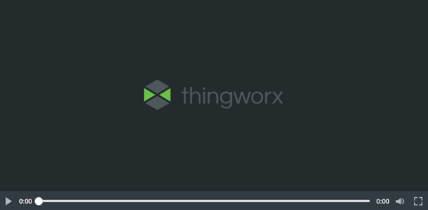
Adding a Thumbnail
Use the Thumbnail property to display a preview image before the video starts. The image appears in place of the video until the user selects the play button. This feature is useful for providing context, branding, or a preview of the content. When playback begins, the thumbnail is replaced by the video.
Configuring Playback Settings
You can enable the AutoPlay property to start video playback automatically when the mashup loads. When AutoPlay is enabled, the video is muted by default. To enable audio, users must manually unmute the video after it starts playing. To configure the audio, you can enable or disable the widget Mute property or create bindings to control the audio dynamically.
Add a Download Button
Use the EnableDownload property to display a download button in the player. When enabled, this button lets users download the video based on the URL. Use this feature to support offline viewing or to share video content.
|
|
A message is displayed when the download is blocked because of a security setting, such CSP rules.
|
Configuring CSP Rules
To ensure the Video Player Widget works correctly when Content Security Policy (CSP) rules are enabled in your ThingWorx environment, you must updated the media-src directive to include the external domains that you are loading the video from. For example:
media-src 'self' https://cdn.com https://video-location.com;
For more information on configuring CSP rules, see Content Security Policies.
Widget Properties
The following table lists the widget properties:
|
Property Name
|
Description
|
Base Type
|
Default Value
|
Bindable? (Y/N)
|
Localizable? (Y/N)
|
|---|---|---|---|---|---|
|
Label
|
Specifies the text for the widget label.
|
STRING
|
Y
|
Y
|
|
|
LabelAlignment
|
Aligns the label text to the left, right, or the center of the widget.
|
STRING
|
left
|
N
|
N
|
|
VideoURL
|
Specifies the URL of the video to be played.
|
NUMBER
|
None
|
Y
|
N
|
|
EnableDownload
|
Adds a download button to the player controls that enables users to download the video.
|
BOOLEAN
|
False
|
Y
|
N
|
|
Thumbnail
|
Specifies the thumbnail image for the video.
|
NUMBER
|
None
|
Y
|
N
|
|
AutoPlay
|
Specifies whether videos play automatically when the widget loads. When AutoPlay is enabled, the video plays muted.
|
BOOLEAN
|
False
|
N
|
N
|
|
Mute
|
Mutes the video.
|
BOOLEAN
|
False
|
Y
|
N
|
|
OverlayControls
|
Overlays the player controls on the video, reducing the space the player takes in the layout. The controls are only displayed when hovering over the video. When disabled, the player controls are visible at all times.
|
BOOLEAN
|
False
|
Y
|
N
|
|
Width
|
Specifies the width of the video player.
|
NUMBER
|
480
|
Y
|
N
|
|
Height
|
Specifies the height of the video player.
|
NUMBER
|
314
|
Y
|
N
|
|
CustomClass
|
User defined CSS class to apply to the top div of the widget. Multiple classes can be entered, separated by space.
|
NUMBER
|
None
|
Y
|
N
|
|
TabSequence
|
Specifies the tab order of the widget.
|
NUMBER
|
0
|
N
|
N
|
Validation Properties
The following table lists the widget validation properties:
|
Property Name
|
Description
|
Base Type
|
Default Value
|
Bindable? (Y/N)
|
Localizable? (Y/N)
|
|---|---|---|---|---|---|
|
PlaybackErrorMessage
|
The message to display when the video file is blocked because of CSP rules.
|
STRING
|
Token: [[Widgets.VideoPlayer.Validation.PlaybackErrorMessage]]
Value: Playback error
|
Y
|
Y
|
|
PlaybackErrorMessageDetails
|
The details to display under the message when the video file is blocked because of CSP rules.
|
STRING
|
[[Widgets.VideoPlayer.Validation.PlaybackErrorMessageDetails]]
Make sure the video format is supported and your network connection is working, then try again.
|
Y
|
Y
|
|
NetworkErrorMessage
|
The message to display when the video does not load because of a network error.
|
STRING
|
[[Widgets.VideoPlayer.Validation.NetworkErrorMessage]]
Network issue
|
Y
|
Y
|
|
NetworkErrorMessageDetails
|
The details to display under the message when the video does not load because of a network error.
|
STRING
|
[[Widgets.VideoPlayer.Validation.NetworkErrorMessageDetails]]
Check your network connection and try again.
|
Y
|
Y
|
|
DownloadBlockedMessage
|
The message to display when video cannot be downloaded because of an access permission issue.
|
STRING
|
[[Widgets.VideoPlayer.Validation.DownloadBlockedMessage]]
Download blocked
|
Y
|
Y
|
|
DownloadBlockedMessageDetails
|
The details to display under the message when video cannot be downloaded because of an access permission issue.
|
STRING
|
[[Widgets.VideoPlayer.Validation.DownloadBlockedMessageDetails]]
Download is blocked by the platform. Make sure the platform CSP rules are configured correctly and try again.
|
Y
|
Y
|
|
PlaybackBlockedMessage
|
The message to display when the video file is blocked because of CSP rules.
|
STRING
|
[[Widgets.VideoPlayer.Validation.PlaybackBlockedMessage]]
This content is blocked
|
Y
|
Y
|
|
PlaybackBlockedMessageDetails
|
The details to display under the message when the video file is blocked because of CSP rules.
|
STRING
|
[[Widgets.VideoPlayer.Validation.PlaybackBlockedMessageDetails]]
Contact the site owner to fix this issue.
|
Y
|
Y
|
|
ValidationFailureIcon
|
Specifies the icon to display when validation fails.
|
STRING
|
cds:icon_error
|
N
|
N
|