Text Field Widget (Themable)
The Text Field widget is an input element that's commonly used within forms. You can use a Text Field to enable users to type text in a mashup. You can set or retrieve the text within the field using the Text property. Unlike the Text Area widget, the Text Field is limited to a single line. In addition to the common widget properties, you can configure the widget using properties in the following ways:
• Configure the maximum number of characters and add a counter.
• Use the text as an input for data services, functions, and other widgets.
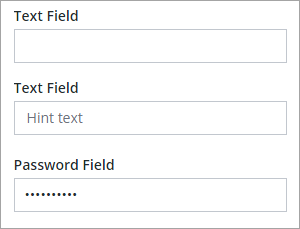
• Show hint text when a value isn't set.
• Add a clear text button.
• Enable read-only mode.
• Hide the input for sensitive information such as passwords.
• Define a mask pattern to make sure that the input is a specific format.
 |
The Text Field widget is available as a standard widget in the platform and as a web part that can be imported from the Web Part SDK.
|
You can use the following widget events to execute data services or functions when the widget is value is updated at run time:
• EnterKeyPressed—Triggers when the ENTER key is pressed.
• FocusLost—Triggers when an area outside the widget is clicked or the TAB key is pressed.
Working with Events
The Text Field widget triggers two bindable events:
• Changed—Triggers when a character is added or removed.
• EnterKeyPressed—Triggers when a user presses the Enter key.
You can use the widget events to trigger functions, data services, or services within widgets. For example, you can bind the events to a Validator function to validate the input as it is typed or when the Enter key is pressed.
Enabling Read Only Mode
You can enable the ReadOnly property to prevent changes to the text at run time. For example, you can use this property to prevent changes until a toggle button is enabled or a check-box is selected in the mashup. When read-only is enabled, you can select and copy text, but you can't edit, cut, or delete the current value. To change the text value of a read-only Text Field, enter a value for the Text property at design time. You can also bind a data source to the property to change the text value at run time.
Setting a Limit on the Number of Characters
You can limit the input from the text field to a specific number of characters in one of the following ways:
• Set the MaxNumberOfCharacters property to any numeric value. By default, the text field supports up to 100 characters.
• Define a mask pattern using the Mask property. The number of special characters within the pattern is used to set the character limit.
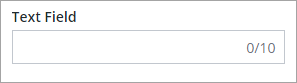
Adding a Counter to the Text Field
To add a counter that shows the number of characters in the text field, set the Counter property to True. The MaxNumberOfCharacters property is used to set the character limit, including whitespace. The following image shows the Text Field widget with a visible counter and a maximum character count of 10:
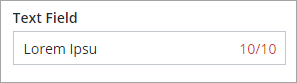
When the character limit is reached, the counter color changes:
Adding a Clear Text Button
You can enable the ShowClearText property to add a text button to the input box of the widget. The button appears automatically to the right side of the widget when the input field has a value. This enables users to quickly remove any existing text within the widget.
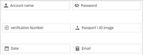
Adding an Icon
You can use the Icon property to display an icon within the text field. The Icon appears automatically to the left side of the widget. You can select an icon from the provided SVG icons that are available in the platform. For more information about these icons, see Using SVG Icons.
Configuring the Text Field Input Pattern
You can use the Mask property to specify an input pattern for numeric, alphabetical, and alphanumeric characters. When you define a pattern, placeholder guides are added to the input box. The guides are lines that are used to indicate the text pattern that a user can type into the text field. In addition to the required pattern, the property sets the number of characters within the text field. You can create patterns using the following special characters:
• a—Alphabetical
• 9—Numeric
• *—Alphanumeric
To create a pattern, combine the special characters into a string that represents the required input. For example, the following patterns represent different types of inputs:
• 9999—A four-digit number
• *****—Five alphanumeric characters
• 99–aa—A two-digit number, followed by a separator dash and two alphabetical characters.
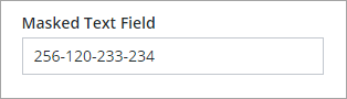
The following image shows the guides for a 999–999–999–999 numeric pattern that has four three-digit numbers at run time:
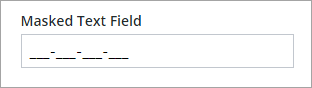
The pattern is used to set the format of the number in addition to the number of digits. In this example, you can type any 12 digit number, such as: 256120233234. As you type, the underscore (_) guides are replaced by numbers.
The indicator guides are displayed based on the total number of characters that you set within the pattern during design time. When you type a number with fewer digits than the pattern, the input remains incomplete. You should use the mask to define patterns with a specific number of characters, such as a phone numbers or Zip codes. Avoid using a mask when the input isn't a specific number of characters, such as a monetary amount.
|
|
You can use different types of symbols such as periods, dashes, slashes, and more as separators between characters.
|
Enabling Numeric Input Mode
You can configure the Text Field widget to restrict input to numbers only. This helps ensure users enter valid numeric data and simplifies validation. To enable numeric input for the text field, select the widget, then on the Properties panel, enable the NumericInputMode property. Additional configuration properties for this mode are displayed.
Use AllowDecimals to let users enter decimal values, and AllowNegativeValues to allow negative numbers. Set DecimalPlaces to define how many digits can appear after the decimal point. To limit the range of values, use MinValue and MaxValue validation properties. You can also customize the messages that appear when users enter values outside the allowed range using MinValueFailureMessage and MaxValueFailureMessage.
To control the number format, use the FormatToken property. You can also set the StepSize property to control how much the value changes when users use keyboard shortcuts. The NumericValue property lets you bind the field to a data source so you can track or update the value dynamically.
Resizing the TextField Widget
You can control whether users can resize a text field widget horizontally by using the AllowResize property. When this property is set to true, the widget displays a horizontal resize handle, allowing users to adjust its width directly in the mashup interface. This can improve usability in layouts where flexible input space is useful.
The following table lists the Text Field widget properties.
|
Property Name
|
Description
|
Base Type
|
Default Value
|
Bindable? (Y/N)
|
Localizable? (Y/N)
|
||
|---|---|---|---|---|---|---|---|
|
Text
|
The text that is displayed in the text field.
|
STRING
|
n/a
|
Y
|
Y
|
||
|
Label
|
The text that is displayed in the label of the text field.
|
STRING
|
n/a
|
Y
|
Y
|
||
|
AllowResize
|
Adds a control that enables users to resize the text field at runtime.
|
BOOLEAN
|
False
|
N
|
N
|
||
|
Counter
|
Counts and displays the number of characters that are entered in the text field.
|
BOOLEAN
|
False
|
N
|
N
|
||
|
MaxNumberOfCharacters
|
Enables you to set a maximum number of characters in the textfield.
|
NUMBER
|
100
|
Y
|
N
|
||
|
NumericInputMode
|
Enables numeric entry mode for the widget. In this mode, only numeric entry is supported.
|
Sets the widget to numeric entry mode. In this one, only numeric characters are allowed.
|
False
|
N
|
N
|
||
|
NumericValue
|
Sets or retrieves the numeric value of the widget.
|
NUMBER
|
0
|
Y
|
N
|
||
|
AllowDecimals
|
Allows decimal values when using numeric entry mode.
|
BOOLEAN
|
False
|
N
|
N
|
||
|
AllowNegativeValues
|
Allows negative values when using numeric entry mode.
|
BOOLEAN
|
False
|
N
|
N
|
||
|
DecimalPLaces
|
Sets the number of allowed decimal places for the numeric value.
|
NUMBER
|
0
|
N
|
N
|
||
|
FormatToken
|
Enter a localization token to format of the numeric value . When a format token is set, it overrides the AllowDecimals, AllowNegativeValues and DecimalPlaces properties. For more information about the supported formats, refer to the Intl.NumberFormat object on https://developer.mozilla.org/en-US/docs/Web/JavaScript/Reference/Global_Objects/Intl/NumberFormat
|
STRING
|
n/a
|
N
|
N
|
||
|
StepSize
|
Controls the step size for the numeric value when using keyboard shortcuts.
|
NUMBER
|
1
|
N
|
N
|
||
|
HintText
|
Displays placeholder text that explains what should be entered in the field.
|
STRING
|
n/a
|
N
|
N
|
||
|
Disabled
|
Use this property to disable the widget in the mashup. The widget is displayed in the mashup but you can't click it.
|
BOOLEAN
|
False
|
Y
|
N
|
||
|
ReadOnly
|
Enables you to set the text field as read-only and the user can't edit the text.
|
BOOLEAN
|
False
|
N
|
N
|
||
|
Password
|
Enables you to hide the text field entry.
|
BOOLEAN
|
False
|
N
|
N
|
||
|
ShowClearText
|
Enables you to add a Clear button inside the text field, which allows the user to clear the text in the field at run time when the button is clicked.
|
BOOLEAN
|
True
|
N
|
N
|
||
|
LabelAlignment
|
Enables you to align the label to the left, right or center.
|
STRING
|
Left
|
N
|
N
|
||
|
TextAlignment
|
Enables you to align the text to the left or right in the field.
|
STRING
|
Left
|
N
|
N
|
||
|
Mask
|
Enables you to set predefined characters in the text field. In the property configuration field, use “a” to set a alphabetical entries, “9” for numeric entries, and “*” for alphanumeric entries.
|
STRING
|
n/a
|
N
|
N
|
||
|
TabSequence
|
The sequence of the widgets in which they are highlighted when the user presses Tab key.
|
NUMBER
|
n/a
|
N
|
N
|
||
|
CustomClass
|
Enables you to define the CSS to the top div of the widget. Many classes can be entered, separated by space.
|
STRING
|
n/a
|
Y
|
N
|
||
|
EnterKeyPressed
|
An event that is triggered when the ENTER key is pressed while editing the text value.
|
n/a
|
n/a
|
Y
|
N
|
||
|
FocusLost
|
An event that is triggered when a user changes the focus by pressing the TAB key or by clicking an area outside the widget while editing the text value.
|
n/a
|
n/a
|
Y
|
N
|
||
|
Changed
|
The event that is triggered when the data of this widget is modified.
|
n/a
|
n/a
|
Y
|
N
|
||
|
ResetToDefaultValue
|
Resets the inputs for this widget to their default values.
|
n/a
|
n/a
|
Y
|
N
|
||
|
Width
|
The width of the widget.
|
NUMBER
|
273
|
N
|
N
|
||
|
Height
|
The height of the widget. It's automatically calculated by default. The height increases if you include a label within the text field.
|
NUMBER
|
Autosize
|
N
|
N
|
||
|
TooltipField
|
Sets a tooltip text that is displayed when you hover over the widget.
|
STRING
|
n/a
|
Y
|
Y
|
||
|
TooltipIcon
|
Sets an icon image for the tooltip of the widget.
You can add an image or specify an image URL path.
|
Media entity
|
n/a
|
N
|
N
|
||
|
Icon
|
Specifies the icon to display within the text box.
|
LIST OF SVG ICONS
|
n/a
|
N
|
N
|
Validating Widget Data
In addition to the common properties, you can use the MaxLength and MinLength validation properties to validate the number of characters within the Text Field widget.
You can customize the default failure messages using the MaxLengthFailureMessage and MinLengthFailureMessage property. The maximum and minimum values are displayed within the messages using the ${value} parameter.
For more information about using the common validation properties, see Applying Validation to Widgets.
The following table lists validation properties that are available on the Validation panel.
|
Property
|
Description
|
Base Type
|
Default Value
|
Bindable (Y/N)
|
Localizable (Y/N)
|
|---|---|---|---|---|---|
|
CriteriaMessage
|
The message to display for the validation criteria and when the validation fails.
|
STRING
|
n/a
|
Y
|
Y
|
|
CriteriaMessageDetails
|
The details to display for the validation criteria and failure message.
|
STRING
|
n/a
|
Y
|
Y
|
|
MaxLength
|
The maximum length for the text field value.
|
STRING
|
n/a
|
Y
|
N
|
|
MaxLengthFailureMessage
|
The message to display when the current value exceeds the maximum character length.
|
STRING
|
${value} characters is the maximum
|
Y
|
Y
|
|
MinLength
|
The minimum length for the text field value.
|
STRING
|
n/a
|
Y
|
N
|
|
MinLengthFailureMessage
|
The message to display when the current value is under the minimum character length.
|
STRING
|
${value} characters is the minimum
|
Y
|
Y
|
|
MaxValue
|
Sets the maximum numeric value for the widget.
|
NUMBER
|
N/A
|
Y
|
N
|
|
MaxValueFailureMessage
|
The message to display when the numeric value is over the maximum.
|
STRING
|
Value exceeds the maximum of
|
Y
|
Y
|
|
MinValue
|
Sets the minimum numeric value for the widget.
|
NUMBER
|
Y
|
N
|
|
|
MinValueFailureMessage
|
The message to display when the numeric value is under the minimum.
|
STRING
|
Y
|
Y
|
|
|
RequiredMessage
|
The message to display when value required is set to true and item isn't selected.
|
STRING
|
A value is required
|
Y
|
Y
|
|
ShowValidationCriteria
|
Shows a hint message about the required input when editing the text field.
|
BOOLEAN
|
False
|
Y
|
N
|
|
ShowValidationFailure
|
Show a failure message when the entered value fails the validation.
|
BOOLEAN
|
False
|
Y
|
N
|
|
ShowValidationSuccess
|
Show a success message when the entered value is validated as successful.
|
BOOLEAN
|
False
|
Y
|
N
|
|
SuccessMessage
|
The message to display when the validation is successful.
|
STRING
|
n/a
|
Y
|
Y
|
|
SuccessMessageDetails
|
A secondary message that displays more information about the validation success message.
|
STRING
|
n/a
|
Y
|
Y
|
|
Validate
|
A bindable event that is triggered when the widget value is changed. Bind this event to a service or a function to apply a validation pattern or expression.
|
Event
|
n/a
|
Y
|
N
|
|
ValidationCriteriaIcon
|
Sets the SVG icon to display within the hint message for the validation criteria.
|
IMAGELINK
|
info
|
N
|
N
|
|
ValidationFailureIcon
|
Sets the SVG icon to display within the status message when the validation fails.
|
IMAGELINK
|
error
|
N
|
N
|
|
ValidationOutput
|
Retrieves the output of the widget validation. Returned values are Undefined,Unvalidated,Valid, orInvalid.
|
STRING
|
n/a
|
Y
|
N
|
|
ValidationState
|
A bindable property that sets the validation state. You can set this property to Undefined, Unvalidated, Valid, or Invalid.
|
STRING
|
Undefined
|
Y
|
N
|
|
ValidationSuccessIcon
|
Select an SVG icon to display within the statues message when the validation succeeds.
|
IMAGELINK
|
success
|
N
|
N
|
|
ValueRequired
|
Require an item in the list to be selected.
|
BOOLEAN
|
False
|
Y
|
N
|