Configuring the Collection Widget
Selecting a Layout for the Collection
You can configure the widget layout using the Layout property.
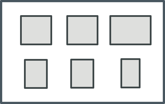
Flex—A responsive layout based on Flexbox layout rules. This mode places as many cells that can fit into the available space for each row. Cells automatically wrap onto a new row when the available space becomes limited. Each cell expands to fill the available space in a row or shrinks until the minimum space required to display the cell content is reached. When this limit is reached, the cell wraps onto a new line. To control the horizontal alignment of cells in the last row, use the AlignLastRow property.
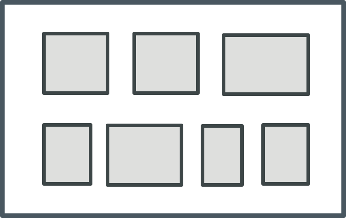
Grid—A responsive layout that displays the collection as a gird with cells organized as rows and columns. This mode fits the same number of cells in each row in the collection, based on the available space and the cell width. When a row cannot be displayed in the available width for the row, the last cell is wrapped onto a new line and the number of columns in the layout is reduced by one. The column width is set to fit the widest cell in the column and the row height is set to fit the highest cell in the row.
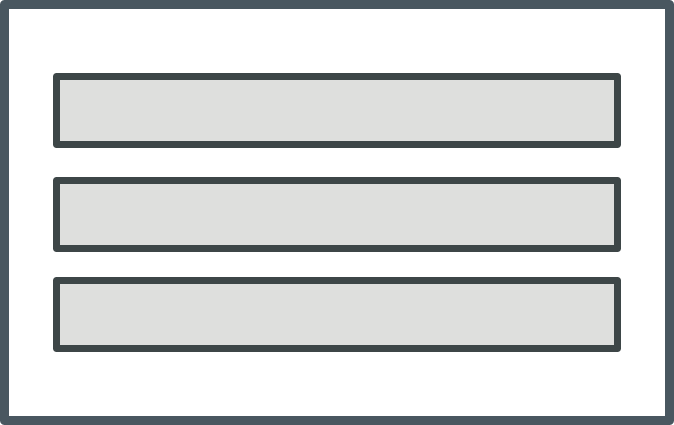
Table—Displays the collection cells as a single column.
You can control how cells are aligned within a row or a column using the VerticalAlignment and HorizontalAlignment properties. By default, the horizontal alignment within rows set to distribute the cells with equal spacing between the cells. You can control the space between the cells using the ColumnGap and RowGap properties. To control the alignment of the last row in the collection in a grid layout, use the LeftAlignLastRow. To make all rows in the collection the same height, set the UniformHeight property to true. The row height is increased to match the highest row in the collection.
 |
You can combine different layouts by nesting Collection widgets. For example, you can create a top-level collection where the layout is set to Table and a contained collection where the layout is set to Flex.
|
Grouping Collection Rows into Sections
You can group the collection rows into sections with headers or footers that contain titles and labels that visually separate groups or categories within a collection. This enables you to organize and label parts of the collection, making it easier for users to navigate and read the data. To group cells in a Collection widget, you must specify a column with a category identifier for related cells in the collection infotable. To group collection rows, perform the following steps:
1. In the collection data source, add a column that contains a category identifier. This column should contain values that represent the categories or groups you want to create within the collection.
2. Create two mashups to use as a template for the section headers and footers. These mashups can include labels, images, or other UI elements that you want to within the headers and footers.
3. Configure the Collection widget properties on the Properties panel.
◦ Next to the SectionField property, select the name of the column that contains the category data.
◦ Set the SectionHeaders and SectionFooters properties to Visible or Pinned. When pinned, headers and footers are fixed to the top and bottom of the viewport as scrolling a section.
◦ Next to the HeaderMashup and FooterMashup properties, select the mashup that you created in step 2.
◦ To sort the collection, you can use the SortField property.
◦ To set the header and footer heights, specify a numeric value in the HeaderHeight and FooterHeight properties.
◦ Optionally, if you want to pass dynamic content to the headers or footers, use the HeaderSectionParam and FooterSectionParam properties to bind column names from the data source to mashup parameters.
4. Save the mashup.
At runtime, the cells are grouped based on the infotable column that you selected for the SectionField property.
Configuring the Space between and Around the Collection Cells
To configure the space between cells in the collection, use the ColumnGap and RowGap properties.
To configure the space between the cell collection and the widget border, use the PaddingRight, PaddingLeft, PaddingTop, and PaddingBottom properties.
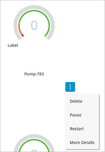
Adding a Menu Button to the Collection Cells
You can display a menu button under each cell in the collection by adding a state definition to the widget CellMenu property. The menu button allows users to perform a number of actions specific to each item in the collection. For examples, you can define menu items that allow users to edit, delete, or view more details about the cell. To add a menu button to the collection, perform the following steps.
1. In Composer, create a state definition that defines each menu item that you want to display for the collection cells.
|
|
Applying font or background colors and styles to each menu items using a style definition is not supported. Only icons are supported.
|
2. In Mashup Builder, select the Collection widget on the canvas or using the Explorer panel.
3. On the Properties panel, specify the state definition that you created for the CellMenu property.
An event is added for each menu item that you defined in the state definition using the following format: CellMenu:<MenuItem>
4. Bind the events for each menu item to a service, function, or widget to trigger an action when the menu item is clicked.
5. Click Save, then view the mashup.
At runtime, a menu button is added under each cell and menu items are displayed based on the selected state definition entity.
Enabling Drag and Drop for Collection Cells
The collection drag-and-drop feature lets users change the visual order of cells at runtime, enabling users to customize the collection view as needed. Users can drag a single cell to a new position inside the same collection when ungrouped. Moving cells between collections is supported when both collections use the same data shape, have drag enabled, and the DragCellsBetweenWidgets property is set to true.
• Reorder cells in an ungrouped collection.
• Move cells between two collections that share the same data shape when the DragCellsBetweenWidgets property is enabled.
|
|
Drag and drop is not supported when grouping is enabled. Additionally, moving a cell outside a collection widget is not supported. Only one cell can be dragged at a time.
|
To enable drag and drop for a collection:
1. In Mashup Builder, select the Collection widget on the canvas or using the Explorer panel.
2. On the Properties panel, set the DragEnabled property to true.
3. If you want to enable dragging cells between multiple collections, set the DragCellsBetweenWidgets property to true for each collection that supports cross-widget dragging.
4. Bind the DragActionsData property to a service that will handle the reordering logic and update your data source.
5. Click Save, then view the mashup.

When a user drags and drops a cell in a Collection widget, the widget stores the changes in the DragActionsData JSON property. This JSON object contains a sourceIdx and a targetIdx of the moved cell, which represent its original and new zero-based positions.
{"sourceIdx": 9, "targetIdx": 7}
This property stores the information you need to update your data source. The widget does not save the new order automatically, and you must use this data in a service to persist the changes to the infotable data for the collection.
Why the Widget Provides Indices Instead of a UID
The Collection widget works with any Data Shape, regardless of its structure. ThingWorx does not require Data Shapes to include a unique identifier field, which means your collection might display rows where all the data is identical. For example, a task list might have multiple rows with the same task name, priority, and status.
When rows contain identical data, the index position is the only way to tell which specific row the user moved. The index acts as a unique reference to that exact row at the time of the drag operation.
Using indices ensures the widget works reliably with any data structure. The widget does not require or assume a unique identifier field exists, which prevents errors when working with data that lacks one. If you need a permanent identifier to track rows over time or across different operations, add a unique identifier field to your Data Shape, such as a GUID or ID number, and use it in your services.
Using DragActionsData to Update Your Data Source
When users reorder cells in a Collection widget, you may need to save these changes in your application. For example, if cells represent tasks in a priority list, reordering them should update the task sequence in your database.
The DragActionsData property provides the sourceIdx and targetIdx values, which identify where the cell moved from and where it moved to. Use these index values to look up the row in your collection infotable, then get the data you need to update your data source.
To save reordered cells:
1. Bind the DragActionsData property to a service input parameter.
2. Use the sourceIdx or targetIdx value to access the row in the infotable. Infotables are zero-based arrays, so you can use the index value to get the row information.
3. Get the fields you need from the row, such as IDs, names, or other identifiers, to identify the item being moved.
4. Update your data source with the new order. You may need to reorder records in a database table, update sequence numbers, or change related data.
5. Refresh the collection data to show the updated changes.
 |
The index values in DragActionsData show the cell positions at the moment of the drag operation. If your Data Shape does not include a unique identifier field and contains duplicate rows with identical data, the index is the only way to identify which row was moved. Consider adding a unique identifier field to your Data Shape if you need to track individual rows across multiple operations or sessions.
|