Text Area Widget
The Text Area widget enables the mashup user to enter a multi-line text in a mashup.
 |
The Text Area widget is available as a standard widget in the ThingWorx Platform and as a web component that can be imported from an SDK.
|
Default Widget Sizing
The Text Area widget sizing differs depending on your version of ThingWorx:
• In ThingWorx 9.3.2 and later, the widget is responsive by default. When you add it to an empty container, it expands to fill all of the available space in the container.
• In earlier versions of ThingWorx, the widget has a default width and height that you can manually adjust using properties.
When you migrate to ThingWorx 9.3.2 or later, Text Area widgets that are displayed as a single widget within a container will fill all of the available space in the container. This change may affect the layout of your mashup. To update the layout, make sure to adjust the mashup layout. For more information, see the following sections.
Widget Sizing in ThingWorx 9.3.1 and Earlier
By default, the Text Area is displayed using default width and height dimensions. The width is set to a fixed value. However, the height is set to Autosize to allow the widget to grow vertically. As you type, the widget grows to display additional characters when the text exceeds the available space, until the value defined in the MaxNumberOfCharacters property is reached. You can add additional widgets and control the layout using the alignment and distribution options on the Layout panel. The following figure shows the widget in a mashup layout:
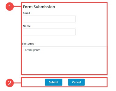
The layout is divided as follows:
1. A responsive container that contains four widgets: a Label, two Textfields and a Text Area.
2. A fixed container with two buttons.
The widget width is set to a fixed value. However, the height is set to Autosize to allow the widget to expand vertically when the number of characters is more than available space. You can use the Width and Height properties to adjust the widget size. An ellipsis is displayed.
Widget Sizing in ThingWorx 9.3.2 and Later
When you add the widget to a new or existing mashup, its default dimensions are set according to the size of its container. The widget automatically grows to fill the available space within the container. To adjust the widget dimensions relative to the layout, you must configure the container layout using the Layout panel. When widget is expanded on the container, the Width and Height properties are not listed on the Properties panel. Adding additional widgets to the Text Area container restores the earlier sizing. The following figure shows the widget in a responsive container in version 9.3.2 or later of the ThingWorx platform.
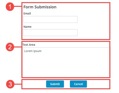
The layout is divided as follows:
1. A static container with a fixed height that contains three widgets: A Label widget and two Text Field widgets. The items direction is set to Vertical.
2. A responsive container with a Text Area widget.
3. A static container that displays two buttons.
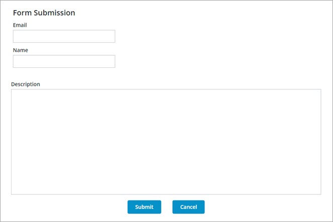
Using a separate container to display the widget enables you to create more responsive layouts. The following image shows the previous form when more space is available for the mashup. Note that the text area grows with its container, and the text fields remain the same size.
Widget Properties
The properties of the Text Area widget are listed below.
|
Property Name
|
Description
|
Base Type
|
Default Value
|
Bindable? (Y/N)
|
Localizable? (Y/N)
|
|---|---|---|---|---|---|
|
Text
|
The text that is displayed in the text area.
|
STRING
|
n/a
|
Y
|
Y
|
|
Label
|
The text that is displayed as the label for the text area.
|
STRING
|
n/a
|
Y
|
Y
|
|
Counter
|
Counts and displays the number of characters that are entered in the text area.
|
BOOLEAN
|
False
|
N
|
N
|
|
MaxNumberOfCharacters
|
Enables you to set a maximum number of characters allowed in the text area.
|
NUMBER
|
100
|
Y
|
N
|
|
HintText
|
Displays placeholder text that explains what should be entered in the field.
|
STRING
|
n/a
|
N
|
Y
|
|
Disabled
|
Use this property to disable the widget in the mashup. The widget is displayed in the mashup but you cannot click it.
|
BOOLEAN
|
False
|
Y
|
N
|
|
ReadOnly
|
Enables you to set the text area as read-only and the user cannot edit the included text.
|
BOOLEAN
|
False
|
N
|
N
|
|
TextAlignment
|
Enables you to align the text to the left or right.
|
STRING
|
Left
|
N
|
N
|
|
LabelAlignment
|
Enables you to align the label to the left, right or center.
|
STRING
|
Left
|
N
|
N
|
|
TabSequence
|
The sequence of the widgets in which they are highlighted when the user presses Tab key.
|
NUMBER
|
n/a
|
N
|
N
|
|
CustomClass
|
Enables you to define the CSS to the top div of the widget. Multiple classes can be entered, separated by space.
|
STRING
|
n/a
|
Y
|
N
|
|
Changed
|
The event that is triggered when the data is modified.
|
n/a
|
n/a
|
Y
|
N
|
|
ResetToDefaultValue
|
Resets the inputs for this widget to their default values.
|
n/a
|
n/a
|
Y
|
N
|
|
Width
|
The width of the widget.
In ThingWorx 9.3.2 or later, this property is hidden, unless you add the widget to a container with one or more widgets.
|
NUMBER
|
273
|
N
|
N
|
|
Height
|
The height of the widget. It is automatically calculated by default. Enter a value in the property panel or resize the widget in the canvas to set a fixed height. In ThingWorx 9.3.2 or later, this property is hidden, unless you add the widget to a container with one or more widgets.
|
NUMBER
|
Autosize
|
N
|
N
|
|
MinWidth
|
Sets the minimum width of the widget when it is added to a responsive container in ThingWorx 9.3.2 or later.
|
NUMBER
|
n/a
|
N
|
N
|
|
TextChanged
|
A bindable event that is triggered when you click an area outside the widget after updating the widget value.
|
n/a
|
n/a
|
Y
|
N
|
|
TooltipField
|
Sets a tooltip text that is displayed when you hover over the widget.
|
STRING
|
n/a
|
Y
|
Y
|
|
TooltipIcon
|
Sets an icon image for the tooltip of the widget.
You can add an image or specify an image URL path.
|
Media entity
|
n/a
|
N
|
N
|
Validating Widget Data
In addition to the common validation properties, you can use the MaxLength and MinLength properties to validate the number of characters within the Text Area widget.
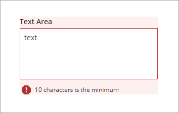
You can customize the default failure messages using the MaxLengthFailureMessage and MinLengthFailureMessage property. The maximum and minimum values are displayed within the messages using the ${value} parameter.
For more information about using the common validation properties, see Applying Validation to Widgets.
The following table lists validation properties that are available on the Validation panel.
|
Property
|
Description
|
Base Type
|
Default Value
|
Bindable (Y/N)
|
Localizable (Y/N)
|
|---|---|---|---|---|---|
|
CriteriaMessage
|
The message to display for the validation criteria and when the validation fails.
|
STRING
|
n/a
|
Y
|
Y
|
|
CriteriaMessageDetails
|
The details to display for the validation criteria and failure message.
|
STRING
|
n/a
|
Y
|
Y
|
|
MaxLength
|
The maximum length for the text area value.
|
STRING
|
n/a
|
Y
|
N
|
|
MaxLengthFailureMessage
|
The message to display when the current value exceeds the maximum character length.
|
STRING
|
${value} characters is the maximum
|
Y
|
Y
|
|
MinLength
|
The minimum length for the text area value.
|
STRING
|
n/a
|
Y
|
N
|
|
MinLengthFailureMessage
|
The message to display when the current value is under the minimum character length.
|
STRING
|
${value} characters is the minimum
|
Y
|
Y
|
|
RequiredMessage
|
The message to display when value required is set to true and item is not selected.
|
STRING
|
A value is required
|
Y
|
Y
|
|
ShowValidationCriteria
|
Shows a hint message about the required input when editing the text area.
|
BOOLEAN
|
False
|
Y
|
N
|
|
ShowValidationFailure
|
Show a failure message when the entered value fails the validation.
|
BOOLEAN
|
False
|
Y
|
N
|
|
ShowValidationState
|
A bindable service that enables you to display the validation state before a user interacts with the widget at run time. By default, the validation state is only displayed after user interaction.
|
Service
|
n/a
|
In
|
N
|
|
ShowValidationSuccess
|
Show a success message when the entered value is validated as successful.
|
BOOLEAN
|
False
|
Y
|
N
|
|
SuccessMessage
|
The message to display when the validation is successful.
|
STRING
|
n/a
|
Y
|
Y
|
|
SuccessMessageDetails
|
A secondary message that displays more information about the validation success message.
|
STRING
|
n/a
|
Y
|
Y
|
|
Validate
|
A bindable event that is triggered when the widget value is changed. Bind this event to service or function to apply a validation pattern or expression.
|
event
|
n/a
|
Y
|
N
|
|
ValidationCriteriaIcon
|
Select an SVG icon to display within the hint message for the validation criteria.
|
IMAGELINK
|
info
|
N
|
N
|
|
ValidationFailureIcon
|
Sets the SVG icon to display within the status message when the validation fails.
|
IMAGELINK
|
error
|
N
|
N
|
|
ValidationOutput
|
Retrieves the output of the widget validation. Returned values are Undefined,Unvalidated ,Valid , orInvalid.
|
STRING
|
n/a
|
Y
|
N
|
|
ValidationState
|
A bindable property that sets the validation state. You can set this property to Undefined, Unvalidated, Valid, Invalid.
|
STRING
|
Undefined
|
Y
|
N
|
|
ValidationSuccessIcon
|
Select an SVG icon to display within the statues message when the validation succeeds.
|
IMAGELINK
|
success
|
N
|
N
|
|
ValueRequired
|
Require an item in the list to be selected.
|
BOOLEAN
|
False
|
Y
|
N
|