Slider Widget (Themable)
The Slider widget displays a slider element that enables users to enter numeric input in a mashup. You can enable range selection to allow users to specify a minimum and a maximum value.
Widget Anatomy
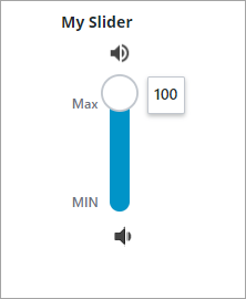
The following figure shows the different parts of the Slider widget.
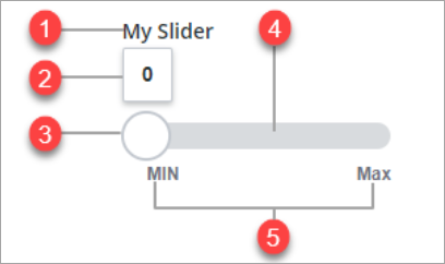
1. Widget label
2. Value label
3. Drag handle
4. Slider track
5. Minimum and maximum value label
 |
The Slider widget is available as a standard widget in the platform and as web component that you can import from an SDK.
|
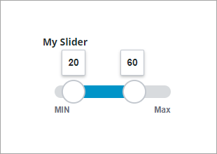
Enabling Range Selection Mode
You can enable the widget RangeSelection property to allow users to select a range of values at run time. When range selection is enabled, two handles are used to indicate the start and end of the value range on the slider. You can specify these values using the widget Value and EndValue properties. To execute services based on changes to the slider value, bind the ValueChanged and EndValueChanged events to other widgets, functions, or data services in the mashup. For example, you can define a value range to filter data for a service that retrieves information about available resources on a factory floor.
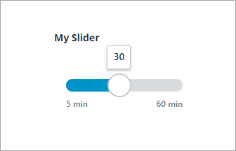
Enabling Stepping Mode
You can enable incremental stepping mode on the slider track by setting the widget Stepping Mode property to true. Defining incremental steps on the slider helps users understand the scale of the track values, and makes it easier to place the handle at a specific value. You can define the increment on the slider in one of the following ways:
• To divide the track into increments, use the NumberOfSteps property.
• To set the step size, use the StepSize property.
For example, you can define 5–minute increments for a Slider widget that sets the time it takes to update data in a mashup. At run time, the handle automatically snaps to the steps that are defined along the slider track.
Enabling Vertical Mode
You can enable vertical mode by setting the widget VerticalSlider property to true.
Enabling Editable Value
You can enable value editing mode by setting the widget EditableValue property to true. In this configuration, users can type a value in the value label without moving the handle. To change the value of the slider, double click the value label, and then type a value. The handle position changes automatically based on the new value.
Styling the Widget
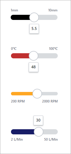
You can edit style properties on the Style Properties panel. You can customize the widget color, font, shape, and sizes of multiple parts under different states.
• TheSlider category allows users to edit the background, foreground, and bar color.
• TheThumb category allows users to edit the style and color of the slider thumb or drag handle.
• TheMin-Max Label category allows users to edit the label style font and color of the min max label.
• TheTrack category allows users to edit the color of the track background.
Widget Properties
The properties of the Slider widgets are listed in the following table.
|
Property Name
|
Description
|
Base Type
|
Default Value
|
Bindable? (Y/N)
|
Localizable? (Y/N)
|
||
|---|---|---|---|---|---|---|---|
|
label
|
The text that appears in the label of the slider.
|
STRING
|
N/A
|
Y
|
Y
|
||
|
labelAlignment
|
Aligns the widget label to the Left, Right, or Center.
|
STRING
|
Left
|
Y
|
N
|
||
|
LabelType
|
Sets the label type as Header, Sub-Header, Label, or Body.
|
STRING
|
Label
|
Y
|
N
|
||
|
Value
|
Sets or binds the slider value.
|
NUMBER
|
N/A
|
Y
|
N
|
||
|
CustomClass
|
Defines the CSS to the top div of the widget.When entering multiple classes, separate each class with a space.
|
STRING
|
N/A
|
Y
|
N
|
||
|
TabSequence
|
Sets the sequence in which a widget is highlighted when you press TAB.
|
NUMBER
|
N/A
|
N
|
N
|
||
|
EndValue
|
The slider value for the second handle when in range selection mode.
|
NUMBER
|
N/A
|
Y
|
N
|
||
|
EndValueChanged
|
Triggers an event when the end value for the slider is changed.
|
N/A
|
N/A
|
Y
|
N
|
||
|
Minimum
|
Sets the minimum value for the slider.
|
NUMBER
|
0
|
Y
|
N
|
||
|
Maximum
|
Sets the maximum value for the slider.
|
NUMBER
|
100
|
Y
|
N
|
||
|
SteppingMode
|
Select to move the slider by a specific number of steps for each click.
|
BOOLEAN
|
False
|
N
|
N
|
||
|
StepSize
|
Sets the change in value for each step the slider moves.
|
NUMBER
|
N/A
|
Y
|
N
|
||
|
NumberOfSteps
|
Sets the number of steps the slider moves for each click.
|
NUMBER
|
N/A
|
Y
|
N
|
||
|
ValuePrecision
|
Sets the number of digits to show after the decimal point for the slider value.
|
NUMBER
|
N/A
|
N
|
N
|
||
|
DisplayValueLabel
|
Sets the display option for the slider value label to Yes, No, or On Drag.
|
STRING
|
Yes
|
N
|
N
|
||
|
EditableValue
|
Enables you to move the handle by editing the value label in the mashup.
|
BOOLEAN
|
False
|
N
|
N
|
||
|
DisplayMinMaxLabels
|
Displays the labels of the minimum and maximum values.
|
BOOLEAN
|
True
|
N
|
N
|
||
|
HandleSize
|
Sets the handle size in pixels.
|
NUMBER
|
N/A
|
N
|
N
|
||
|
TrackSize
|
Sets the track size in pixels.
|
NUMBER
|
N/A
|
N
|
N
|
||
|
TrackAlignment
|
Aligns the track on the Center, Start, or End of the slider.
|
STRING
|
Center
|
N
|
N
|
||
|
FullTrack
|
Extends the slider track to fully contain the handle icon.
|
BOOLEAN
|
False
|
Y
|
N
|
||
|
MinValueLabel
|
Specifies the label for the minimum value.
|
STRING
|
MIN
|
Y
|
Y
|
||
|
MaxValueLabel
|
Specifies the label for the maximum value.
|
STRING
|
MAX
|
Y
|
Y
|
||
|
HandleIcon
|
Controls the shape of the handle icon as None, Circle or Split.
|
STRING
|
Circle
|
N
|
N
|
||
|
SecondHandleIcon
|
Selects a media entity for the second handle icon as None, Circle or Split.
|
STRING
|
Circle
|
N
|
N
|
||
|
MinSideIcon
|
Specifies an icon for the minimum side.
|
Media entity
|
N/A
|
N
|
N
|
||
|
MinIconSize
|
Controls the size of the minimum value icon. Options: Small Medium, Large, or XLarge
|
STRING
|
Medium
|
Y
|
N
|
||
|
MaxSideIcon
|
Selects an icon for the maximum side.
|
Media entity
|
N/A
|
N
|
N
|
||
|
MaxIconSize
|
Controls the size of the maximum value icon. Options:Small, Medium, Large, or XLarge
|
STRING
|
N/A
|
Y
|
N
|
||
|
RangeSelection
|
Adds a second handle and enables range selection on the slider.
|
BOOLEAN
|
False
|
N
|
N
|
||
|
VerticalSlider
|
Changes the slider orientation to vertical.
|
BOOLEAN
|
False
|
N
|
N
|
||
|
ReverseMinMaxValues
|
Reverses the position of the minimum and maximum values.
|
BOOLEAN
|
False
|
N
|
N
|
||
|
ReverseLabelPosition
|
Reverses the label positions of the minimum and maximum values
|
BOOLEAN
|
False
|
N
|
N
|
||
|
OverlapHandle
|
Enables overlap between the two slider handle, when range selection is enabled.
|
BOOLEAN
|
False
|
N
|
N
|
||
|
ValueChanged
|
Triggers an event when the slider value is changed.
|
N/A
|
N/A
|
Y
|
N
|
||
|
Increment
|
A bindable service that increments the slider value.
|
N/A
|
N/A
|
Y
|
N
|
||
|
Decrement
|
A bindable service that decrements the slider value.
|
N/A
|
N/A
|
Y
|
N
|
||
|
IncrementSecondHandle
|
A bindable service that increments the value of the second handle when range selection mode is enabled.
|
N/A
|
N/A
|
Y
|
N
|
||
|
DecrementSecondHandle
|
A bindable service that decrements the value of the second handle when range selection mode is enabled.
|
N/A
|
N/A
|
Y
|
N
|
||
|
Disabled
|
Disables the widget in the mashup. The widget remains visible but is not interactive.
|
BOOLEAN
|
False
|
Y
|
N
|
||
|
HandleTooltipField
|
Displays a tooltip text when you hover over the slider handle.
|
STRING
|
N/A
|
Y
|
Y
|
||
|
HandleTooltipIcon
|
Sets an icon image for the tooltip of the slider handle.
|
Media entity
|
N/A
|
N
|
N
|
||
|
SecondHandleTooltipField
|
Displays a tooltip text when you hover over the slider second handle.
|
STRING
|
N/A
|
Y
|
Y
|
||
|
SecondHandleTooltipIcon
|
Sets an icon image for the tooltip of the slider second handle.
|
Media entity
|
N/A
|
N
|
N
|
Validating Slider Widget Data
You can use validation properties to set minimum and a maximum value when using single selection or range selection:
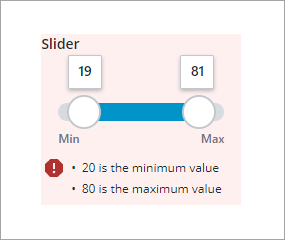
To configure the default failure messages, use the MinValueFailureMessgae and MaxValueFailureMessgae properties.
For more information about the common validation properties, see Applying Validation to Widgets.
The following table lists validation properties that are available on the Validation panel.
|
Property
|
Description
|
Base Type
|
Default Value
|
Bindable (Y/N)
|
Localizable (Y/N)
|
|---|---|---|---|---|---|
|
CriteriaMessage
|
The message to display for the validation criteria and when the validation fails.
|
STRING
|
n/a
|
Y
|
Y
|
|
CriteriaMessageDetails
|
The details to display for the validation criteria and failure message.
|
STRING
|
n/a
|
Y
|
Y
|
|
MaxValidValue
|
The maximum slider value that users can set the validation.
|
STRING
|
n/a
|
Y
|
N
|
|
MaxValueFailureMessage
|
The message to display when the slider value is higher than the maximum valid value.
|
NUMBER
|
${value} is the maximum value
|
Y
|
Y
|
|
MinValidValue
|
The minimum slider value that users can set the validation.
|
STRING
|
n/a
|
Y
|
N
|
|
MinValueFailureMessgae
|
The message to display when the slider value is lower than the minimum valid value.
|
NUMBER
|
${value} is the minimum value
|
Y
|
Y
|
|
ShowValidationCriteria
|
Shows a hint message about the required input when editing the slider.
|
BOOLEAN
|
False
|
Y
|
N
|
|
ShowValidationFailure
|
Show a failure message when the entered value fails the validation.
|
BOOLEAN
|
False
|
Y
|
N
|
|
ShowValidationState
|
A bindable service that enables you to display the validation state before a user interacts with the widget at run time. By default, the validation state is only displayed after user interaction.
|
Service
|
n/a
|
In
|
N
|
|
ShowValidationSuccess
|
Show a success message when the entered value is validated as successful.
|
BOOLEAN
|
False
|
Y
|
N
|
|
SucessMessgae
|
The message to display when the value is valid
|
STRING
|
n/a
|
Y
|
Y
|
|
SuccessMessageDetails
|
A secondary message that displays more information about the validation success message.
|
STRING
|
n/a
|
Y
|
Y
|
|
Validate
|
A bindable event that is triggered when the widget value is changed. Bind this event to service or function to apply a validation pattern or expression.
|
event
|
n/a
|
Y
|
N
|
|
ValidationCriteriaIcon
|
Select SVG icon to display within the hint message for validation criteria.
|
IMAGELINK
|
info
|
N
|
N
|
|
ValidationFailureIcon
|
Sets the SVG icon to display within the status message when the validation fails.
|
IMAGELINK
|
error
|
N
|
N
|
|
ValidationOutput
|
Retrieves the output of the widget validation. Returned values are Undefined,Unvalidated ,Valid , orInvalid.
|
STRING
|
n/a
|
Y
|
N
|
|
ValidationState
|
A bindable property that sets the validation state. You can set this property to Undefined Unvalidated Valid, Invalid.
|
STRING
|
Undefined
|
Y
|
N
|
|
ValidationSuccessIcon
|
Select an SVG icon to display within the statues message when the validation succeeds.
|
IMAGELINK
|
success
|
N
|
N
|