Property Display Widget (Themable)
You can use the Property Display widget to display a structured group of key-value pairs in the mashup.
 |
The Property Display widget is available as a standard widget in the platform and as a web component that you can import from an SDK.
|
Data Format
To display properties in the widget, you must bind a data service that returns an infotable according to the following data format:
|
Column 1
|
...
|
Column N
|
|
|---|---|---|---|
|
...
|
|||
|
Use
|
Defines a property name for the widget.
|
...
|
Defines property names for each additional column.
|
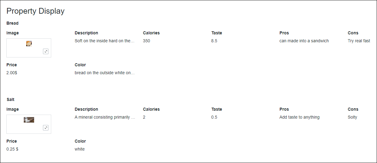
Each row in the infotable represents a set of values that correspond to the defined columns. The widget displays row values and column names as pairs. This is repeated for each row in the infotable. At run time, the widget formatting is automatically set based on the base type of each infotable column in the Data Shape.
You can group properties under a common label using the GroupNameField property. To display the properties and values using tabular layout, enable the TableLayout property.
Grouping Properties
By default, the listed properties are displayed according to the format of the bound infotable, unless you use the configuration dialog box to hide or rename specific columns. All properties are displayed on the same level at run time. You can enable grouping to organize properties that belong to a single item. When grouping is enabled, a data column from the bound infotable is used to specify labels for each group of properties in the widget.
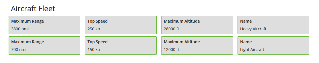
For example, consider the following infotable that returns the properties of two listed items:
|
Name
|
TopSpeed
|
MaxRange
|
MaxAltitude
|
|---|---|---|---|
|
Heavy Aircraft
|
250 kn
|
3800 nmi
|
28000 ft
|
|
Light Aircraft
|
150 kn
|
700 nmi
|
12000 ft
|
At run time, Heavy Aircraft is displayed as a property value under Name.
To use the value of the Name column as a group label for the properties, set the GroupNameField widget property:
1. Select the Property Display widget, then open the Properties panel. The widget properties are listed.
2. Set the GroupNameField property by selecting the infotable column with a STRING base type to use as a label for the properties.
|
|
You cannot set this property without binding an infotable to the Data property.
|
3. Click Save, then view the mashup.
At run time, the value of the selected column is used to group all the properties in each row. The following image shows the previous example with grouped properties using values in the Name column.
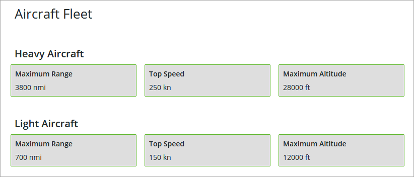
Depending on your implementation and design, you can use any other from the infotable to group the properties. This enables you to organize and sort properties.
Configuring the List of Properties
The list of properties for each row is sorted according to the order of columns in the infotable. The column name is determined by the field definition in the Data Shape for the bound infotable. You can override the default order of properties using the column configuration dialog box.
Select the widget on the canvas, and then open the widget configuration dialog box in one of the following ways:
• On the canvas, click  in the top-left corner of the widget, then click Configure Grid Columns.
in the top-left corner of the widget, then click Configure Grid Columns.• Click  on the Properties panel.
on the Properties panel.The widget configuration dialog box opens.
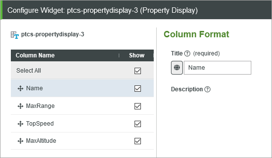
• To reorder the properties, in the left pane, drag the columns to change the order as required. You can move columns up or down in the list. The order of the properties is changed accordingly from left to right at run time.
• To change the property name, in the left pane, select a column, and then enter a new label to display for the property. To select a localization token, click  and then choose a token from the list.
and then choose a token from the list.• To hide a specific property at run time, clear the check box under Show.
|
|
• When you select a column for the GroupNameField property, then the column is not listed, and any existing configuration is ignored.
|
Click Done to apply the changes and close the dialog box.
Widget Properties
The following table lists the widget properties:
|
Property Name
|
Description
|
Base Type
|
Default Value
|
Bindable? (Y/N)
|
Localizable? (Y/N)
|
||
|---|---|---|---|---|---|---|---|
|
VerticalMode
|
Aligns the data along the vertical axis. It appears horizontally if not selected.
|
BOOLEAN
|
False
|
Y
|
N
|
||
|
HideGroupTitles
|
Hides the group title labels.
|
BOOLEAN
|
False
|
Y
|
N
|
||
|
ModalWidth
|
Sets a fixed width for the modal window.
|
NUMBER
|
n/a
|
Y
|
N
|
||
|
ModalHeight
|
Sets a fixed height for the modal window.
|
NUMBER
|
n/a
|
Y
|
N
|
||
|
CustomClass
|
Defines the CSS to the top div of the widget. When entering multiple classes, separate each class with a space.
|
STRING
|
n/a
|
Y
|
N
|
||
|
DisclosureControl
|
Specifies how to display the full value when it exceeds the specified dimensions for the widget. How the full value appears, depends on what you select:
• Display info button — In a modal window.
• Use 'Show more...' link — Using a Show More link.
• Display ellipsis (...) — Using an ellipsis.
|
STRING
|
Display Info Button
|
N
|
N
|
||
|
MultiLine
|
Breaks the text across a new line when it exceeds the specified width.
|
BOOLEAN
|
False
|
||||
|
TextIfNoValue
|
Sets a text that appears when the widget data source does not contain a value.
|
STRING
|
n/a
|
Y
|
Y
|
||
|
Disabled
|
Disables the widget in the mashup. The widget appears but it is not available to use.
|
BOOLEAN
|
False
|
Y
|
N
|
||
|
TabSequence
|
Sets the sequence in which a widget is highlighted when you press a TAB.
|
NUMBER
|
n/a
|
N
|
N
|
||
|
Data
|
The data source for the Property Display.
The label for each entry is derived from the field name as defined by the infotable Data Shape.
• If the field has a friendly name defined in the Data Shape definition, this name is used.
• If the field does not have a friendly name defined in the Data Shape definition, the field name is selected from the current localization table.
• If neither of the above two scenarios work, the field name itself is used as the label.
The value of each field is used as the entry value. The type of this value is determined automatically by the field type as defined in the Data Shape. There is no need to configure these. For example, a field with the type IMAGE appears as an image.
|
INFOTABLE
|
n/a
|
Y
|
N
|
||
|
GroupNameField
|
Specifies the infotable field that is used to group properties.
This property selects one of the fields in the infotable to use as the group title. If this property is set, the value of this field is used as the group title and this field does not appear among other properties. If no field is selected for GroupNameField, the property display widget displays all fields and the groups do not get a title.
|
INFOTABLE
|
n/a
|
N
|
N
|
||
|
Label
|
Displays the label text for the Property Display widget.
|
STRING
|
n/a
|
Y
|
Y
|
||
|
LabelAlignment
|
Aligns the label to the Left, Right, or Center along the horizontal axis.
|
STRING
|
Left
|
N
|
N
|
||
|
LabelType
|
Sets the type for the label.as Header, Sub-Header, Label, or Body.
|
STRING
|
Label
|
N
|
N
|
||
|
HideLabel
|
Hides the label in the mashup.
|
BOOLEAN
|
False
|
N
|
N
|
||
|
GroupTitleAlignment
|
Aligns the group label to the Left, Right, or Center along the horizontal axis.
|
STRING
|
Left
|
N
|
N
|
||
|
GroupTitleType
|
Sets a type for the group titles asHeader, Sub-Header, Label, or Body
|
STRING
|
Label
|
N
|
N
|
||
|
TableLayout
|
Displays the list of properties and their values as rows and columns within a table layout.
|
BOOLEAN
|
False
|
N
|
N
|
||
|
KeyColumnWidth
|
Sets the width of the column used to display the property names when the widget is configured using a table layout.
|
NUMBER
|
n/a
|
N
|
N
|
||
|
ValueMaxWidth
|
Sets the maximum width for values.
|
NUMBER
|
n/a
|
Y
|
N
|
||
|
ValueMaxHeight
|
Sets the maximum height for values.
|
NUMBER
|
n/a
|
Y
|
N
|