Pie Chart Widget (Themable)
 |
The Pie Chart is available as a widget in Mashup Builder and as a Web Component that you can import from an SDK.
|
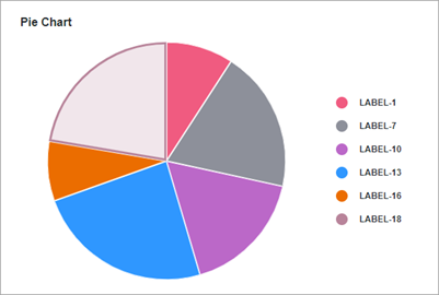
The Pie Chart widget displays values of one data series in an infotable. You can display numeric values for category types such as numbers, dates, or strings. Values are visualized relative to each as slices. The size of each slice is proportional to its value relative to the total of the values on the chart. You can configure the pie chart in the following ways:
• Define a radius to display donut chart.
• Display numeric data in percentage values.
• Set a start and an end angle for the chart.
• Round the corners and add padding between chart slices.
Data Format
To display data on the chart, you must create an infotable with field definitions that represent the chart data structure. The infotable must include a field definition for the label and value of each slice on the chart. Each infotable row represents a slice on the chart and its corresponding values. The following table lists the data format for the infotable:
|
Slice Label
|
Slice Value
|
|
|---|---|---|
|
Field Definition
|
x: { name: 'x', baseType: 'STRING' }
|
value: { name: 'value', baseType: 'NUMBER' }
|
|
Use
|
Defines the slice label. The data must have a STRING, NUMBER, or DATETIME base type. Each row is displayed as a slice on the chart. The defined name for this column is the option that you should select in the widget DataField property.
|
Defines the value and the legend label for the category.
|
|
Base Type
|
STRING, NUMBER, or DATETIME
|
NUMBER
|
|
Row Example
|
x: 'Apple'—Where Apple is the data label to show on the slice.
|
value: 10—The value for the slice.
|
Binding a Data Source
To bind the chart to a data source, perform the following steps:
1. On the Data panel, add a data service that returns an infotable with the correct data format for the widget.
|
|
Make sure that the service is triggered by an event at run time.
|
2. Bind the All Data property of the data service to the Data property of the chart.
3. Select the chart, then on the Properties panel, use the DataField property to select the infotable column to use for slice labels.
4. Click Save, then View Mashup.
You can also configure the widget using additional properties. For example:
• To apply state formatting to the chart, use the DataStyle property. For more information, see Example: Applying State Formatting to Charts.
For more information about the available configuration options, refer to the widget properties section in this topic.
 |
To update the chart data automatically at run time, create an Auto Refresh function and bind it to the chart data service. For more information, see Auto Refresh.
|
Best Practices
• Avoid adding too many data categories to the chart. Small slices are difficult to read.
• Hide the value label to fit the chart within small areas.
• Sort the data from highest to lowest to make it easier to see the difference between slices.
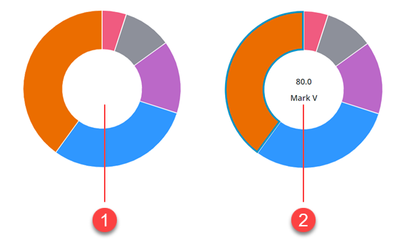
Configuring the Widget as a Donut Chart
You can configure the widget as a donut chart by specifying a a value within the chart DonutHoleSize property. A donut chart is a pie chart without the center part. Optionally, you can use the center of the donut chart to display additional information about the selected data by enabling the widget ShowDonutSliceLabel property. Both the value and the label of the selected slice are displayed in the empty area in the center of the donut chart and the ValuesPosition property is ignored.
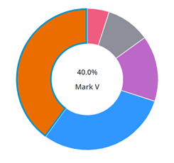
Displaying Data Values as Percentages
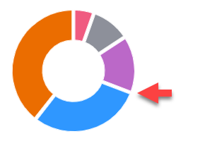
You can display the value of the selected slice in percentages using the PercentileValues property. The following figure shows a donut chart with a selected slice that is equal to 40% of the total data on the chart.
Configuring the Start and End Angle
By default, the Pie Chart widget displays data in a full 360–degree circle where 0 is at the 12 o'clock position. You can use the widget StartAngle and EndAngle properties to set a custom start and end angle for the pie visualization.
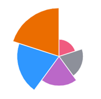
Enabling Polar View Mode
The polar view mode displays each slice on the chart at an equal angle. The radius length of each slice is used to highlight the difference in the chart data. To enable this mode, set the widget PolarView property to true.
|
|
The polar view mode is not supported when the widget is configured as a donut chart.
|
Rounding the Corners of the Chart Slices
To make the pie slice corners rounded, enter a value within the widget PieSliceRadius property. By default, radius value affects the outer corners of the pie chart. However, when the widget is configured as a donut chart, the radius value is applied to the inner and outer corners.

Adding Padding Between Chart Slices
Use the SlicePadding property to specify space between the slices on the chart.
Configuring Data Selection
The pie chart widget supports single and multiple selection using the SelectionMode property. You can bind the selected data to other widgets or data services using the widget SelectedData infotable property.
Widget Properties
|
Name
|
Description
|
Base Type
|
Default Value
|
Bindable?
|
|---|---|---|---|---|
|
CustomClass
|
The user defined CSS class to apply to the top div of the widget.
You can enter multiple classes, separated by a space.
|
STRING
|
N/A
|
Y
|
|
Data
|
An infotable that contains data for the chart.
|
INFOTABLE
|
N/A
|
Y
|
|
DataField
|
Specifies the infotable column that contains the data labels to display on the chart.
|
Field Name
|
N/A
|
N
|
|
DataFieldType
|
Controls the formatting of the data labels.
|
STRING
|
String
|
N
|
|
DataStyle
|
Applies state formatting to the chart.
|
State Definition
|
N/A
|
N
|
|
Disabled
|
Disables the widget in the mashup.
The widget is displayed in the mashup but you cannot click or select it.
|
BOOLEAN
|
False
|
Y
|
|
DonutHoleSize
|
Sets the size of the hole in the center of the pie chart. Use this property to display a Donut chart. Supported values are between 40 and 99.
|
NUMBER
|
0
|
Y
|
|
DonutSelectionlabelType
|
The type of label used to display the value of the selected slice in a donut chart.
|
STRING
|
Large Title
|
N
|
|
EndAngle
|
Sets the end angle for the pie chart.
|
NUMBER
|
360
|
Y
|
|
StartAngle
|
Sets the start angle for the chart.
|
NUMBER
|
0
|
Y
|
|
HideDataTooltips
|
Hides tooltips that are displayed on hovering or selecting a data point on the chart.
|
BOOLEAN
|
False
|
N
|
|
HideLegend
|
Hides the legend area on the chart.
|
BOOLEAN
|
False
|
Y
|
|
HideNotes
|
Hides the notes area on the chart.
|
BOOLEAN
|
False
|
Y
|
|
HighlightSelection
|
Highlights the selected slices on the chart.
|
BOOLEAN
|
False
|
N
|
|
Label
|
Specifies the text label to display for the Pie Chart.
|
STRING
|
Pie Chart
|
Y
|
|
LabelAlignment
|
Aligns the label of the Pie Chart widget to the Left, Center, or Right.
|
STRING
|
Left
|
N
|
|
LabelPosition
|
Sets the position of the label at the Top or Bottom.
|
STRING
|
Top
|
N
|
|
LabelType
|
Controls the label type used for the pie chart.
|
STRING
|
Sub-Header
|
Y
|
|
Margin
|
Enables you to set a space around the widget in a mashup layout.
|
NUMBER
|
5
|
N
|
|
Notes
|
Specifies the text to display within the notes area on the chart. You can enter a string or select a localization token.
|
STRING
|
N/A
|
Y
|
|
NotesAlignment
|
Aligns the note text to the Left, Right, or Center within the notes area.
|
STRING
|
Left
|
N
|
|
NotesPosition
|
Sets the position of the notes area at the Top, or Bottom.
|
STRING
|
Bottom
|
N
|
|
PercentileValues
|
Converts and displays the data values as percentages.
|
BOOLEAN
|
False
|
N
|
|
PieSlicePadding
|
Sets the size of the padding between the Pie chart slices.
|
NUMBER
|
0
|
N
|
|
PieSliceRadius
|
Specifies the corner radius for the chart slices.
|
NUMBER
|
0
|
N
|
|
PolarView
|
Uses the radius to visualize the difference between values. Each category is displayed at an equal angle.
|
BOOLEAN
|
False
|
N
|
|
ResetToDefaultValue
|
A bindable service that resets the widget to its default values at run time
|
Service
|
N/A
|
Y
|
|
SelectedData
|
An infotable that contains data for selected slices on the chart. Contains multiple rows when multiple selection is enabled.
|
INFOTABLE
|
N/A
|
Y
|
|
SelectionMode
|
Enables you to set the selection mode to single or multiple.
|
STRING
|
Single
|
Y
|
|
SeriesClicked
|
An event that triggers when data on the widget is clicked.
|
Event
|
N/A
|
Y
|
|
ShowDataLoading
|
Displays a spinning icon when data is loading.
|
BOOLEAN
|
True
|
N
|
|
ShowDonutSliceLabel
|
Displays a label for the donut chart slices.
|
BOOLEAN
|
False
|
N
|
|
ShowHideLegend
|
Displays toggle button that shows or hides the legend area at run time.
|
BOOLEAN
|
False
|
N
|
|
ShowValues
|
Displays the slice values on the chart. When the widget is opened in small view ports, make sure to display a limited number of slices.
|
BOOLEAN
|
False
|
Y
|
|
ValuesPosition
|
Controls the position o f the chart value label on the chart. Options:
• On Slices
• Outside Slices
• Outside Slices with Line
|
STRING
|
On Slices
|
N
|
|
SparkView
|
Displays a simplified visualization of the chart.
|
BOOLEAN
|
False
|
Y
|
|
TabSequence
|
The sequence number of the widget when the TAB key is pressed.
|
NUMBER
|
0
|
N
|
|
ValueField
|
The infotable column that contains the data values for each label on the chart.
|
Field Name
|
N/A
|
N
|
|
ValueFormat
|
Formats data values that are displayed on the chart. You can customize the format to make the chart fit the labels on smaller view ports.
|
STRING
|
0000.0
|
Y
|
|
ValuesTooltip
|
Enables you to configure the formatting and content of the chart tooltip. For more information, see Creating Custom Chart Tooltips.
|
STRING
|
PieChartDefaultTooltip
|
Y
|
|
Visible
|
Controls the visibility of the widget at run time.
|
BOOLEAN
|
True
|
Y
|