Media Gallery Widget (Themable)
The Media Gallery Widget (Themable) allows you to display a collection of media items, such as images in a gallery format. This widget supports looping, full-screen mode, and dynamic data binding, making it useful for creating mashups that are used to display multiple images.
 |
The Media Gallery is available as a widget and as a Web Component that you can customize and import from the ThingWorx Web Component SDK
|
Anatomy
The Media Gallery widget includes the following components:
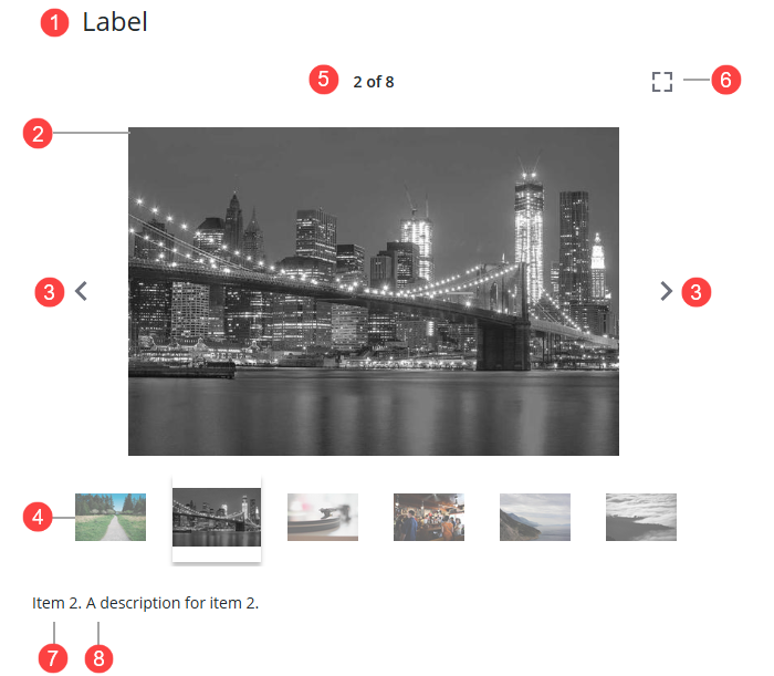
1. Widget label
2. Gallery panel—The primary area that displays media items.
3. Navigation arrows—Controls that allow users to browse through media items manually.
4. Thumbnail strip—An optional row of thumbnails that you can add to preview media items in the gallery.
5. Gallery counter—Shows the sequence number for the current media item and the total items in the gallery.
6. Full-screen button—A control that expands the widget to view images in full-screen mode.
7. Media title
8. Media description
Data Format
To display a media gallery, you must create a service that returns infotable data with the following fields.
|
Field Name
|
Base Type
|
Description
|
|---|---|---|
|
description
|
STRING
|
Optional. The description for the media item.
|
|
title
|
STRING
|
Optional. The title for the media item.
|
|
url
|
STRING
|
Required. The URL to the media item.
|
You can also manually enter values for the media gallery using the Add button next to the widget Data property.
Adding and Configuring the Widget
To add and configure the Media Gallery widget, perform the following steps:
1. Drag and drop the widget from the Widgets panel onto a container on the canvas.
2. Resize and position the widget as needed to fit your layout.
3. Bind the Data property to an infotable data source containing the media items you want to display.
4. Configure additional properties in the Properties panel:
5. Save the mashup and preview it to verify the widget's functionality.
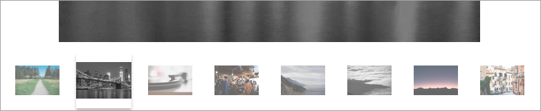
Displaying Preview Thumbnails
Set the ShowThumbnails property to True to show a strip of preview thumbnails below the current media. These thumbnails allow users to quickly navigate to specific media items. Ensure that your data source includes appropriate preview images.
Configuring Full-Screen Mode
The Media Gallery widget supports full-screen mode, allowing you to view gallery items in a full-screen view. At runtime, you can enter this mode by clicking the full-screen button. To close the full-screen view, press the ESCAPE button by click the exit button. In addition, you can configure the following properties for this mode:
• To show the media item labels, set the ShowLabelInFullScreen property to True.
• To show the gallery thumbnail in this mode, set ShowThumbnailsInFullScreen property to True.
Looping the Gallery
To enable continuous looping of the media items, set the LoopGallery property to True. This allows the gallery to automatically cycle through all items and return to the beginning.
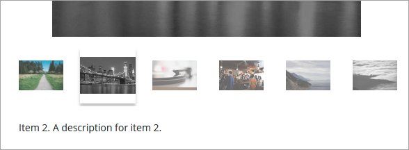
Adding Titles and Descriptions to Media Items
Adding titles and descriptions to the infotable data provides context and improve accessibility for each media item in the gallery. The following example shows a selected media item with both a title and a description. Item 2 is the media title, and the description appears next to it.
You can hide the title or the description for the media gallery items using the HideMediaTitle and HideMediaDescription properties.
Widget Properties
The following table lists the widget properties.
|
Property Name
|
Description
|
Base Type
|
Default Value
|
Bindable?
|
Localizable?
|
|---|---|---|---|---|---|
|
Label
|
Specifies the text for the widget label.
|
STRING
|
N/A
|
Y
|
Y
|
|
LabelType
|
Sets the type of label to display for the widget.
|
STRING
|
Header
|
N
|
N
|
|
LabelAlignment
|
Aligns the label text to the left, right, or the center of the widget. Options: Left/Center/Right
|
STRING
|
Left
|
N
|
N
|
|
ShowThumbnails
|
Shows thumbnails for media items when in the carousel view.
|
BOOLEAN
|
False
|
Y
|
N
|
|
ShowThumbnailsInFullScreen
|
Shows thumbnails for media items in full screen mode.
|
BOOLEAN
|
False
|
Y
|
N
|
|
LoopGallery
|
Loops through media items for continuous playback. When this property is enabled, clicking the next button on the last item returns to the first item.
|
BOOLEAN
|
False
|
Y
|
N
|
|
Data
|
The infotable data source for the widget.
|
INFOTABLE
|
N/A
|
Y
|
N
|
|
ShowLabelInFullScreen
|
Shows the media label in full screen mode.
|
BOOLEAN
|
False
|
Y
|
N
|
|
HideMediaDescription
|
Hides the media titles.
|
BOOLEAN
|
False
|
Y
|
N
|
|
HideMediaTitle
|
Hides the media descriptions.
|
BOOLEAN
|
False
|
Y
|
N
|
|
MediaDescriptionLableType
|
Sets the type of label to display for item description.
|
STRING
|
Body
|
N
|
N
|
|
MediaTitleLableType
|
Sets the type of label to display for item title.
|
STRING
|
Large Title
|