File Upload Widget (Themable)
The File Upload widget allows users to upload one or multiple files to a ThingWorx repository. You can configure the widget to upload files in one of the following ways:
• Select files on the local system by clicking a Browse button. Selected files are uploaded when the Upload button is clicked.
• Drag files from your local system to the drop zone on the widget.
In addition, you can configure validation rules to apply restrictions on the file type, size, amount, and more.
Widget Anatomy
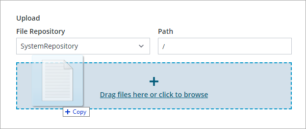
Drag and Drop
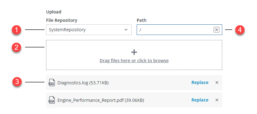
1. File repository selector
2. File drop zone
3. Uploaded files
4. Repository path
When you drag or select a file in this mode, files are instantly uploaded or listed, based on the value of the DisableInstantUpload property. Optionally, you can disable the AllowInstantUpload property and upload files manually using a button or the widget Upload service. In addition, a Replace button is displayed that enables you to replace an uploaded file on the repository.
Browse Button Only
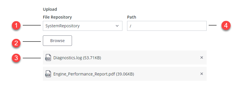
1. File repository selector
2. Browse button
3. Selected files
4. Repository path
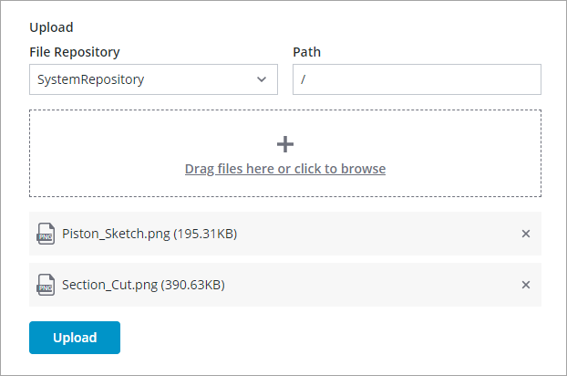
Disabling Instant Upload
By default, selected files are automatically uploaded to the repository. A progress bar is displayed to indicate the upload the progress for each file.
To allow users to review the selected files before uploading, set the widget DisbaleInstantUpload and ShowUploadButton properties to true. At run time, users can start the upload by clicking the Upload button. Optionally, bind a mashup, function, or widget event to the widget Upload service to start the upload based on a specific condition.
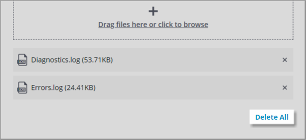
Adding a Delete Button
You can add a delete button to enable users to stop the upload and remove the selected files from the list. Uploaded files are only removed from the list and are not deleted from the ThingWorx Repository. To delete files from the repository, use a custom data service.
Uploading Files to a ThingWorx Repository
By default, users can use the available controls to select a repository and a folder to upload files to. To prevent users from choosing a repository or a folder path, set the ShowRepositoryPath and ShowRepositorySelector properties to false. You can specify the default repository name and folder using the widget RepositoryName and Path properties. For more information about repositories in the platform, see Managing File Repositories.
Validating File Size
By default, users can upload files of any size at run time. You can limit the maximum file size that is available for upload using the widget MaxFileSize property on the Validation panel. To customize the failure messages when a file is larger than the allowed maximum, configure the MaxFileSizeFailureMessage and MaxFileSizeFailureTitle properties.
Validating Upload Size
You can use the MaxUploadSize validation property to restrict the size of total upload. A failure message is displayed when the total upload size exceeds the limit. To customize the error message, use the MaxUploadSizeFailureMessage and MaxUploadSizeFailureTitle properties.
Maximum Number of Files
You can limit the maximum number of files that users can upload using the widget MaxFileSize property on the Validation panel. When the selected number of files is higher than the maximum, a failure message is displayed. To customize the error message, use the MaxNumberOfFilesFailureMessage property.
Restricting File Types
You can configure the widget to accept specific file formats using the AllowedFileTypes property. You can add multiple file types, separated by a comma. For example, type: .pdf, .png to allow PDF and PNG files only. Use the AllowedFileTypesMessage and AllowedFileTypesTitle properties to customize the error message that is displayed when an unsupported file type is added.
 |
Consider listing the supported file types in the drop zone label.
|
Configuring the File Drop Zone
You can drag files to the drop zone area or click the label to open a file selection dialog box. The zone color automatically changes to indicate that you can drop files.
You can use the following properties to configure the drop zone:
• DropZoneHeight—Sets a specific height for the drop zone.
• DropZoneIcon—Displays a media entity as an icon.
• DropZoneLabel—Sets the label to display. You can use this property to provide information about the supported file types and sizes.
Widget Properties
The following table lists properties that are available on the Properties panel.
|
Property Name
|
Description
|
Base Type
|
Defualt Value
|
Bindable (Y\N)
|
Localizable (Y\N)
|
|---|---|---|---|---|---|
|
BrowseButtonLabel
|
Sets the label of the Browse button.
|
STRING
|
Browse
|
Y
|
Y
|
|
BrowseButtonType
|
Sets the Browse button type. Options: Primary, Secondary, Tertiary
|
STRING
|
Primary
|
N
|
N
|
|
ClearList
|
A bindable service that clears the list of selected files.
|
Service
|
n/a
|
Y
|
N
|
|
CustomClass
|
Sets the CSS class to apply to the top div element of the widget. You can enter multiple classes, separated by a space.
|
STRING
|
n/a
|
Y
|
N
|
|
DisableInstantUpload
|
Disables instant upload when a file is select
|
BOOLEAN
|
False
|
||
|
DropZoneHeight
|
Sets the height of the file drop zone.
|
NUMBER
|
96
|
||
|
DropZoneIcon
|
Sets the icon to display within the drop zone.
|
IMAGELINK
|
n/a
|
||
|
DropZoneLabel
|
Sets the label of the drop zone.
|
STRING
|
Drag files here or click to browse
|
||
|
FileNames
|
Contains the names of the selected files.
|
STRING
|
n/a
|
Y
|
N
|
|
FileUploadMode
|
Specifies how files are selected at run time. You can drag and drop, or show a browse button.
|
STRING
|
Drag and Drop
|
N
|
N
|
|
RepositoryName
|
The name of the file repository used by the widget.
|
THINGNAME
|
SystemRepository
|
Y
|
N
|
|
ShowRespositorySelector
|
Displays whether the destination file repository should be editable.
|
BOOLEAN
|
True
|
N
|
N
|
|
Path
|
The folder path to upload files to on the repository.
|
STRING
|
n/a
|
Y
|
N
|
|
MultiFilesSelect
|
Enables multiple file selection.
|
BOOLEAN
|
False
|
N
|
N
|
|
ShowDataLoading
|
Displays a spinning icon when data is loading.
|
BOOLEAN
|
True
|
N
|
N
|
|
Width
|
The width of the widget.
|
NUMBER
|
302
|
N
|
|
|
Height
|
The height of the widget.
|
NUMBER
|
95
|
N
|
N
|
|
Visible
|
Sets the visibility of the widget at run time.
|
True
|
True
|
N
|
N
|
|
ClearList
|
Clears list of files added to the widget.
|
n/a
|
n/a
|
Y
|
N
|
|
DisbaleInstantUpload
|
Disables instant upload after a file is selected. when set to false, files are only uploaded after the upload button is clicked.
|
False
|
False
|
Y
|
N
|
|
ResetToDefaultValue
|
Resets the inputs for the widget to their default values.
|
n/a
|
n/a
|
Y
|
N
|
|
ShowDeleteAllButton
|
shows delete all button and allows users to cancel the upload and delete all uploaded files.
|
BOOLEAN
|
False
|
N
|
N
|
|
ShowRepositoryPath
|
Enables users to specify a path within the repository using a text field.
|
BOOLEAN
|
True
|
N
|
N
|
|
ShowRepositorySelector
|
Displays a drop-down list that enables users to select the ThingWorx repository to upload files to.
|
BOOLEAN
|
True
|
N
|
N
|
|
ShowUploadButton
|
Displays an upload button that uploads selected files. This property is only available when InstantUpload is set to false.
|
BOOLEAN
|
False
|
N
|
N
|
|
UploadComplete
|
A bindable event that triggers when the file upload is complete.
|
n/a
|
n/a
|
Y
|
N
|
|
Upload
|
A bindable service that uploads the selected files.
|
Service
|
|||
|
UploadDescription
|
Sets the description text that is used to guide users on what files to upload.
|
n/a
|
n/a
|
Y
|
N
|
|
UploadDescriptionType
|
The type of label used to display the description text.
|
Body
|
Body
|
N
|
N
|
|
UploadStarted
|
A bindable event that triggers when the upload starts.
|
n/a
|
n/a
|
Y
|
N
|
|
UploadFailed
|
A bindable event that triggers when a file fails to upload.
|
n/a
|
n/a
|
Y
|
N
|
Validating the File Upload Widget Data
Unlike other widgets that support validation, the File Upload does not support validation and criteria messages. You can define a criteria message and enable ShowFailureMessage to display a failure message when the ValidationState is Invalid.
 |
Only the Invalid state is available when styling the failure messages on the Style Properties panel.
|
For more information about using the common validation properties, see Text Field Widget (Themable).
The following table lists validation properties that are available on the Validation panel.
|
Name
|
Description
|
Base Type
|
Default Value
|
Bindable?
|
Localizable?
|
|---|---|---|---|---|---|
|
AllowedFileTypes
|
Sets the allowed files types that users can select, separated by comma. For example: .png, .pdf, .txt
|
STRING
|
N/A
|
Y
|
N
|
|
AllowedFileTypesMessage
|
The message to display when an unsupported file type is added.
|
STRING
|
Y
|
Y
|
|
|
AllowedFileTypesMessageDetails
|
The details to display under the message which lists the allowed file types.
|
STRING
|
Y
|
Y
|
|
|
CriteriaMessage
|
The message to display for the validation criteria and when the validation fails.
|
STRING
|
Y
|
Y
|
|
|
CriteriaMessageDetails
|
The details to display for the validation criteria and failure message.
|
STRING
|
Y
|
Y
|
|
|
FileRequired
|
Require a file to upload.
|
BOOLEAN
|
False
|
Y
|
N
|
|
FileRequiredMessage
|
The message to display when a required file is missing.
|
STRING
|
Y
|
Y
|
|
|
FileUploadErrorDetails
|
A message that displays additional details about files that failed to upload.
|
STRING
|
Y
|
Y
|
|
|
FileUploadErrorMessage
|
The message to display when a file fails to upload.
|
STRING
|
Y
|
Y
|
|
|
MaxFileSize
|
Sets a maximum size limit on each individual file in megabytes.
|
NUMBER
|
N/A
|
Y
|
N
|
|
MaxFileSizeFailureMessage
|
The message to display when a file exceeds the maximum allowed file size.
|
STRING
|
Y
|
Y
|
|
|
MaxFileSizeFailureTitle
|
The title of the dialog box that is displayed when the file size exceeds the maximum allowed file size.
|
STRING
|
Y
|
Y
|
|
|
MaxNumberOfFiles
|
Sets the maximum number of files that you can add to the upload list.
|
NUMBER
|
N/A
|
Y
|
Y
|
|
MaxNumberOfFilesFailureMessage
|
The message to display when the number of files added exceeds the maximum.
|
STRING
|
Y
|
Y
|
|
|
MaxUploadSize
|
Sets a maximum size limit in megabytes for the upload when multiple files are selected.
|
NUMBER
|
N/A
|
Y
|
N
|
|
MaxUploadSizeFailureMessage
|
The message to display when the total files size exceeds the maximum allowed file size.
|
STRING
|
Y
|
Y
|
|
|
MaxUploadSizeFailureTitle
|
The title of the dialog box that is displayed when the total file size exceeds the maximum allowed value.
|
STRING
|
Y
|
Y
|
|
|
ShowValidationFailure
|
Displays a failure message when the validation fails.
|
BOOLEAN
|
False
|
Y
|
N
|
|
ShowValidationState
|
A bindable service that enables you to display the validation state before a user interacts with the widget at run time. By default, the validation state is only displayed after user interaction.
|
Service
|
n/a
|
In
|
N
|
|
Validate
|
An event that triggers when the widget value is changed. Bind this event to service or function to apply a validation pattern or expression.
|
Event
|
N/A
|
Y
|
N
|
|
ValidationFailureIcon
|
Sets the SVG icon to display within the status message when the validation fails.
|
IMAGELINK
|
cds:icon_error
|
N
|
N
|
|
ValidationOutput
|
Retrieves the output of the widget validation. Returned values are Undefined, Unvalidated, Valid, or Invalid.
|
STRING
|
N/A
|
Y
|
N
|
|
ValidationState
|
A bindable property that sets the validation state. You can set this property to Undefined, Unvalidated, Valid, or Invalid.
|
STRING
|
Undefined
|
Y
|
N
|