Date Time Picker Widget (Themable)
Overview
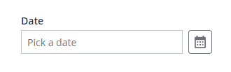
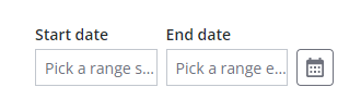
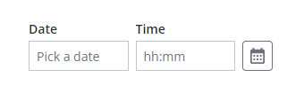
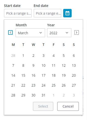
You can use the Date Time Picker widget to allow users to select a single date or time; or a range in a mashups. At run time, the widget is displayed in a collapsed state. Clicking the calendar icon opens a calendar view that displays selection drop-down lists in addition to the days for each month. The calendar drop-down lists are combination boxes that support keyboard input. You can type a value to select an item more quickly. The calendar button opens a pop-up calendar that enables you to select dates interactively. Different controls are displayed on the calendar based on the date picker configuration. You can configure the widget in the following ways:
• Enable range selection.
• Apply a minimum and a maximum value when selecting from a range.
• Customize the date and time format using the syntax of the Moment.JS library. For more information, see Formatting Date and Time for Widgets.
• Change the display order of the date.
• Enable time selection, with or without seconds.
• Display time using a 24–hour or a 12–hour format.
 |
Changes to Date Time Picker widget also affect the interface of the Chip Based Data Filter widget when applying date or time filters.
|
Date selections are only saved when the Select button is clicked, and are not saved when an area outside the widget is clicked or when the ESCAPE key is pressed.
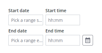
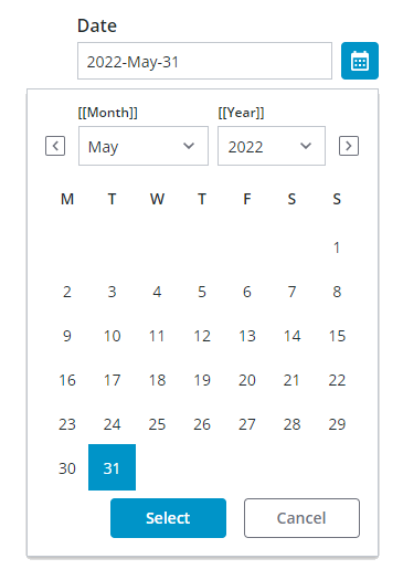
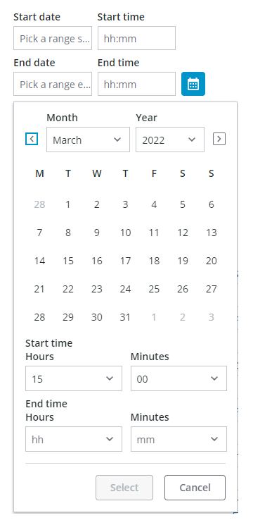
Widget Anatomy
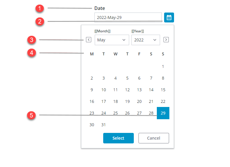
1. Widget label
2. Calendar button
3. Next and previous month buttons
4. Month calendar
5. Selected date
Additional selection boxes are added to the widget, depending on the configured date selection. The following table lists available options:
|
State and Configuration
|
Date Selection
|
Date with Range Selection
|
Date-and Time Selection
|
Date-and Time with Range Selection
|
|---|---|---|---|---|
|
Closed
|
 |
 |
 |
 |
|
Open
|
 |
 |
 |
 |
Enabling Range Selection
When selecting a range, the first selection is used as the start of the range. However, dates are automatically switched to keep a valid range when the second date selection is earlier than the first date. In addition, clicking a new date clears the existing range and initiates the selection of a new range.
Applying Restrictions on Date Selections
You can restrict the date range that is available for selection on the calendar in one of three ways:
• Using the MinDate and MaxDate properties when selecting a single date, or the MinStartDate, MaxStartDate, MinEndDate, and MaxEndDate.
• Using YearRange property. By default, the range value is set to 10 years.
• Using MaxRange property, to restrict the available date to a specific range.
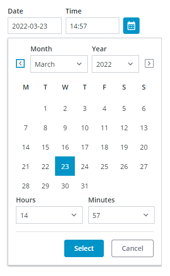
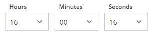
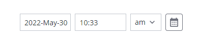
Enabling Time Selection
By default, the date-time picker allows you to select dates. Enabling time selection lets users select specific time or a time range in addition to dates on the calendar. To add time selection to the widget, set the widget DateOnly property to false. By default, time selection is configured for hours and minutes. You can let users select seconds by setting the DisplaySeconds property to true. The following image shows the widget with time selection that includes seconds.
Customizing the Range Value
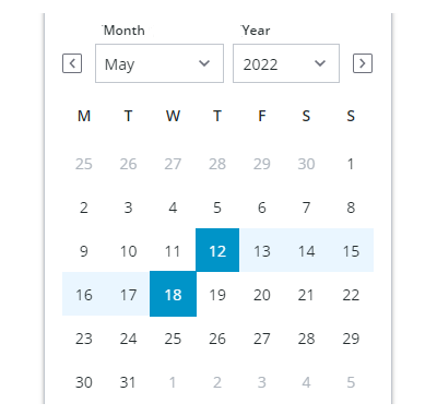
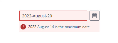
By default, the widget displays all dates. You can use the MaxRange property to restrict the date selection to a specific range. For example, to set the possible range to 20 days. Set the DateRange property to true and the MaxRange property on the Validation panel to 20.
The following image shows a selected range value and dates that are out of range. The range is calculated at run time after the user selects an initial start or end date. MaxRangeis within the Minimum and maximum start and end dates .On selection, dates outside the set value are then disabled; see example number 3 in the image.
Customizing the Time Format
Time is displayed using a 24–hour format by default. To display the time using a 12–hour format, set the widget TwelveHourClock property to true. An additional drop-down list is displayed for AM or PM selection.
|
|
You can use the arrow keys to select PM or AM.
|
Setting Date and Time Intervals
Use the Interval property to offset the default selected value relative to the current date or time when the widget is displayed at run time. You can offset the selected value forwards or backwards by days, hours, minutes, or seconds using the IntervalType property. For example, to advance the selected time on the date picker widget by 30 minutes, set the IntervalType property to Minutes and the Interval property to 30.
Customizing the Date Order
By default, the date order is automatically set according to the locale of the user viewing the mashup. For example, in some geographies, dates are displayed using Day-Month-Year format while others use Month-Day-Year. You can manually set the order for all users using the widget DateOrder property. When you apply a specific order, MonthFormat and DateDelimiter are added to the list of properties.
Customizing the Date Format
You can set the date format by configuring the widget FormatToken property based on the MomentJS library syntax. For more information about the formatting options for dates, see Formatting Date and Time for Widgets.
Using Input Masks
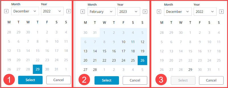
By default, the widget displays a string of characters that indicate the date or time format that are supported by the widget. Using the combination box allows users to type a widget value more quickly, without opening the calendar. You can disable input masks by setting the DisableMaskedInput property to true. The following image shows a date update where an input masks is displayed.

Widget Properties
|
Property
|
Description
|
Base Type
|
Default Value
|
Bindable? (Y/N
|
Localizable?
|
||
|---|---|---|---|---|---|---|---|
|
Label
|
The text that is displayed in the label of the Date Time Picker widget.
|
STRING
|
N/A
|
Y
|
Y
|
||
|
LabelAlignment
|
Aligns the widget label to the Left, Right, or Center.
|
STRING
|
Left
|
Y
|
N
|
||
|
Disabled
|
Use this property to disable the widget in the mashup. The widget is displayed in the mashup but you cannot click it.
|
BOOLEAN
|
False
|
Y
|
N
|
||
|
DisableMaskedInput
|
Disables the input mask that displays a preview of the date pattern at run time.
|
BOOLEAN
|
False
|
Y
|
N
|
||
|
HintText
|
Displays placeholder text that explains what should be entered in the field.
|
STRING
|
SELECT DATE & TIME
|
Y
|
Y
|
||
|
DateOnly
|
Allows users to select dates only. To enable time selection, set this property to false.
|
BOOLEAN
|
TRUE
|
N
|
N
|
||
|
DisplaySeconds
|
Enables you to display the time with seconds. Available when DateOnly is false.
|
BOOLEAN
|
FALSE
|
N
|
N
|
||
|
DateDelimiter
|
Specifies the character used to separate the day, month, and year. For example, a (—) hyphen displays the date as: 05–10–2020.
|
STRING
|
N/A
|
N
|
Y
|
||
|
MonthFormat
|
Enables you to control the month format within the date. Supported options:
• Full—October
• Short—Oct
• Numeric—10
|
STRING
|
Full
|
N
|
N
|
||
|
PrimaryActionPosition
|
Enables you to set the position of the primary action button to the Left or Right
The primary action is the
• Done
button in the button group.
|
STRING
|
Left
|
N
|
N
|
||
|
DateOrder
|
Enables you to set the format of the date display. Supported options:
• Auto
• Day-Month-Year
• Month-Day-Year
• Year-Month-Day
Changing this property from Auto to a specific order adds the DateDelimiter and MonthFormat properties to the widget.
|
STRING
|
Auto
|
N
|
N
|
||
|
FormatToken
|
When the default Auto is selected, the system date appears in the widget. Also, the DateDelimiter and MonthFormat properties are hidden.
|
STRING
|
N/A
|
N
|
Y
|
||
|
MinDate
|
Sets the minimum date available for the date selection.
|
DATETIME
|
Default hint text
|
In
|
N
|
||
|
MaxDate
|
Sets the maximum date available for the date selection.
|
DATETIME
|
Default hint text
|
In
|
N
|
||
|
DateRange
|
Enables range selection for dates.
|
BOOLEAN
|
False
|
||||
|
RangeChanged
|
An event that triggers when the selected date range is changed.
|
Event
|
N/A
|
Y
|
N
|
||
|
HintText
|
The hint text to display as a placeholder within the widget. Hint text is displayed based on the applied pattern when input masking is enabled.
|
STRING
|
Autohint
|
Y
|
Y
|
||
|
StartDateHintText
|
Sets the hint text to display for the start date when range selection is enabled.
|
STRING
|
Autohint
|
Y
|
Y
|
||
|
EndDateHintText
|
Sets the hint text to display for the end date when range selection is enabled.
|
STRING
|
Autohint
|
Y
|
Y
|
||
|
StartDateLabel
|
Sets the label to display for the start date on the calendar.
|
STRING
|
N/A
|
Y
|
Y
|
||
|
EndDateLabel
|
Sets the label to display for the end date on the calendar.
|
STRING
|
N/A
|
Y
|
Y
|
||
|
StartTimeLabel
|
Sets the label to display for the end time field on the widget.
|
STRING
|
From
|
Y
|
Y
|
||
|
EndTimeLabel
|
Sets the label to display for the end time field on the widget.
|
STRING
|
To
|
Y
|
Y
|
||
|
AMPMLabel
|
Sets the label to display for the AM/PM drop-down list when using a 12–hour time format.
|
STRING
|
AM/PM
|
Y
|
Y
|
||
|
CalendarStartTimeLabel
|
Sets the label to display above the time start field on the calendar when range selection is enabled.
|
STRING
|
N/A
|
Y
|
Y
|
||
|
CalendarEndTimeLabel
|
Sets the label to display above the time end field on the calendar when range selection is enabled.
|
STRING
|
N/A
|
Y
|
Y
|
||
|
MinStartDate
|
Sets the minimum date available for the date range selection.
|
DATETIME
|
Default hint text
|
In
|
N
|
||
|
MaxStartDate
|
Sets the maximum date available for the start date when selecting a date range.
|
DATETIME
|
Default hint text
|
In
|
N
|
||
|
MinEndDate
|
Sets the minimum date available for the end date when selecting a date range.
|
DATETIME
|
Default hint text
|
In
|
N
|
||
|
MaxEndDate
|
Sets the maximum date available for the date range selection.
|
DATETIME
|
Default hint text
|
In
|
N
|
||
|
IntervalType
|
Enables you to set an interval type as Hours,Minutes,Seconds or Days.
|
STRING
|
Hours
|
N
|
N
|
||
|
Interval
|
Sets the date or time interval.
|
NUMBER
|
N/A
|
N
|
N
|
||
|
CustomClass
|
Enables you to define the CSS class name to apply to the top div element of the widget. You can enter multiple classes, separated by a space.
|
STRING
|
N/A
|
Y
|
N
|
||
|
TabSequence
|
The sequence of the widgets in which they are highlighted when the user presses Tab key.
|
NUMBER
|
N/A
|
N
|
N
|
||
|
WeeklyCalendarStart
|
Enables you to configure the weekly calendar to start on Sunday or Monday.
|
STRING
|
Monday
|
N
|
N
|
||
|
InitializeWithCurrentDateTime
|
Displays the current date and time as the default selection when the widget is viewed at run time.
|
BOOLEAN
|
TRUE
|
N
|
N
|
||
|
LabelAlignment
|
Enables you to align the label to the left, right or center on the widget.
|
STRING
|
Left
|
N
|
N
|
||
|
DateTime
|
Enables you to set or retrieve the selected value on the widget.
|
DATETIME
|
N/A
|
Y
|
N
|
||
|
Changed
|
A bindable event that is triggered when the data for this widget is modified.
|
N/A
|
N/A
|
Y
|
N
|
||
|
ResetToDefaultValue
|
Resets the inputs for this widget to its default values.
|
N/A
|
N/A
|
Y
|
N
|
||
|
Width
|
The width of the widget.
|
NUMBER
|
N/A
|
N
|
N
|
||
|
Height
|
The height of the widget. The height is set to the maximum width of the label by default. It increases if the widget has multiline label. Enter a value in the property panel or resize the widget in the canvas to set a fixed height.
|
NUMBER
|
N/A
|
N
|
N
|
Validating Date Time Picker Widget Data
In addition to the common properties, you can use MaxDate and MinDate properties to restrict the available date range in the widget. When a date outside of the range is selected, a failure message is displayed.
To configure the default failure messages, use the MinDateFailureMessage and MaxDateFailureMessage properties or the MaxRangeFailureMessage property.
For more information about the common validation properties, see Applying Validation to Widgets.
|
Property
|
Description
|
Base Type
|
Default Value
|
Bindable (Y/N)
|
Localizable (Y/N)
|
|---|---|---|---|---|---|
|
CriteriaMessage
|
The message to display for the validation criteria and when the validation fails.
|
STRING
|
n\a
|
Y
|
Y
|
|
CriteriaMessageDetails
|
The details to display for the validation criteria and failure message.
|
STRING
|
n\a
|
Y
|
Y
|
|
MaxDate
|
Sets the maximum date available for the date selection.
|
DATETIME
|
${value} is the maximum value
|
Y
|
N
|
|
MaxRange
|
Set the maximum number of days to restrict the user to select Start Date and End Dates.
|
NUMBER
|
n\a
|
N
|
N
|
|
MaxRangeFailureMessage
|
The message to display when the selected range between the start and end dates exceeds the MaxRange value.
|
TEXT FIELD
|
n\a
|
IN
|
Y
|
|
MaxDateFailureMessage
|
The message to display when the selected date is later than the maximum date value.
|
DATETIME
|
${value} is the maximum date
|
Y
|
Y
|
|
MinDate
|
The minimum date available for the date selection.
|
DATETIME
|
${value} is the maximum date
|
Y
|
N
|
|
MinDateFailureMessage
|
The message to display when the selected date is earlier than the minimum date value.
|
DATETIME
|
${value} is the minimum date
|
Y
|
Y
|
|
RequireValidDate
|
Requires a valid and complete date for the date validation to be successful when entering date values.
|
BOOLEAN
|
False
|
Y
|
N
|
|
InvalidDateMessage
|
The message to display when the date value is invalid or incomplete.
|
STRING
|
Invalid date
|
Y
|
Y
|
|
RequiredMessage
|
The message to display when a required value is missing.
|
STRING
|
A value is required
|
Y
|
Y
|
|
ShowValidationCriteria
|
Shows a hint message about the required input when editing the date time picker.
|
BOOLEAN
|
False
|
Y
|
N
|
|
ShowValidationFailure
|
Show a failure message when the entered value fails the validation.
|
BOOLEAN
|
False
|
Y
|
N
|
|
ShowValidationState
|
A bindable service that enables you to display the validation state before a user interacts with the widget at run time. By default, the validation state is only displayed after user interaction.
|
Service
|
n/a
|
In
|
N
|
|
ShowValidationSuccess
|
Show a success message when the entered value is validated as successful.
|
BOOLEAN
|
False
|
Y
|
|
|
SuccessMessage
|
The message to display when the value is valid.
|
STRING
|
n\a
|
Y
|
Y
|
|
SuccessMessageDetails
|
A secondary message that displays more information about the validation success message.
|
STRING
|
n\a
|
Y
|
Y
|
|
Validate
|
A bindable event that is triggered when the widget value is changed. Bind this event to service or function to apply a validation pattern or expression.
|
Event
|
n\a
|
Y
|
N
|
|
ValidationCompleted
|
An event that triggers when all validation for this widget is completed.
|
Event
|
n\a
|
Y
|
N
|
|
ValidationCriteriaIcon
|
Sets the SVG icon to display within the hint message for the validation criteria.
|
IMAGELINK
|
info
|
N
|
N
|
|
ValidationFailureIcon
|
Sets the SVG icon to display within the status message when the validation fails.
|
IMAGELINK
|
error
|
N
|
N
|
|
ValidationOutput
|
Retrieves the output of the widget validation. Returned values are undefined,unvalidated ,valid , orinvalid.
|
STRING
|
n\a
|
Y
|
N
|
|
ValidationState
|
A bindable property that sets the validation state. You can set this property to undefined, unvalidated, valid, invalid.
|
STRING
|
undefined
|
Y
|
N
|
|
ValidationSuccessIcon
|
Select an SVG icon to display within the statues message when the validation succeeds.
|
IMAGELINK
|
success
|
N
|
N
|
|
ValueRequired
|
Require a date or time selection in the widget.
|
BOOLEAN
|
False
|
Y
|
N
|