Applying Custom CSS Styling to Web Component Widgets
We recommend styling component widgets by creating a custom style themes or using the style properties that are available on the Style Properties panel in Mashup Builder. Applying custom CSS styles to web-component widgets is not recommended. For more information, see Style Themes and Using the Style Properties Panel.
You should consider the following guidelines when applying CSS to a web-component widget:
• Custom CSS may stop working if the DOM structure of a web-component is changed in a future version of ThingWorx. You must review and update your custom CSS rules manually after upgrading.
• Unlike legacy widgets, the web components functionality, behavior, and style is encapsulated inside a hidden tree that is attached to the main DOM. The hidden tree is named Shadow DOM. Plain CSS may not work when styling complex widgets that contain sub-components. For more information about Shadow DOM concepts, refer to the following article Using shadow DOM - Web Components | MDN (mozilla.org).
• To apply custom CSS, you should be familiar with the web component structure, including sub-components, part names, available states, and style properties. For more information about web components and their style properties, variants, and states, refer to the ThingWorx Web Component SDK documentation.
• To style sub-component parts that are exposed using the part attribute, use the CSS ::part() pseudo selector.
• To support styling elements within the Shadow DOM, most complex web components support adding external style modules into the component. These style modules can target the subparts of the component and any of their states using CSS selectors.
• CSS features are not supported consistently across all browsers, which can cause styles to display differently for users that are using different browsers. You can add a ptcs-style-unit when plain or shadow parts CSS syntax are not applying correctly to a web component.
• Loading custom CSS stylesheets from external domains is not supported. Some browsers implement security measures to block importing custom CSS files from different servers.
• To target a single widget or mashup with custom CSS, you can apply a unique class using the CustomClass property for the widget or the mashup.
Using Plain CSS
You can use plain CSS to style the element that the Shadow DOM tree is attached to. The following example shows using plain CSS to style ptcs-button as a large button:
ptcs-button
{
  color: #FAFAFA;
  background-color: #2B80D5;
  padding: 0px 60px;
  font-size: 24px;
  font-weight: bold;
  height: 80px;
  border-radius: 6px;
}
Preview
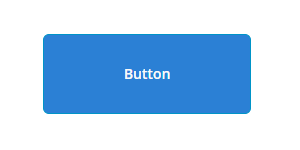
You can only use plain CSS to style the main web component or to specify inheritable properties. This method does not work when styling components that contain multiple sub-components. The following sections describes how to styles to the sub-components using ptcs-style-unit inside the Shadow DOM.
Adding a ptcs-style-unit Element
You can use the standard @supports CSS rule to add a ptcs-style-unit element within a web-component when plain or shadow parts CSS does not work. This element enables you to apply CSS to sub-components inside the Shadow DOM tree. Use the part attribute to specify the element to style within the Shadow DOM hierarchy. For example:
@supports (ptcs-style-unit: "PTCS-DATEPICKER") {
  [part=date-field] {
    background-color: red;
  }
}
You can also add variant and state selectors. The following sections show examples of using the ptcs-style-unit to apply custom CSS to different widgets in Mashup Builder.
 |
You can achieve some of the following styles using style properties. We recommend using style properties instead of CSS when possible.
|
For more information about ptcs-style-unit and the available selectors, see ptcs-style-unit - ThingWorx Web Component SDK.
Example: Styling a Button Widget
|
CSS
|
Description
|
Preview
|
||
|---|---|---|---|---|
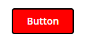
@supports (ptcs-style-unit: "PTCS-BUTTON.primary") {
|
Sets the background color of the button to red and applies a blue border.
|
 |
||
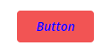
@supports (ptcs-style-unit: "PTCS-BUTTON.danger") {
|
Sets the label color of the button danger variant to blue and the font style to italic.
|
 |
||
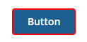
@supports (ptcs-style-unit: "PTCS-BUTTON.primary") {
|
Displays a red border around the button when the hover state is active.
|
 |
||
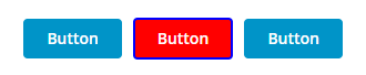
@supports (ptcs-style-unit: "PTCS-BUTTON.primary") {
|
Sets the background color of a button with CustomClass value of custom-button to red and applies a blue border. In the example, only the middle button has a custom CSS class set.
|
 |
Example: Styling a Text Field
|
CSS
|
Description
|
Preview
|
|---|---|---|
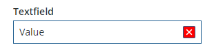
@supports (ptcs-style-unit: "PTCS-TEXTFIELD") {
|
Sets the color of the clear button to red.
|
 |
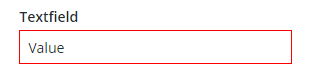
@supports (ptcs-style-unit: "PTCS-TEXTFIELD") {
|
Sets the color of the text box border to red.
|
 |
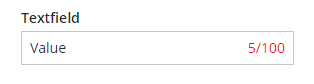
@supports (ptcs-style-unit: "PTCS-TEXTFIELD") {
|
Sets the color of the character counter to red.
|
 |
Example: Styling a Dropdown Widget
|
CSS
|
Description
|
Preview
|
|---|---|---|
@supports (ptcs-style-unit: "PTCS-DROPDOWN") {
|
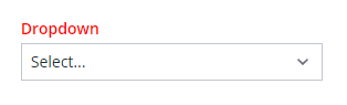 |
|
@supports (ptcs-style-unit: "PTCS-DROPDOWN") {
|
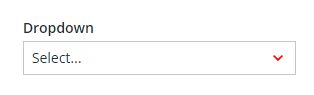 |
|
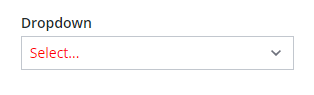
@supports (ptcs-style-unit: "PTCS-DROPDOWN") {
|
Sets the color of the selected item value to red.
|
 |
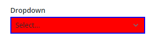
@supports (ptcs-style-unit: "PTCS-DROPDOWN") {
|
Sets the background color of the drop-down to red and the border to blue.
|
 |
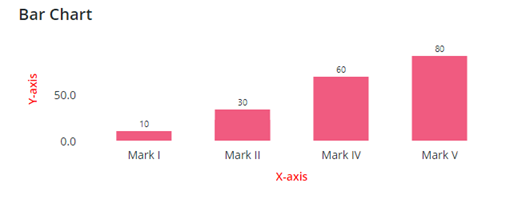
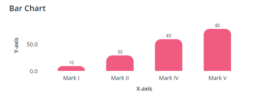
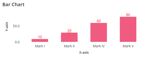
Example: Styling a Bar Chart
|
CSS
|
Description
|
Preview
|
|---|---|---|
@supports (ptcs-style-unit: "PTCS-CHART-AXIS") {
|
Sets the color of the chart axes to red.
|
 |
@supports (ptcs-style-unit: "PTCS-CHART-CORE-BAR") {
|
Rounds the top right and top left corners of columns.
|
 |
@supports (ptcs-style-unit: "PTCS-CHART-CORE-BAR") {
|
Sets the color and font style of the column data labels.
|
 |