Item Identity
Definition and Usage
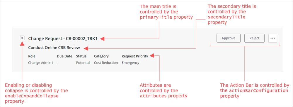
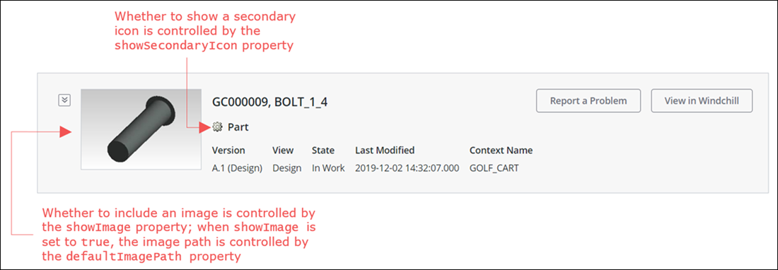
The Item Identity component is a widget that lets you display basic information, also known as identity information, on a specific item. The information appears in a panel, typically at the top of the item page. The panel contains the image, primary title, secondary title, secondary icon, and various identity attributes for the item. The secondary icon indicates the item type and can be configured to use Windchill icons. The Item Identity component also contains an embedded Action Bar, which contains actions that you can execute on the item.
The following is a sample image showing the Item Identity component:

You can configure the Item Identity component in the following ways:
• Define the primary and secondary titles
• Configure the actions available in the embedded Action Bar
• Define the identity attributes to display
• Choose whether to show an image and define a default image path
• Choose whether to show a secondary icon
• Choose whether the panel can be collapsed
Task Identity, Part Identity, and Document Identity are the predefined configurations available for the Item Identity component.
Binding Properties
Input | ||||
|---|---|---|---|---|
Property Name | Description | Property Type | ||
Input | Used for identifying the data to be fetched from the backend system. The following is a sample: Sample JSON: { "version":"1.0.0", "data":[ { "adapter":{ "thingName":"PTC.WCAdapter", "instanceName":"windchill" }, "itemListsData":[ { "objectType":"PTC.ChangeMgmt.ChangeRequest", "items":[ { "id":{ "value":"OR:wt.change2.WTChangeRequest2:439476" } } ] } ] } ] }
| JSON in CCO format | ||
TailoringName | Uniquely identifies an instance of the Item Identity component. This value is used internally for looking up tailoring information for that specific instance. Only use this binding property in when there is a dedicated tailoring page for your custom task. | String | ||
Configuration Properties
The following table and images show the JSON properties used to configure this component.
For more information on the structure of the configuration, see Component Configuration Structure.
For more information on sub-properties, see Sub-Properties and Container Keys.


Property Name | Description | Property Type | Default Value | Required or Optional | |||
|---|---|---|---|---|---|---|---|
actionBarConfiguration | Actions to show in the Action Bar in the user interface. See the Action Bar component for more information. | N/A | Optional | ||||
attributes | The list of attributes for which the data is fetched from backend system.
| N/A | Optional | ||||
defaultImagePath | The default path for fetching the image. This property is a sub-property to showImage and is only relevant when showImage is set to true. Its container key is itemIdentityShowImageDefinition. | N/A | Required when showImage is set to true. | ||||
enableExpandCollapse | Determines whether the Item Identity panel can be collapsed and expanded in the user interface. When set to true, the panel can be collapsed to show only the primary title and when relevant, the Action Bar. When set to false, the panel cannot be collapsed and is always fully expanded. | true | Required | ||||
primaryTitle | The main title which appears at the top of the Item Identity panel. | N/A | Required | ||||
secondaryTitle | The secondary title, which appears below the primary title in the Item Identity panel. | N/A | Required | ||||
showImage | Determines whether to show an image in the Item Identity panel. Options: true, false. When set to true, an image is shown in the panel. Define the image path using the defaultImagePath property. When set to false, no image is shown. | N/A | Required | ||||
showSecondaryIcon | Whether to show a secondary icon. Options: true, false. When set to true, a secondary icon is shown in the panel. When set to false, no secondary icon is shown. | false | Required | ||||
Sample Configuration
For sample configurations for the Item Identity component, see Task Identity, Part Identity, and Document Identity.
Customization Services
In addition to configuration, each component supports extending its business logic to customize the component. The business logic of each component includes overridable services in a Thing Template that you can extend and override. The overridable services for this component are detailed in the following table.
For examples of returns and parameters for each service, see Examples of Input/Output for Customization Services.
Name | Description |
|---|---|
GetConfigurations | Returns the available configurations for the component implementation. Parameters: None Returns: JSON |
GetImplementationLabel | Returns either the localized name of the component or the token that can be used to obtain the localized name. This localized name is displayed in the Mashup Builder user interface. Parameters: None Returns: String |
ProcessAttributesConfiguration | Processes the attributes configuration and splits attributes into out-of-the-box attributes and additional attributes. Returns a JSON with key value pairs in the following form: • OOTBAttributes : OOTB Attributes configuration CCO JSON • additionalAttributes : Additional Attributes configuration CCO JSON The attributes are split into out-of-the-box and additional based on their object type. Attributes that have object type ending with .Custom.Adapter or .Custom.Implementation are treated as additional attributes. All other attributes are considered out-of-the-box attributes. The Item Identity component doesn’t support using only attributes with an object type ending in .Custom.Implementation. Make sure to use at least one attribute with a different object type. Parameters: attributes (Required)– JSON with the list of out-of-the-box attributes and additional attributes. configuration (Optional)– JSON with the final merged configuration obtained from the Tailoring Manager resource. Returns: JSON in CCO format |
GetItemIdentityAttributes | Checks configuration and adds any additional attributes that are required, and then calls GetAttributeValues to fetch all attribute values from the backend system. Parameters: input (Required)– JSON in CCO format that includes the input ID for the data to be fetched from the backend system and the adapter information for the backend system. configuration (Optional)– JSON with the final merged configuration obtained from the Tailoring Manager resource. attributes (Required)– JSON with the list of out-of-the-box attributes, as defined in the configuration or set via tailoring. Returns: JSON |
GetAttributesValues | Returns a JSON with attributes and their values. Parameters: input (Required)– JSON in CCOformat that includes the input ID for the data to be fetched from the backend system and the adapter information for the backend system. configuration (Optional)– JSON with the final merged configuration obtained from the Tailoring Manager resource. attributes (Required)– JSON with the list of out-of-the-box attributes and additional attributes. Returns: JSON in CCO format |
GetAdditionalAttributes | Returns the list of additional attributes to be added to the list of available out-of-the-box attributes. Parameters: None Returns: JSON |
Implementation Definition
For implementation definitions for the Item Identity component, see Task Identity, Part Identity, and Document Identity.