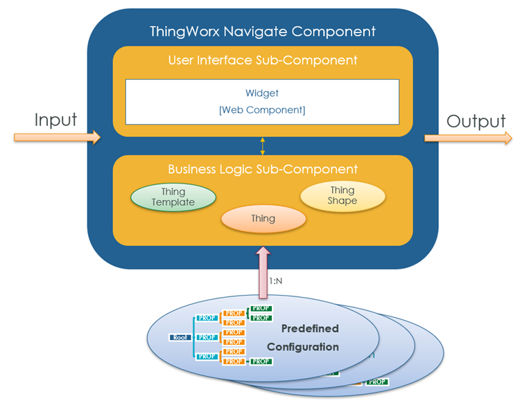
Overview of ThingWorx Navigate Components
This topic provides an overview on how to develop applications using ThingWorx Navigate components that can be reused throughout your applications. It also provides best practices for configuring and customizing these reusable components.
When you build your applications with components, you can easily reuse standard components as well as configure and customize components to suit your business needs. This approach speeds up your development time and minimizes your maintenance cost. It also results in consistency across your applications that improves the user experience of your product.
For more general information on components, see the section Building ThingWorx Solutions Using Reusable Components in the ThingWorx Help Center. Note that ThingWorx Navigate components are classified as composite components, in accordance with the terminology used in that section.
Components in ThingWorx Navigate
ThingWorx Navigate components improve and simplify application development because they can be used out-of-the-box to assemble into custom tasks. When you insert a component into a mashup, the component object type or behaviors should be further configured. This can be done via the configuration drop-down or, for more advanced configuration, via the JSON configuration. Some components have one or more predefined configurations available, which can be used for specialized applications with minimal additional configuration. For example, the Item List component has six predefined configurations: Tasks, Drawings, Part Structure, Attachments, Affected Items, and Activity. Each of these is a specialized configuration of the Item List component.
The components’ predefined configurations use Windchill as their backend system. Thus, all access control settings, attribute visibility configurations, and security labels that are configured in Windchill are honored by ThingWorx Navigate components. As a result, users can only see what the Windchill rules allow them to see.
The following diagram and table provide a summary of the existing components and their predefined configurations. The components are based on the PTC Design System to ensure consistency.

Component | Description | Predefined Configurations |
|---|---|---|
Item List | Displays a data set as a flat list or as a structure tree in a grid format. It includes sorting, filtering, and searching as well as more advanced capabilities. | Tasks, Drawings, Part Structure, Attachments, Affected Items, Activity |
Attributes | Displays data in the form of name-value pairs. | Generic |
Tiles | Displays a set of tiles. Each tile displays data in the form of a name-value pair. Tiles can be used to highlight key pieces of information so users can see them at a glance. | Generic |
Item Identity | Displays basic identity information on a specific item, including the title and identity attributes. | Task Identity, Part Identity, Document Identity |
Progress | Displays a summary of progress on an item, including member votes and how many members have already taken action. | Task Progress |
Action Bar (BETA) | Displays available actions. Typically embedded into Item List and Item Identity to enable actions within those components. When you use this BETA component, you will need to make updates in future releases. | None |
ThingWorx Navigate Component Composition
ThingWorx Navigate components are composite components. They are made of smaller sub-components, which combine to create powerful components that add business value.
Each component typically consists of two different sub-components, a user interface sub-component and a business logic sub-component.
User Interface Sub-Component
The user interface sub-component is a single widget created outside of ThingWorx which is packed and imported into ThingWorx. It is typically written in web-component technology.
The user interface sub-component communicates with the business logic sub-component via services.
Business Logic Sub-Component
The business logic sub-component retrieves and processes the business data from the backend systems.
Business logic sub-components are designed to be customized and extended.
Component Configuration
The ThingWorx Navigate components are inherently configurable. During design time, when you add a component to a mashup, all the configuration parameters for the component can be specified as a single configuration JSON object. In the future, the plan is to provide a user interface that allows setting each parameter individually.
By design, ThingWorx Navigate components are robust. As such, a typical configuration JSON object consists of dozens of parameters to configure. To speed up work and avoid unnecessary errors, ThingWorx Navigate ships one or more predefined configurations with each component. Each of the predefined configurations is named and can be selected when configuring a component. Once you select a predefined configuration, the entire configuration JSON auto-populates in the configuration box, and you can make minor tweaks to the configuration without needing to create the entire configuration JSON.
For more detailed information on selecting and configuring components and predefined configurations, see Add and Configure Components.
The following diagram sums up the basic composition of a ThingWorx Navigate component:
