To Define Axes Limits in Your Worksheet
1. In a worksheet, insert a Chart component.
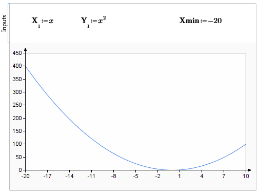
2. Insert X1 and Y1 and set their values to x and x2, respectively. The trace appears in the plot area.

3. To set the lowest value of the X-axis, in the Inputs area, type and define Xmin. This affects the range of the plotted points. In the example below, the X-axis range now extends from –20 to 10.
You can filter your X-axis values to display a decreased range:
• Click >  > . Select the User-Defined Range check box. In the Minimum box, edit the X-axis value.
> . Select the User-Defined Range check box. In the Minimum box, edit the X-axis value.This only filters values you already defined with Xmin and does not add new plot points. In the example above, if you edit the Minimum to -30, the X-axis would extend to -30 but no additional points would appear between -30 to -20.
You can also filter ranges you already defined for other axes. This does not plot new points, meaning you can only display decreased ranges from what you already defined for Xmax, Ymin, Ymax, Y2min, and Y2max. If you edit the Minimum or Maximum for each axis to increase the range, you will not see new points, only a larger plot area. The axes will be updated accordingly, but only the points that you previously defined will appear.
To avoid confusion, consider defining your axes limits either in your worksheet or in the PTC Mathcad Chart application, but not both. |