Example: Contour Plots or Level Curves
Contour Plot of a Function
Use a contour plot to produce level curves of a function of two variables.
1. Enter a function F of two variables:

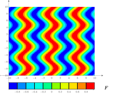
2. Plot the function in a contour plot:

Function F is automatically plotted on a square grid with an x and y axis range of -10 to 10. You can manually change the plot tick mark values, or you can set them using the arguments of the CreateMesh function.
3. Enter the endpoints of the x range:


4. Enter the number of divisions of x range:

5. Enter the endpoints of the y range:


6. Enter the number of divisions of y range:

7. Use CreateMesh to build a grid of values:

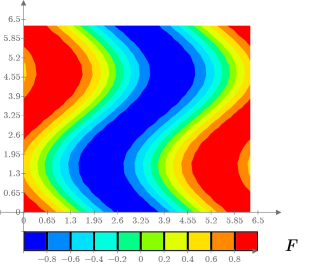
8. Plot the output of CreateMesh.

The plot is focussed on the first quadrant of the XY plane and the width of the plot is 2π.
Contour Plot of Data
Use a contour plot to display data recorded in a matrix.
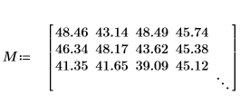
1. Define a matrix.

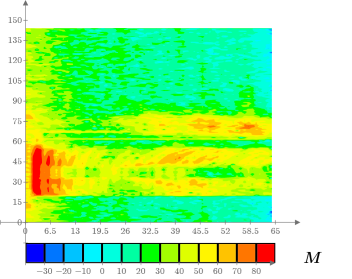
2. Use a contour plot to visualize the data:

By examining the color scale and the contour plot you can visually get a gross idea about the value of the matrix elements. For example, you can see that columns 90 and higher have no elements, in all matrix rows, that fall within the red interval of the color scale (or whose value is greater than or equal to 80). |
3. Verify that there are no elements that fall within the red interval of the color scale (greater than 80) past column 90:
a. Use the submatrix function to extract rows 0-64 and columns 90-144 of matrix M:


There are no matching values.