![[Previous Page]](../../icons/Nav_Prev.png "Previous Page")
![[Next Page]](../../icons/Nav_Next.png "Next Page")
![[Integration Kit Contents]](../../icons/Nav01_Home.png "Integration Kit Contents")
![[Integration Kit What's New]](../Nav02_WhatsNew.png "Integration Kit What's New")
![[Integration Kit Function Index]](../../icons/Nav03_Index.png "Integration Kit Function Index")
![[More Documentation]](../../icons/Nav04_Advanced.png "More Documentation")
![[PTC]](../../icons/logo.png "Visit PTC.Com")
| |
|
The Creo Elements/Direct Modeling Fluent User Interface replaces the previous Menu and Task Bar UI and includes these major components:
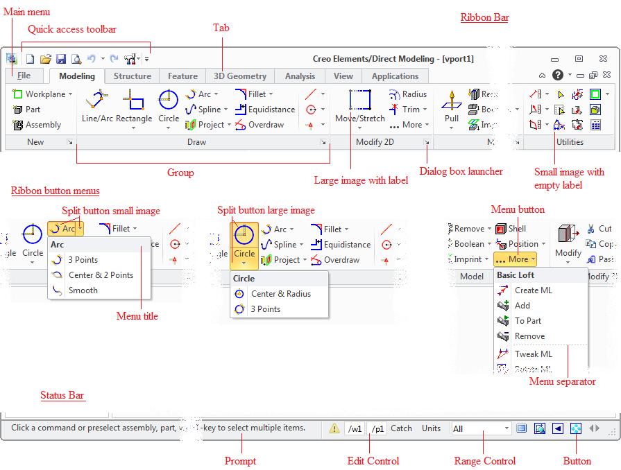
A ribbon is a command bar structured into tabs and groups. A group is a labeled set of commands which are closely related. In addition to tabs and groups a ribbon consists of:
The status bar displays current prompt text and contains additional controls for certain actions like setting current part or workplane.
Mini toolbars are being displayed context depending on the current preselection. A mini toolbar fades away when you move the mouse cursor away from it. It is also displayed together with the context menu on a right mouse button click.


A control in Fluent UI is a push button, toggle button, range control (combo box), separator or edit control.
The definition of the controls visible in the Fluent UI is based on
available
commands. The concept of available commands is described here. The
action of a control is defined in the available command. It can be a dialog
created via sd-defdialog, any existing command or a lisp form,
for instance to display specific user interface. By default also the command
name, description, icon and enable status is defined with the available
command. These properties can be overwritten in the definition of a ribbon
control.
The goal is to minimize the need to switch between different tabs. Therefore the contents of the Home tab are dedicated to support a specific task. Examples are:
Focus user's attention on important commands using large icons.
Split menu buttons give fast access to the last used command. (see above)
Rarely used commands are listed in a menu button at the end of a ribbon group named ... More to keep the UI overall small.
Ribbon groups that have the same functions are ordered and named the same way in Modeling, Annotation and Drafting. Examples are "Draw" and "Annotate".
The ribbon layout is only changed when switching between different applications. The visibility of ribbon controls is not changed during run time. Only the accessibility (enable/disable) might be changed depending on a certain context.
User has fast access to group specific settings using the Dialog Box Launcher. All settings are accessible via the "File" tab.
User has fast access to "Utilities" ribbon group in all tabs (not View & Application). This group contains frequently used utility commands such as "Delete 2D".
The File tab has 4 main purposes:
Applications exchange the ribbon contents and replace the Home tab tailored to the specific application.
Modules extend the functionality and append addon tab(s) to the Modeling ribbon behind the existing tabs. For each module a single addon-context should be created and used with every module specific addon tab. This way those addon-tabs are also visibly grouped together.
| |
|
| © 2023 Parametric
Technology GmbH (a subsidiary of PTC Inc.), All Rights Reserved |