Viewing the Results Graph for the Selected Stackup
The Results graph depends on the Target Quality defined for the selected Stackup.
The graph title contains the Stackup type appended with the name of the Stackup. The part of the graph that lies within the specification limits is shown in green and the part lying outside the limits is shown in red.
Worst-Case Results Graph
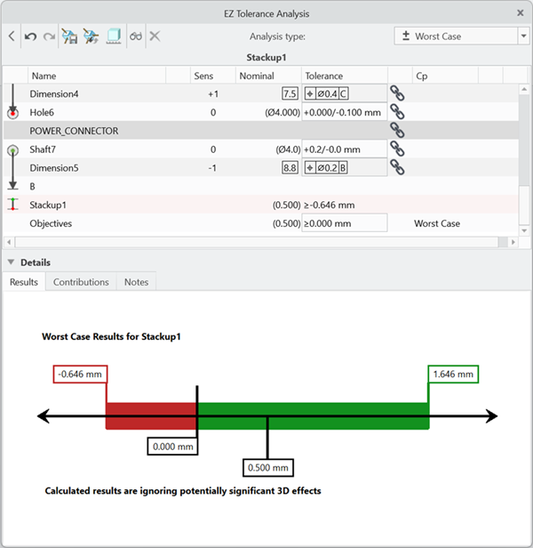
The nominal Stackup value and upper and lower specification limits for the Stackup appear at the bottom of the Results graph, which is defined in the Objective. For unilateral specifications as shown in the image, in which the results must be greater than 0.010 mm, only one specification limit is shown.
The numbers at the top of the graph indicate the upper and lower limits of the Stackup at the Worst-Case Target Quality. These limits are shown as vertical green or red bars.
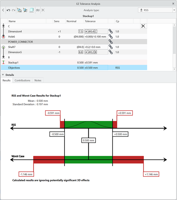
RSS Results Graph
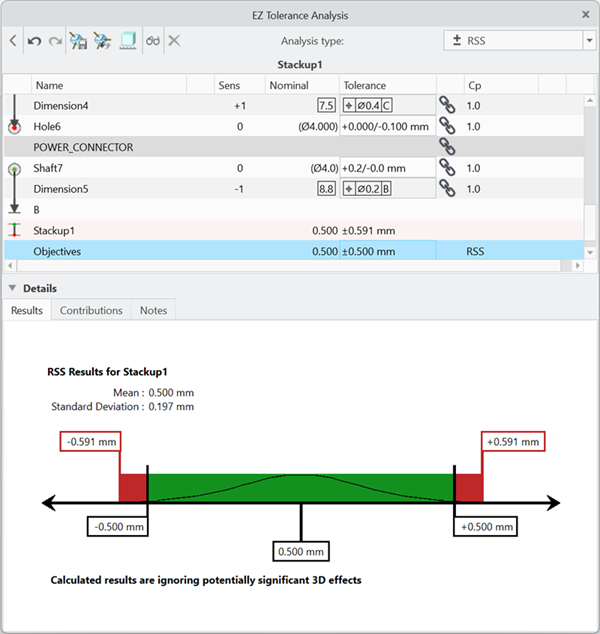
The RSS Results Graph is similar to the Worst-Case Results graph with the following exceptions:
• The normal curve within the rectangular section of the graph indicates the statistical nature of the analysis.
• The calculated mean and standard deviation parameters for the RSS component of the results are shown above the graph.
The nominal Stackup value and upper and lower specification limits for the Stackup, which are defined in the Objective, appear at the bottom of the Results graph.
The numbers at the top of the graph indicate the upper and lower limits of the Stackup at the RSS Target Quality. These limits are shown as vertical green or red bars.
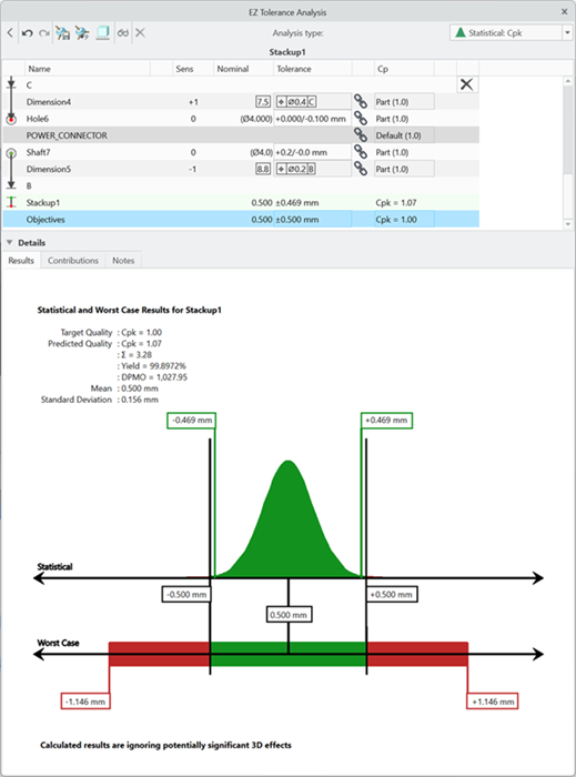
Statistical Results Graph
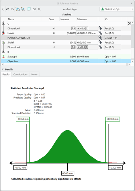
The Statistical graph is of the shape of the probability density function, which is associated with the Gaussian or Normal distribution. It is referred to as a bell curve.
The desired Target Quality metric and value appear above the graph. The predicted quality level based on the percentage of the curve falling outside of the upper and lower speciation limits is also shown for the chosen quality metric as well as the other three quality metrics. In addition, you can see the calculated mean and standard deviation parameters for the distribution.
The numbers on the top of the graph represent the upper and lower calculated limits of curve at the specified target quality level listed below the graph. In this example, the quality is Cpk of 1.0.
Including the Worst Case with RSS and Statistical Results Graphs
If you set the stackup target quality to RSS or Statistical, you can also display the Worst Case results in the graph. To include the Worst Case results, from the analysis type list at the upper-right of the Stackup table window, select Show Worst Case graph.
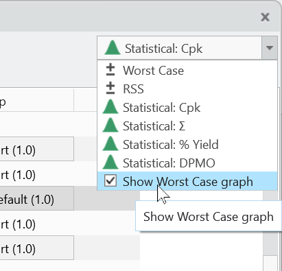
The results graph now displays the Worst Case results alongside the RSS or Statistical results, allowing you to see both sets of results simultaneously.
You can set the default value for new stackups in the Options dialog box by selecting Include Worst Case with RSS and Statistical.
The Pass or Fail status for the stackup is still based on the selected target quality, either RSS or Statistical. Therefore, if the stackup passes its target quality based on RSS, but the Worst Case limits are not within the objective, the stackup will still show a Pass status. |