Report Visualization
Report Visualization Widgets show the actual result of the reports.
Supported chart types:
• Pie
• Area
• Bar (simple, multi and stacked)
• Table
• Gauge
• Speedometer
The Report Visualization Widgets have a common Editor format.
|
|
Some fields are not shown for the different chart types.
|
The most important fields of the editor:
|
Field Name
|
Features
|
|---|---|
|
Data Source
|
The chart visualizes the result of this source report.
Some chart types have special requirements regarding the data source. For example, for a Multi Bar Chart only Reports that are grouped by at least two fields can be used.
Reports that cannot be used for the selected chart type are disabled in the list.
Hints under the fields inform the user about the exact reason.
|
|
Grouping Field
|
The Report Visualization Widgets accept only grouped Reports as data sources.
In this field, the grouping field to be used on the visualization can be selected.
|
|
Aggregation Function
|
If the report is aggregated by multiple functions (sum, avg, etc.), the aggregated value to be shown on the visualization can be selected in this field.
|
|
Display unit
|
High values can be rounded to hundreds, thousands, millions or billions to make the chart more straightforward.
|
|
Ordering
|
Defines in which order the values are shown on the chart.
The ordering can be changed on both axes:
• When ordering by Group name, the labels on the horizontal axis are in their natural order.
• When ordering by values, the labels are ordered by their corresponding value on the vertical axis.
|
|
Horizontal/Vertical Axis label
|
The labels shown under the horizontal and beside the vertical axis.
|
|
No Group Text
|
When grouping a Report by a field, it may happen that some matching items have no values in the related field.
By default, the label for these values in the charts is No Group.
The default label can be changed in this field.
|
|
Chart Colors
|
A comma-separated list of colors (either RGB codes ( #fff ) or color names).
These colors override the default colors in the chart, that is, the first chart segment is painted with the first color provided, the second segment with the second color. and so on.
In case more chart segments are available than the number of colors provided, the same color will be used in the chart multiple times.
|
|
Show Values
|
When checked, the actual values are shown above the chart segments.
|
|
Value Label
|
Specifies what information the values on charts reflect to. It works together with the previous option. 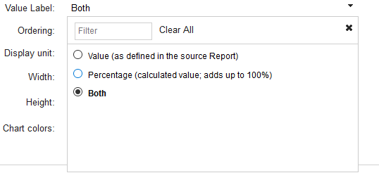 Possible values:  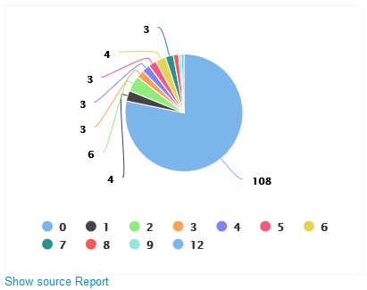  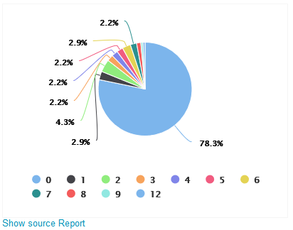  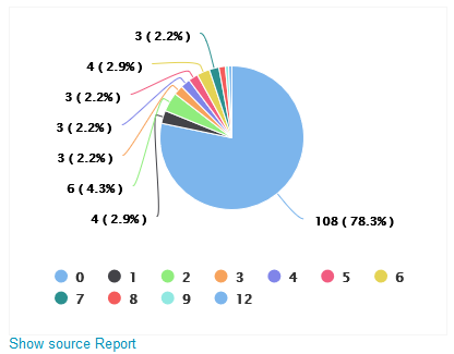 |
|
Show Legend
|
When checked, the widget adds a legend (an explanation of the chart colors) below the chart.
|
CBQL Table
Codebeamer displays work items that are based on various cbQL tables.
Chart
Chart widgets unify the previously standalone report visualization widgets, making it possible to change the chart types after creating the widgets. The configuration options for each widget types remained the same.
Table
The Table widget displays the result of reports in tabular form.
Further options available on the editor overlay:
• Columns - select the columns of the report to shown in the table.
• Column order - change the order of the columns with drag and drop.
• Order by - select the column used for ordering.
• Sort - the direction of the ordering (ascending or descending)
• Page size - the maximum number of items shown in the table. If there are more rows then the table is pageable.