Box Layout
The Box layout model divides a portion of the dialog box into a series of nested containers using the <box> element. Each container is oriented horizontally or vertically. Controls inside each container are listed in order according to the orientation of the container.
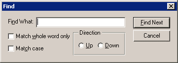
For example, the following dialog box can be expressed by using seven containers:
Dialog box with the following controls.
Box 1 contains the Find What label and its text field.
Box 2 contains the two check boxes.
Container 3 is the Direction radio group.
Box 4 contains the Find Next and Cancel buttons.
Box 5 contains box 2 and container 3.
Box 6 contains box 1 and box 5.
Container 7 is the root (<window>), which contains box 4 and box 6.
This dialog box can be described using XUI as follows:
<?xml version="1.0" encoding="utf-8"?>
<!DOCTYPE window PUBLIC "-//Arbortext//DTD XUI XML 1.1//EN" "xui.dtd">
<window orient="horizontal" focus="findtext" modal="false" title="Find">
<box orient="vertical">
<box orient="horizontal">
<label label="Fi&nd What:"/>
<textbox id="findtext">
<value></value>
</textbox>
</box>
<box orient="horizontal">
<box orient="vertical">
<checkbox label="Match &whole word only"></checkbox>
<checkbox label="Match &case"></checkbox>
</box>
<radiogroup label="Direction" resize="both" orient="horizontal">
<radio label="&Up"></radio>
<radio label="&Down"></radio>
</radiogroup>
</box>
</box>
<spacer resize="none" width="4"/>
<box orient="vertical" pack="start">
<button label="&Find Next" type="accept"></button>
<button label="Cancel" type="cancel"></button>
</box>
</window>
The
<box> element has attributes for customizing the layout. For example, the attribute
pack specifies how extra space should be distributed. The attribute
orient specifies the baseline of the controls in a box. Refer to
<box> Element for a detailed description of the
<box> element.