Left Bar Update
Overview
The left blue bar in the Layout Developer user interface has been unchanged for a long time. With the move to XML and not using Style tags in templates the left bar has become less useful unless in Page mode to see the layers and layer groups. In this release we provide an updated left bar which includes the ability to create custom lists which appear under different modes (Page, Text, Document) and also custom actions which can be associated with each of the list items. The left bar behaviours and lists are template properties, and so can be configured specifically for a template to provide a customised user interface for that template.
Basics
To use a customised left bar, the template preference fTemplate.preferences.useNewLeftBar must be set to true. If this preference is set to false, the default behaviour will be as in previous versions.
With this preference active, the fTemplate.leftBar object becomes available. This object has three properties which hold arrays of items for the three working modes the customisable left bar is applicable to:
• fLeftBar.docMode — an array of items for the left bar to show when in Document mode
• fLeftBar.pageMode — an array of items for the left bar to show when in Page mode
• fLeftBar.textMode — an array of items for the left bar to show when in Text mode
Switching mode will change the list which is visible. Each element in the arrays is an fLeftBarItem object. It is up to the template developer to define these, the arrays will otherwise be empty.
The fLeftBarItem has a number of properties:
• fLeftBarItem.displayName — the string to display in the left bar for this item
• fLeftBarItem.function — the name of the function to run when the left bar item is clicked. When the function is called, the index number of the list, the ID string, the mouse button pressed and the display name are automatically passed to the function as arguments.
• fLeftBarItem.icon — the icon to display before the display name of the item
• fLeftBarItem.id — the ID of the item
• fLeftBarItem.indent — the number of pixels to indent the item (should you wish to created nested lists, for example)
Finally, the fLeftBar object has a refresh method (fLeftBar.refresh()) to tell Layout Developer to redraw based on the lists it holds. This method can be called from anywhere, but the new template events provide the ideal places to call this method.
With these building blocks, it is possible to build a set of interactive toolbars to the document.
Customising the Left Bar
So how can these parts be used to build something useful? Let us create a page mode left bar which provides a list of the Layer Groups, Layers and Frames within a document.
At first, we need to create the basic list and turn on the new dynamic left bar mode.
template.preferences.useNewLeftBar = true;
template.leftBar.pageMode = [];
var pageBarContent = template.leftBar.pageMode;
var i=0;
pageBarContent[i] = {id: "layerGroupTitle",
displayName: "Layer groups",
indent:3,
icon:"arr_right",
function:function(){content.
functions.addLayerGroupList()}};
i++;
pageBarContent[i] = {id: "layersTitle",
displayName: "Layers",
indent:3,
icon:"arr_right",
function:function(){content.
functions.addLayerList()}};
i++;
pageBarContent[i] = {id: "framesTitle",
displayName: "Frames",
indent:3,
icon:"arr_right",
function:function(){content.
functions.addFrameList()}};
i++;
template.leftBar.refresh();
In this script, which can be considered a ‘reset’ or ‘setup’ script for the left bar, a number of things happen:
• The dynamic left bar it turned on
• The page mode list is cleared
• Three items are added to the page mode array. Each is a new fLeftBarItem object and has an ID (which will be used to find the right element later), a display name, a 3 pixel indent, an icon (a right arrow icon, one of the built-in icons in Layout Developer) and a function definition which calls a specific function tag. The functions in this case are used to add items to the page mode list so we will look at these next.
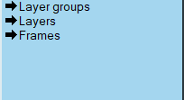
The left bar in page mode now looks like this:
Looking at the function called when a user clicks on the ‘Layer groups’ item — content.functions.addLayerGroupList():
var list = template.leftBar.pageMode;
var titleItem = 0;
//Find the layer groups title item
for (var i=0; i<list.length;i++) {
if (list[i].id == "layerGroupTitle") {
titleItem = i;
break;
}
}
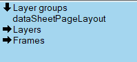
var currentItem = list[titleItem];
currentItem.icon = "arr_down";
currentItem.function = function(){content.functions.
removeLayerGroupList()}
//Create list of layer groups
var layerGroups = content.layergroups;
var layerGroupItems = [];
for (var lg=0; lg < layerGroups.length; lg++) {
var lgName = layerGroups[lg].name;
list.splice((titleItem+1),0,{id:"lg_" + lgName,
displayName: lgName, indent:18})
}
template.leftBar.refresh();
A number of things happen in this script:
• The page mode list is looked at to find the item which has the ‘layerGroupTitle’ ID. It is not safe to assume the element number which holds this ID as other scripts may have added to the array and the item may have moved.
• The icon of the target item is changed to a down arrow to indicate the node in the tree is open
• The function associated with that item is also changed to call removeLayerGroupList() so that when the item is clicked on again, the list of layer groups is removed from the page mode list.
• Next, using the list of layer groups in the document, new items are spliced into the page mode list which show the names of each layer group. A prefix of ‘lg_’ is added to the ID of each layer group item to make it easy to identify when removing them from the list.
• Finally the left bar is refreshed to ensure the list shown is correct.
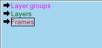
The Display Name text can be styled and can contain icons by adding code similar to that used in toolbars and dialog boxes to apply styling:
• ((31,31,1) — turns on strikethrough
• ((31,31,2)) — turns on overline
• ((31,31,3)) — turns on underline
• ((31,31,4)) — turns on boxing
• ((31,31,0)) — turns off all styling
The text can also be coloured using ((31,x) where x is one of:
• 1 — the colour used for the ‘show macros’ text (by default, red — colour 36)
• 2 — turn the colour back to normal (black)
• 3 — the colour used for the ‘show macros’ menu colour (by default, red — colour 36)
• 5— the yellow bar’s tag colour (by default, blue — colour 110)
• 6 — the yellow bar’s style colour (by default, red — colour 111)
• 7 — the yellow bar’s reference colour (by default, dark blue — colour 112)
• 8 — the yellow bar’s hash code colour (by default, blue — colour 113)
• 9 — the yellow bar’s SGML colour (by default, magenta — colour 116)
• 10 — list box link colour (by default, green — colour 151)
• 11 — list box title colour (by default, red — colour 152)
• 12 — list box tag colour (by default, blue — colour 153)
• 13 — list box reference colour (by default, dark blue — colour 154)
• 14 — menu keyboard shortcut colour (by default, green — colour 163)
• 15 — yellow bar break colour (by default, lighter green — colour 164)
• 16 — yellow bar exit command colour (by default, grey — colour 178)
• 17 — yellow bar goto command colour (by default, dark red — colour 179)
• 18 — yellow bar label colour (by default, purple — colour 180)
• 19 — yellow bar field command colour (by default, magenta — colour 187)
The colour definition numbers are found in the scol256c.3ad file.
For example, using “((31,9))Layer groups”, "((31,14))Layers" and "((31,6))((31,31,4))Frames" would give a left bar like this:
It is important to note that the template.leftBar.refresh() method can (and should) be called from template events should you wish to ensure the left bar is kept up to date properly. See the New Feature documentation elsewhere for information about template events.