Customizing Attribute Displays within Section Headings
You can control the display of attributes by customizing the SectionHeading tag. This section contains the following topics:
• Customizing the Display of Attributes in Groups
• Expanding/Collapsing the Display Groupings
• Customizing the Number of Columns to Display
Customizing the Display of Attributes in Groups
There is a clause in the SectionHeading element that allows you to edit the detail of a group of attributes. Using this clause you can hide or show specific attribute from panels in the display, such as the Create Part Wizard, Insert Existing Part Wizard, or the Information Tab.
In the following sample code "allowAttrDetails=true" clauses have been added to the SectionHeading element of the CreateChildPartTab2 attribute group that is used by the Insert Child Wizard.
Sample Code:
<AttributeGroup id="ptc.wnc.exp.CreateChildPartTab2"
scrollable="true" displayMode="edit">
<SectionHeading allowAttrDetails="true">
<Label>
<Resource key="Properties Top"/>
</Label>
</SectionHeading>
<CellDefinition id="name">
<AttributeDefinition attributeId="name"/>
</CellDefinition>
<CellDefinition id="number">
<AttributeDefinition attributeId="number"
rendererClass="com.ptc.windchill.explorer.structureexplorer.render
er.component.PartNumberComponent"/>
</CellDefinition>
<SectionHeading allowAttrDetails="true">
<Label>
<Resource key="Properties 1"/>
</Label>
</SectionHeading>
<CellDefinition id="view">
<AttributeDefinition attributeId="view"
rendererClass="com.ptc.windchill.explorer.structureexplorer.render
er.component.ViewComponent"/>
</CellDefinition>
<CellDefinition id="folder">
<AttributeDefinition attributeId="folder"
rendererClass="com.ptc.windchill.explorer.structureexplorer.render
er.component.DefaultcontextFolderBrowserComponent"/>
</CellDefinition>
<CellDefinition id="source">
<AttributeDefinition attributeId="source"/>
</CellDefinition>
<CellDefinition id="partType">
<AttributeDefinition attributeId="partType"/>
</CellDefinition>
<SectionHeading allowAttrDetails="true">
<Label>
<Resource key="Properties 2"/>
</Label>
</SectionHeading>
<CellDefinition id="usedQuantityAmount">
<AttributeDefinition attributeId="usedQuantityAmount"/>
</CellDefinition>
<CellDefinition id="usedQuantityUnit">
<AttributeDefinition attributeId="usedQuantityUnit"/>
</CellDefinition>
<CellDefinition id="usedTraceCode">
<AttributeDefinition attributeId="usedTraceCode"/>
</CellDefinition>
<CellDefinition id="effPropagationStop">
<AttributeDefinition attributeId="effPropagationStop"/>
</CellDefinition>
<CellDefinition id="jobAuthorizationNumber">
<AttributeDefinition
attributeId="jobAuthorizationNumber"/>
<EnabledDependency inverted="false">
<Assembly assembly="wadm"/>
</EnabledDependency>
</CellDefinition>
<CellDefinition id="contractNumber">
<AttributeDefinition attributeId="contractNumber"/>
<EnabledDependency inverted="false">
<Assembly assembly="wadm"/>
</EnabledDependency>
</CellDefinition>
<CellDefinition id="phase">
<AttributeDefinition attributeId="phase"/>
<EnabledDependency inverted="false">
<Assembly assembly="wadm"/>
</EnabledDependency>
</CellDefinition>
</AttributeGroup>
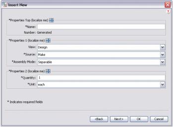
Adding the "allowAttrDetails=true" clauses produces the following output in the UI.
• Adding a SectionHeading creates the box around the group of attributes that follow the SectionHeading.
• The Label clause of the SectionHeading gives the text for the box.
• The allowAttrDetails="true" clause enables the Details icon to show after the label and also enables a popup menu for the panel.
This is the Details dialog that displays after you click the Details icon after the label. The user can hide or show individual attributes, but cannot change the order of the attributes.
For example, the user can choose to hide the Location attribute within the Properties 1 section. This is now saved as a preference for this user and will stay this way the next time the user loads PSE.
Expanding/Collapsing the Display Groupings
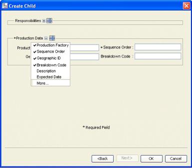
If multiple groups are displayed on a tab or in a step in a wizard, this could cause the contents of the frame to scroll. This might be annoying to a user, especially if they only want to enter the minimum number of attributes. You can customize the Title to allow the user to expand/collapse the set of attributes displayed. This setting will be remembered from session to session.
This is an example of what the UI might look like. The "Responsibilities" group is collapsed, so the + icon is available to expand it. The "Production Data" group is expanded so the - icon is available to collapse it.
Sample Code:
<AttributeGroup id="ptc.wnc.exp.CreateChild" displayMode="edit">
<SectionHeading id="ptc.wnc.exp.CreateChild.Responsibilities"
allowAttrDetails="true" allowCollapsable="true">
<Label>
<Resource key="responsibilitiesSectionLabel"/>
</Label>
</SectionHeading>
… cell definitions for the group here…
</AttributeGroup>
Customizing the Number of Columns to Display
You can customize the number of columns to display within the SectionHeading tag. You can create layouts like the following example.
If you specify a SectionHeading before a group of attributes, those attributes will be enclosed in a border with a title specified by the <Label> tag. See Customizing the Display of Attributes in Groups for more information on the <Label> tag.
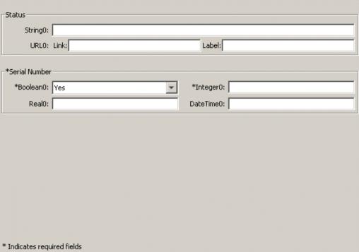
If the numberOfColumns is set to “1”, a single column of attributes will display; if set to “2” two columns of attributes will display.
In the example screenshot above, URL0: is a single attribute that happens to have two fields for input. Note that if any of the attribute in a section is required, the label on the border is also marked as required.
Sample Code:
<AttributeGroup id="ptc.wnc.exp.CreatePartTab4"
scrollable="true" displayMode="edit">
<SectionHeading numberOfColumns="1">
<Label>
<Resource key="checkoutInfoStateLabel"/>
</Label>
</SectionHeading>
<CellDefinition id="String0">
<AttributeDefinition attributeId="IBA|String0"/>
</CellDefinition>
<CellDefinition id="URL0">
<AttributeDefinition attributeId="IBA|URL0"/>
</CellDefinition>
<SectionHeading numberOfColumns="2">
<Label>
<Resource key="serialNumberValueLabel"/>
</Label>
</SectionHeading>
<CellDefinition id="Boolean0">
<AttributeDefinition attributeId="IBA|Boolean0"
required="true"/>
</CellDefinition>
<CellDefinition id="Integer0">
<AttributeDefinition attributeId="IBA|Integer0"
required="true"/>
</CellDefinition>
<CellDefinition id="Real0">
<AttributeDefinition attributeId="IBA|Real0"/>
</CellDefinition>
<CellDefinition id="DateTime0">
<AttributeDefinition attributeId="IBA|DateTime0"/>
</CellDefinition>
</AttributeGroup>