选择
这个小组件有什么功能?
“选择”小组件可提供下拉菜单。
何时会用到这个小组件?
当想要向用户显示可供选择的下拉菜单时,会用到“选择”小组件。
这个小组件中是否有专用的属性、服务、事件或操作?
若要查看小组件常用的属性、服务和事件的列表,请参阅小组件的通用属性、服务和事件。
下表列出了这个小组件的专用属性、服务和事件。
|
属性
|
JavaScript
|
类型
|
说明
|
|---|---|---|---|
|
值
|
value
|
string
|
小组件的值。
|
|
列表
|
list
|
object
|
数据的绑定目标。通常情况下,将服务的“所有项”与本属性绑定。
|
|
值字段
|
valuefield
|
string
|
指定使用小组件时选择的值字段。
当小组件与 ThingWorx 数据绑定时,该字段会自动填充选项。
|
|
显示字段
|
displayfield
|
string
|
指定在“选择”小组件中出现的字段。通常,该属性与“值”字段相同,但也可能不同。
当小组件与 ThingWorx 数据绑定时,该字段会自动填充选项。
|
|
标签
|
label
|
string
|
显示在小组件上的标签。
|
|
列表项内边距
|
itempadding
|
string
|
列表项周围的内边距。
|
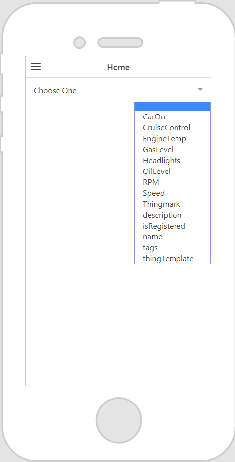
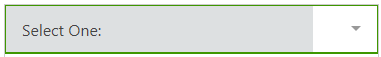
小组件的显示效果
以下是小组件的显示效果示例!
|
使用时的必要步骤
|
显示效果
|
|---|---|
|
1. 将“选择”小组件拖放到工作区。
2. 在“标签”字段中输入“选择”小组件的标签。
3. 在“数据”窗格中,添加您想要从实体中检索数据所使用的服务。
4. 将“所有项”或“所有选择的项”绑定到“选择”小组件,然后在“选择绑定目标”窗口中选择“列表”。
5. 为“显示字段”属性选择一个值。
6. 为“值字段”属性选择一个值。
|
 |
绑定 ThingWorx 数据后的辅助配置字段
将 ThingWorx 数据绑定到小组件之后,某些字段会被下拉列表中的选项所填充。例如,如果您将“所有项”绑定到“选择”小组件,并在“选择绑定目标”窗口中选择了“列表”,则“值字段”和“显示字段”属性将被可用的选项填充。

使用 CSS 设置小组件样式
您可以使用 CSS 设置小组件样式!下面是您可以创建和应用的 CSS 类的示例:
 |
请注意,最好为您的类指定唯一名称,以避免与其他类或预装属性发生冲突。
|
|
CSS 示例
|
显示效果
|
|---|---|
.ptc-select {
|
 |
.ptc-select1 {
|
 |
有关实现 CSS 类的详细信息,请参阅应用程序样式。