Update the 2D Interface
The 2D canvas from 3D-Guided Service Instructions 200 must be updated to fit the needs of the new popup and the cart. Buttons will be added for ordering and clearing the cart, along with labels and a repeater for listing all the items in the cart.
1. Open the 2D canvas.
2. Click on the playButton. In the DETAILS pane, select Remove to remove it from the canvas. The function of playButton will now be triggered by the popup.
3. Click on the left panel, and then click Remove in the DETAILS pane.
4. In row-1 of gridLayout-1 in the bottom panel, click Add Column to add a column to the bottom row. Drag the resetButton widget from its original location and drop it into the new column. Under PROPERTIES for the new column, set the Alignment drop-down to End so the layout looks like the image below.
5. Next, select the right panel and click Remove.
6. Now that parts of the layout from the old experience have been removed, new 2D widgets will be added to the experience.
a. Drag a Grid Layout widget onto the Center Panel. Next, you’ll use the Grid Layout widget to split the center panel into columns of equal width.
b. Click into column-4, the newly created column in the Grid Layout widget. Under Grid Actions, click Add Column twice. This will split the Grid Layout into three equal columns.
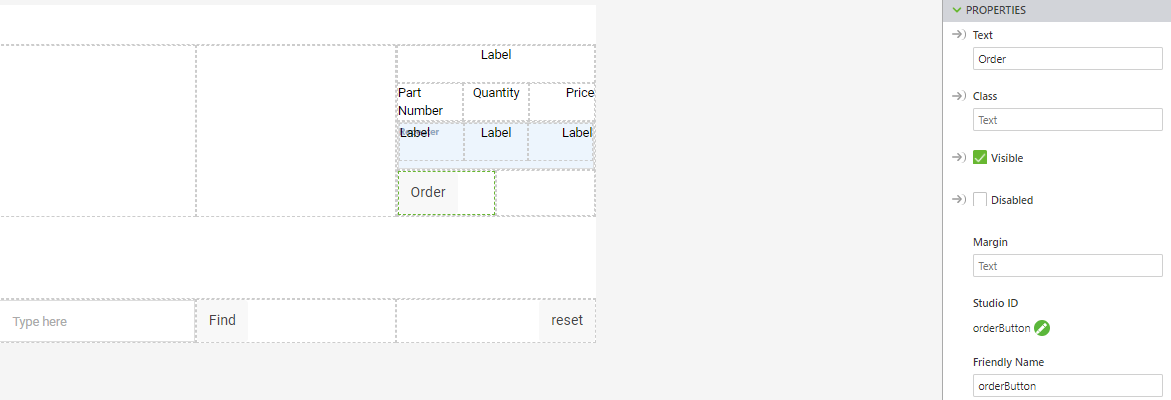
c. Drag another Grid Layout widget into the right column, column-6. In the Grid Layout properties, click Add Row three times so that gridLayout-3 has four rows.
d. Drag a Label widget into the top row of the new Grid Layout widget. Change the Studio ID of this label to labelCart. Click into column-7, or whatever the name is for the column that the label was just placed into, and change the Alignment property to Center to place the label in the middle of the row. This label will display the total price of the items in the cart when it is populated.
e. Open the Data pane. Add a new application parameter called cartLabel. Drag the binding arrows next to the cartLabel application parameter to the Text property for the labelCart widget. This binding will allow the text for this button to be changed using code in Home.js.
f. Divide the second row into three columns. Place a Label widget into each column.
▪ In the first column, change the Text property of the label to Part Number. Change the Alignment property for the column to Start.
▪ For the middle label, change the Text property to Quantity. Change the Alignment property for the column to Center.
▪ In the third column, change the Text property of the label to Price. Change the Alignment property for the column to End.
g. In the third row, add a Repeater widget. The Repeater widget allows data to be displayed in a desired format as many times as required. It will be used for logging information about the parts that are added to the cart through the ordering system and will grow as more parts are added. Change the Studio ID for this widget to cartRepeater.
h. Open the Data pane. Create a new application parameter named cart. Drag the binding arrows next to the new cart application parameter onto the Data property of cartRepeater. This will link the data that is added to the cart based on part selections to the repeater.
i. Drag a Grid Layout widget onto the cartRepeater. Click in the new column that was created for the Grid Layout and then click Add Column twice so the repeater is split into three columns.
j. Drag a Label widget into each of the newly created columns. Similar to the labels in the row above them, set the Alignment of the columns to Start, Center, and End, respectively. These labels will be edited in a later portion of the project.
k. Click in the fourth row (below the labels you just added) and select Add Column to add another column.
l. Add a
Button widget to the left column. Change the
Text property to
Order and the
Studio ID to
orderButton. Open the
JS box for the
Click event and enter
orderCart(). This button will be bound to a
ThingWorx service for ordering the contents of the cart in
3D-Guided Service Instructions 303.
m. In the right-hand column of the same row, add another Button widget. This time, change the Text property to Clear, the Studio ID to clearButton, and enter clearCart() in the JS box of the Click event. This button will be used to clear all listed items from the cart. Change the Alignment property of this column to End.
n. Click Preview. If your experience looks like the image below, then the 2D layout has been created correctly.


