Use CSS to Style the Experience
The final step for this tutorial is to add CSS styling to the project to add color to the buttons and cart.
|
|
The full code for this section is available in Appendix 5 in GitHub. |
1. Click Application under STYLES. This is where you’ll include the CSS code.
a. Add the following CSS classes that will be tied to parts of the experience in the next few steps.
.btnadd {
background: #236192;
color: #ffffff;
border-radius: 10px;
padding: 5px 5px 5px 5px;
}
.btncontinue {
background: #c8c9c7;
color: #ffffff;
border-radius: 10px;
padding: 5px 5px 5px 5px;
}
.btndisassemble {
background: #3d4647;
color: #ffffff;
border-radius: 10px;
padding: 5px 5px 5px 5px;
}
.btnfind {
background: #3d4647;
color: #ffffff;
}
.btnreset {
background: #c8c9c7;
color: #ffffff;
}
.cart {
background: #236192;
color: #ffffff;
}
.cartlabels {
background: #00acc8;
color: #ffffff;
}
.btnclear {
background: #3d4647;
color: #ffffff;
border-radius: 0px;
}
.btnorder {
background: #f38800;
color: #ffffff;
border-radius: 0px;
}
.repeater {
background: #c8c9c7;
color: #236192;
}
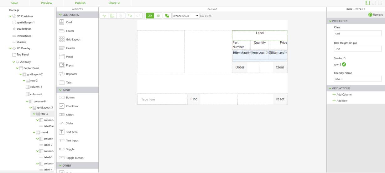
2. Now that the CSS classes have been added to the application styles, you can add them to the 2D interface.
a. Navigate back to the Home view and open the 2D canvas. Change the Text property for each label to the following:
▪ {{item.tag}}
▪ {{item.count}}
▪ ${{item.prc}}
▪ Adding the text calls upon the properties of the cartItem object that was created in the section of code below. The contents of the cartItem object are set equal to the cart application parameter, and the labels tie the repeater back to the properties of cart.
var cartItem =$scope.cart[$scope.currentSelection];
if (cartItem === undefined) {
cartItem = { count: $scope.app.params.itemCount,
itm: $scope.app.params.itemNumber,
tag: $scope.app.params.itemName,
prc: $scope.app.params.priceInfo }
} else {
cartItem.count += $scope.app.params.itemCount
}
$scope.cart[$scope.currentSelection] = cartItem;
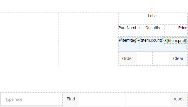
b. Click on the first row in the grid layout with the labelCart widget in it. Change the Class property of the row to cart. This adds a blue background to that column that will act as a header for the cart. Open the column of that same row and change the Padding property to 5px to add padding around the row to separate it from other rows.
c. Click the second row and change the Class property to cartlabels. This adds a light blue background to this row and will be used as headers for each cart column.
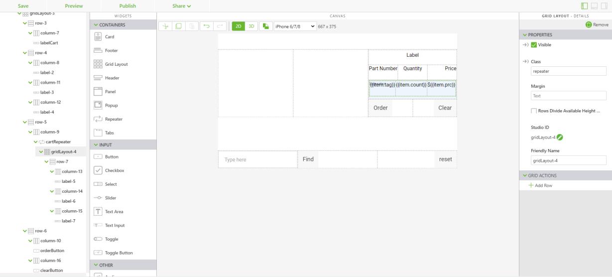
d. To add styling to the contents of the repeater, open the Grid Layout widget that you added after you added the repeater. Change the Class property to repeater. This adds a light gray background with blue lettering to the contents of the repeater.
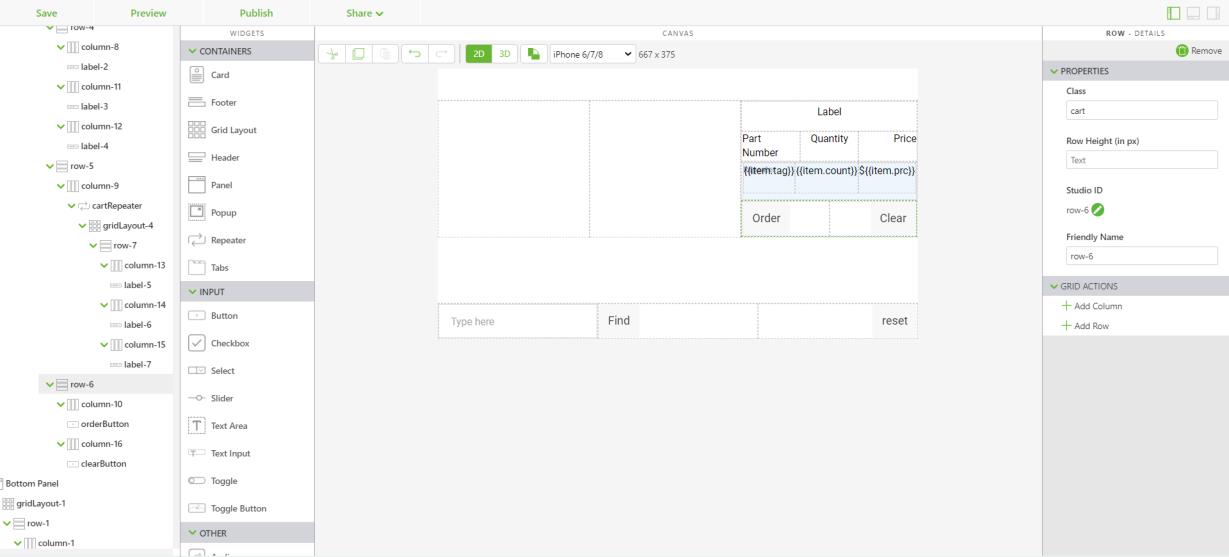
e. Similar to the first row you edited, click the last row in the layout and change its Class property to cart. It will follow the same styling convention as the row with the labelCart widget in it.
f. Edit the Class property for each of the Button widgets with their corresponding CSS class:
▪ orderButton— btnorder
▪ clearButton— btnclear
▪ findButton— btnfind
▪ resetButton— btnreset
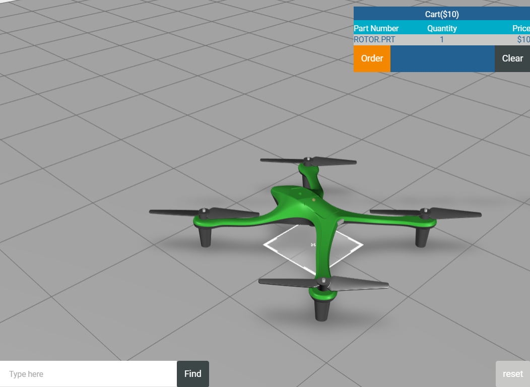
g. Once you’ve added the classes to the appropriate buttons, click Preview. Click on a part and add it to the cart. Your experience should look like the image below.
3. The final step for styling the experience is to add CSS classes to the buttons in the popup. Unlike the buttons in the 2D interface, to edit the buttons in the popup you’ll need to edit the template of the popup. Open Home.js.
a. In the price variable, class="btnadd" must be added to the popup template to style the Add to Cart button.
var price = priceString != undefined ? ' </br>$' + parseFloat(priceString) + ' </div><div class="btnadd" ng-click="hiliteOff(); popup.close();addToCart();"> Add to Cart</div>'
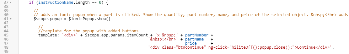
b. When there is no disassembly sequence in the if else statement, the btncontinue class will be added to the popup template for styling the Continue button.
template: '<div>' + $scope.app.params.itemCount + 'x ' + partNumber +
' </br>' + partName +
price +
'<div class="btncontinue" ng-click="hiliteOff();popup.close();">Continue</div>',
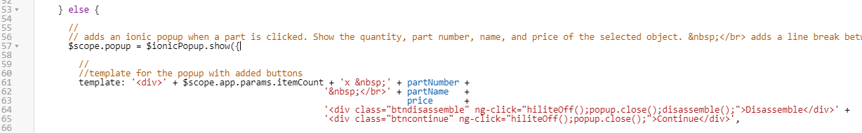
c. When there are Continue and Disassemble buttons in the popup in the else portion of the if else statement, classes for btncontinue and btndisassemble must be added to the template.
template: '<div>' + $scope.app.params.itemCount + 'x ' + partNumber +
' </br>' + partName +
price +
'<div class="btndisassemble" ng-click="hiliteOff();popup.close();disassemble();">Disassemble</div>' +
'<div class="btncontinue" ng-click="hiliteOff();popup.close();">Continue</div>',
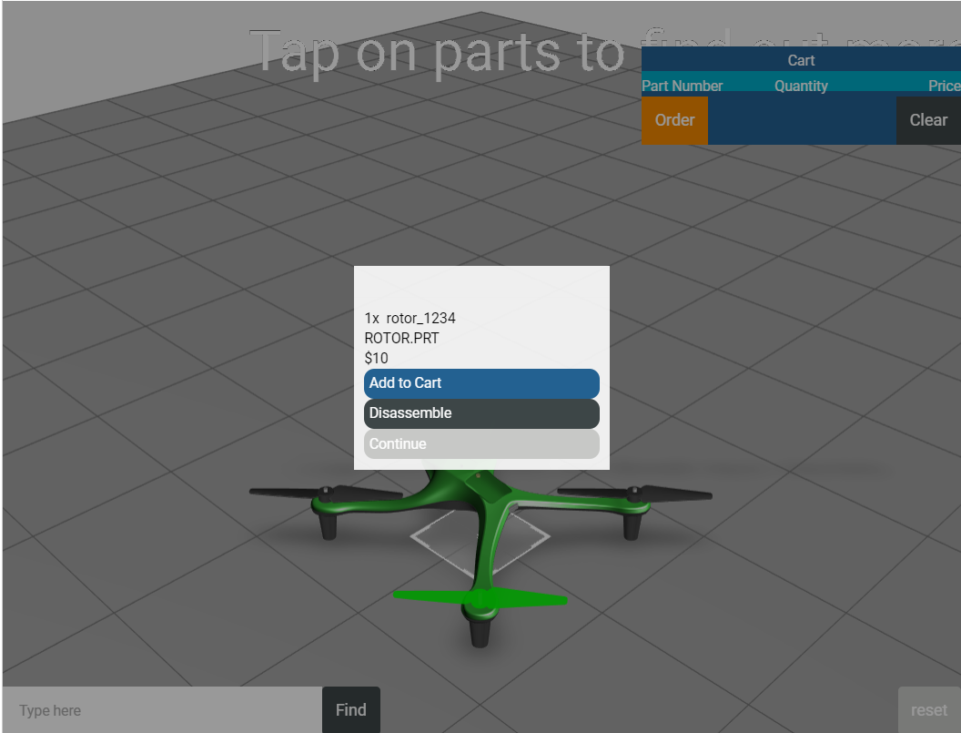
4. All CSS styling has now been added to the experience. Click Preview to see how your experience has changed. If your popup buttons look like the ones in the image below, then this section has been completed correctly.
Try changing the values in the Application tab to see how the styling on the experience changes.
In the next part of this use case, you’ll
add a ThingWorx service to Vuforia Studio.