Toggle Button
What Does This Widget Do?
The Toggle Button widget is similar to the Checkbox widget, but allows for the customization of different states using Resources.
When Should I Use This Widget?
Use a toggle button when you want to allow a user to change a setting between two states using a button. For example, if you want to include an audio setting in an experience to allow a user to toggle the sound on and off, you could use a Toggle Button.
Are There Any Special Properties, Services, Events, or Actions?
To view a list of common widget properties, services, and events, see
Common Widget Properties, Services, and Events.
The following table is a list of properties that are specific to this widget.
|
Property
|
JavaScript
|
Type
|
Description
|
|
Background Color Pressed
|
backgroundColorPressed
|
string
|
Specifies the color of the background when pressed.
|
|
Image when Not Pressed
|
srcnotpressed
|
resource url
|
Specifies the image displayed when not pressed. Supported file formats include:
• .png
• .jpg, .jpeg
• .svg
• .gif
• .bmp
|
|
Image when Pressed
|
src
|
resource url
|
Specifies the image when pressed. Supported file formats include:
• .png
• .jpg, .jpeg
• .svg
• .gif
• .bmp
|
|
Not Pressed
|
notpressed
|
boolean
|
Specifies what happens when not pressed. This is a two-way bindable property.
|
|
Pressed
|
pressed
|
boolean
|
Specifies what happens when pressed. This is a two-way bindable property.
|
|
Event
|
JavaScript
|
Description
|
|
Pressed
|
pressed
|
Triggered when pressed.
|
|
Not Pressed
|
unpressed
|
Triggered when changed to “not pressed” state.
|
The Widget in Action
Here’s an example of what your widget might look like!
|
Minimum Steps Required for Use
|
What It Looks Like
|
|
1. Drag and drop a Toggle Button widget onto the canvas.
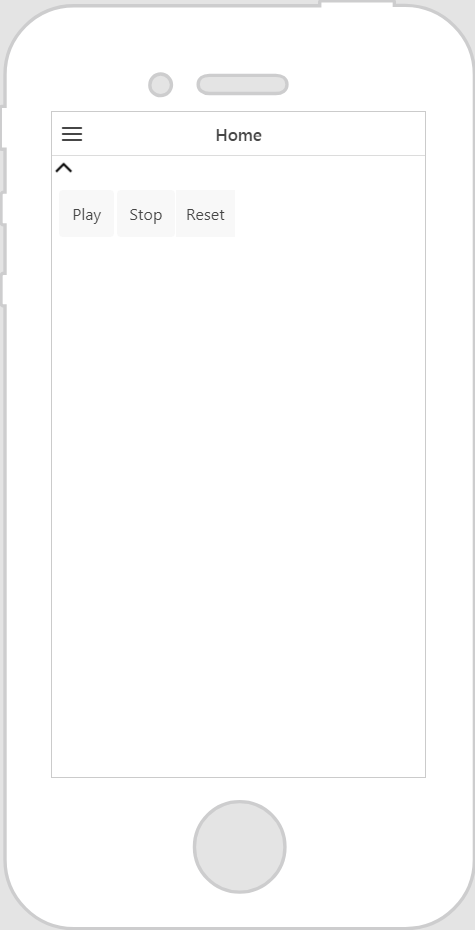
2. Bind the Pressed or Not Pressed property of the Toggle Button widget to another widget or service. For this example, we’ve bound the Pressed property of the Toggle Button to the panel widget, which contains a simple toolbar, and selected Visible on the Select Binding Target window. This will show or hide the panel when the toggle button is pressed.
|
|
