Select
What Does This Widget Do?
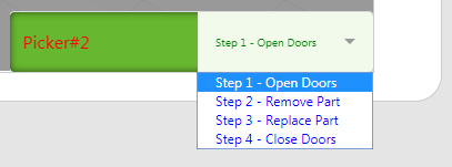
The Select widget provides a drop-down menu.
When Should I Use This Widget?
Use a Select widget when you want to present the user with a drop-down menu of choices.
Are There Any Special Properties, Services, Events, or Actions?
To view a list of common widget properties, services, and events, see
Common Widget Properties, Services, and Events.
The following tables list properties, services, and events that are specific to this widget.
|
Property
|
JavaScript
|
Type
|
Description
|
|
Value
|
value
|
string
|
Value of the widget.
|
|
List
|
list
|
object
|
A binding target for data. Typically, you bind All Items from a service to this property.
|
|
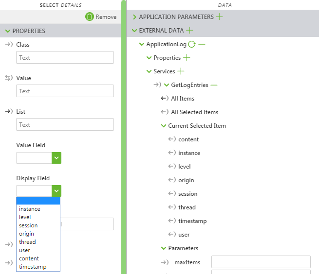
Value Field
|
valuefield
|
string
|
Specifies the value field selected using the widget.
This field is automatically populated with options when the widget is bound to ThingWorx data.
|
|
Display Field
|
displayfield
|
string
|
Specifies the field that appears in the Select widget. Typically this is the same as the Value Field, but can be different.
This field is automatically populated with options when the widget is bound to ThingWorx data.
|
|
Label
|
label
|
string
|
Label that is displayed on the widget.
|
|
List Item Padding
|
itempadding
|
string
|
The padding around the list item.
|
The Widget in Action
Here’s an example of what your widget might look like!
|
Minimum Steps Required for Use
|
What It Looks Like
|
|
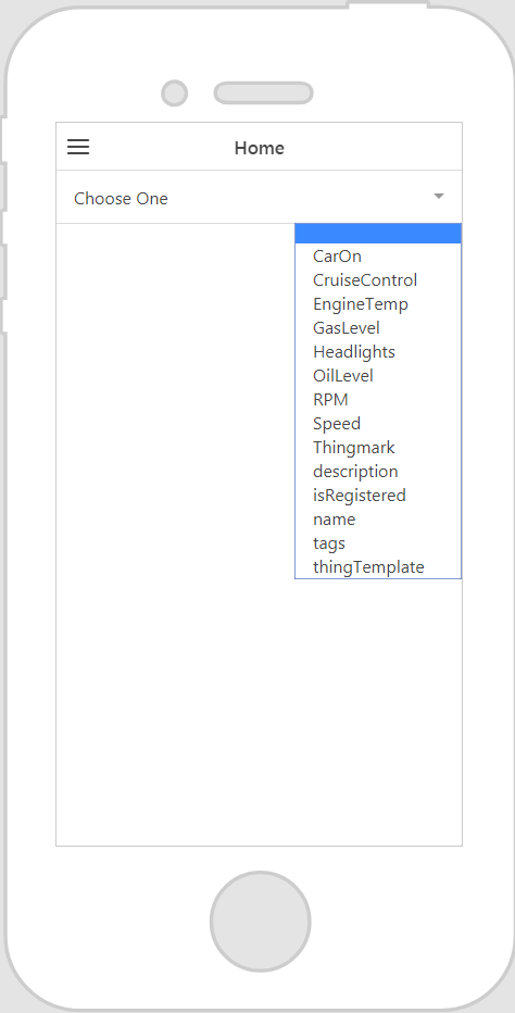
1. Drag and drop a Select widget onto the canvas.
2. Enter a label for Select widget in the Label field.
3. From the Data pane, add a service from the entity you wish to retrieve the data from.
4. Bind the All Items or All Selected Items to the Select widget, and choose List on the Select Binding Target window.
5. Select a value for the Display Field property.
6. Select a value for the Value Field property.
|
|
Assisted Configuration Fields After Binding ThingWorx Data
After you’ve bound ThingWorx data to the widget some fields are populated with options in a drop-down list. For example, if you bind All Items to the Select widget and select List on the Select Binding Target window, the Value Field and Display Field properties populate with available options.
Style the Widget with CSS
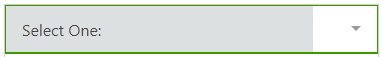
You can use CSS to style the widget! The following is an example of a CSS class you could create and apply:
| Keep in mind that it’s best to give your classes unique names so they do not conflict with other classes or OOTB properties. |
CSS Example | What It Looks Like |
.ptc-select {
border-width: 2px;
border-style: solid;
border-color: rgb(62, 151, 0);
background: rgb(221, 224, 225);
}
| |
.ptc-select1 {
padding:12px;
margin-top:8px;
line-height:1;
border-radius:5px;
background-color:#67b730;
-webkit-appearance:none;
box-shadow:inset 0 0 10px 0 rgba(0,0,0,0.6);
outline:none;
}
// the .input-label class within this .ptc-select1 class affects the label of the select widget (alternately can be referenced as the <div> element within the .ptc-select1 class)
.ptc-select1 .input-label{
font-size:16px;
color: red;
}
// the <select> element within .ptc-select1 class is the selected value from the list of items
.ptc-select1 select{
font-size:10px;
color: green;
background-color: rgba(241, 250, 235, 1);
}
// the .item class (alternately the <option> element) within this .ptc-select1 class applies to the list of options for the drop down list
.ptc-select1 .item{
font-size:12px;
color: blue;
} | |
For more information on implementing CSS classes, see
Application Styles.