Popup
What Does This Widget Do?
The Popup widget is a basic container widget that can be used as a modal or non-modal popup/overlay to display alerts, warnings, or collect user input without switching views.
When Should I Use This Widget?
Use a Popup when:
• You want to display important information or alerts to an experience viewer before they continue in an experience.
• You want to you include a button or checkbox in the popup that ensures the viewer has acknowledged the information.
• You want to limit text within the view of the experience, but still want the information to be available. In this case, you could simply use a “More Info” button, and once pressed, a popup would appear providing more detailed information.
Are There Any Special Properties, Services, Events, or Actions?
To view a list of common widget properties, services, and events, see
Common Widget Properties, Services, and Events.
The following tables list properties, services, and events that are specific to this widget.
|
Property
|
JavaScript
|
Type
|
Description
|
|
Type
|
type
|
string
|
Select the type of popup you want to include:
• Floating Popup
• Modal
|
|
Centered
|
centered
|
boolean
|
When this checkbox is selected, the popup will be centered to the horizontal and vertical center of the screen. If this checkbox is not selected, the following additional properties are displayed:
• Top (px, %, em, vh)
• Bottom (px, %, em, vh)
• Left (px, %, em, vh)
• Right (px, %, em, vh)
|
|
Top (px, %, em, vh)
|
top
|
string
|
Sets the HTML style attribute of the element and allows you to set a fixed top in units (px, %, vw, vh etc.).
|
|
Bottom (px, %, em, vh)
|
bottom
|
string
|
Sets the HTML style attribute of the element and allows you to set a fixed bottom in units (px, %, vw, vh etc.).
|
|
Left (px, %, em, vh)
|
left
|
string
|
Sets the HTML style attribute of the element and allows you to set a fixed left in units (px, %, vw, vh etc.).
|
|
Right (px, %, em, vh)
|
right
|
string
|
Sets the HTML style attribute of the element and allows you to set a fixed right in units (px, %, vw, vh etc.).
|
|
Service
|
JavaScript
|
Description
|
|
Hide Popup
|
hidepopup
|
Bindable service that hides the popup.
|
|
Show Popup
|
showpopup
|
Bindable service that shows the popup.
|
The following actions are available with this widget:
• Hide from canvas
• Show on canvas
The Widget in Action
Here’s an example of what your widget might look like!
|
Minimum Steps Required for Use
|
What It Looks Like
|
|
|
In order for the popup to be displayed, you’ll need to add a widget with a Click event to the experience (for example, a label or button). You will want to bind the Click event of that widget to the Popup widget and select Show Popup on the Select Binding Target window.
|
1. Drag and drop a Popup widget onto the canvas.
2. Drag and drop the widgets you want displayed onto the popup.
|
|
For this example, we’ve formatted the popup by doing the following:
a. Drag and drop a Grid Layout widget onto popup.
b. Add a row.
c. Add a column to the second row.
d. Drag and drop a Label widget into the first row. Enter Do you want to continue? in the Text field.
e. Drag and drop a Button widget into both columns in the second row. Title one button Yes and one No.
f. Bind the Click event of the Yes button to another view in the experience and select Navigate on the Select Binding Target window.
g. Bind the Click event of the No button to the Popup widget and select Hide Popup on the Select Binding Target window.
|
3. Make sure you create a way to close the popup by adding a widget with a Click event to the popup (for example, a label or button). You will want to bind the Click event of that widget to the Popup widget and select Hide Popup on the Select Binding Target window.
|
|
Style the Widget with CSS
You can use CSS to style the widget! The following is an example of a CSS class you could create and apply:
|
|
Keep in mind that it’s best to give your classes unique names so they do not conflict with other classes or OOTB properties.
|
|
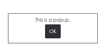
CSS Example
|
What It Looks Like
|
|
.ptc-popup {
border-width: 1px;
border-style: solid;
border-color: black;
font-size: 16px;
font-family: Century Gothic;
color: black;
}
|
|
For more information on implementing CSS classes, see
Application Styles.
