 |
Data must be bound to the Data Grid.
|
|
|
Data must be bound to the Data Grid.
|
|
Property
|
JavaScript
|
Type
|
Description
|
|
Data
|
data
|
string
|
When the Data property is bound to a service result, you can select columns to display in the Data Grid widget. 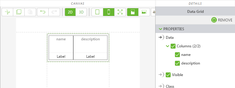 |
|
Enable State-Based Formatting
|
enableStateFormatting
|
boolean
|
Allows you to format the widget based on state definitions that have been defined in ThingWorx.
If the checkbox is selected the following properties appear:
• Dependent Field
• State Definition
For example, if a label has a State Definition value of error, the label turns red.
For more information about style and state definitions in ThingWorx, see Style and State Definitions in the ThingWorx Help Center.
|
|
Header Class
|
headerClass
|
string
|
The CSS class assigned to the header of the widget.
|
|
Horizontal Alignment
(Column property)
|
Specifies the horizontal alignment of a column.
• Left
• Center
• Right
|
|
Vertical Alignment
(Column property)
|
Specifies the vertical alignment of a column.
• Top
• Middle
• Bottom
|
|
Minimum Steps Required for Use
|
What It Looks Like
|
|
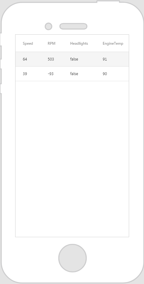
1. Drag and drop a Data Grid widget onto the canvas.
2. From the Data pane, add a service from the entity you wish to retrieve the data from.
3. Once the service has been added, drag and drop All Items onto the widget and select Data on the Select Binding Target window.
4. In the DETAILS pane, under Data, select the columns you want to display.
|
 |
 |
Keep in mind that it’s best to give your classes unique names so they do not conflict with other classes or OOTB properties.
|
|
CSS Example
|
What It Looks Like
|
|
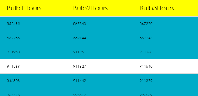
.ptc-DataGrid th {
background-color: yellow; font-size: 22px; opacity: 1; font-family: Century Gothic; } .ptc-DataGrid tr { background-color: #00acc8; border: none; font-family: Century Gothic; } .ptc-DataGrid .item-row:hover { background-color: #fff; } .ptc-DataGrid .item-row.selected { background-color: #fff; } |
 |