Add 2D Widgets
Add a Text Area Widget
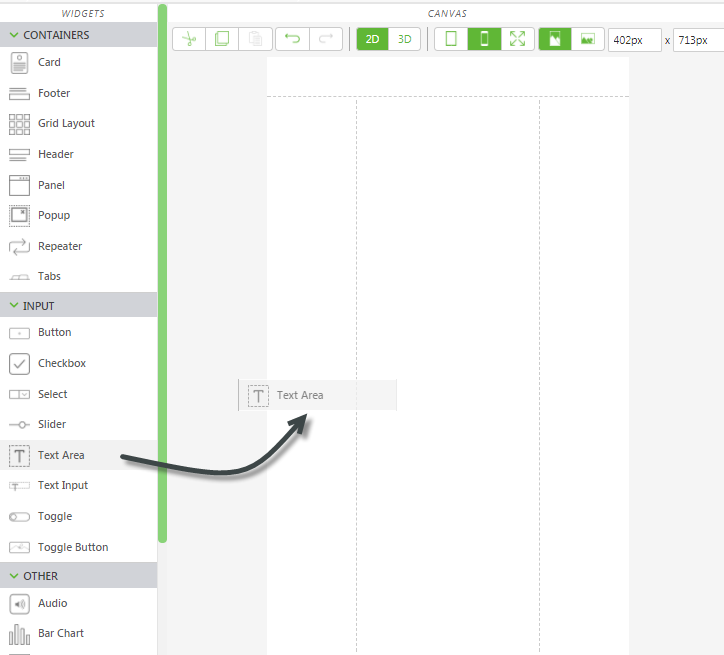
1. On the canvas toolbar, click 2D.
2. Drag and drop a Text Area widget onto the left panel of the canvas.
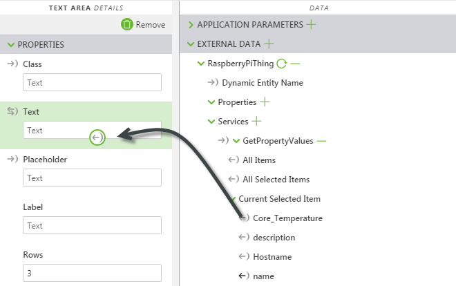
3. Next, drag the binding icon

next to the
Core_Temperature property, and drop it onto the
Text property for the
Text Area widget.
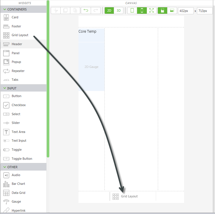
4. Change the value for Label to Core Temp.
Add a Gauge Widget
1. Drag and drop a Gauge widget onto the left panel of the canvas directly below the Text Area widget.
2. Next, drag the binding icon
next to the
Used_Memory property, and drop it onto the
Value property for the
Gauge widget. Also, drag the binding icon
next to the
Total_Memory property, and drop it onto the
Maximum Value property.
3. Change the value of Gauge Title to Used Memory.
Add Button Widgets for Animation Sequence and Other Information
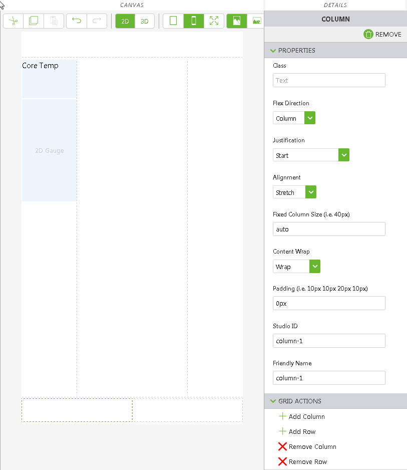
1. Drag and drop a Grid Layout widget onto the bottom panel of the canvas.
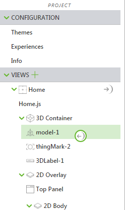
2. In the PROJECT pane, under VIEWS, click row-1 to select it.
3. In the DETAILS pane, click Add Column. The bottom panel divides into two columns.
4. Click the first column to select it.
In the DETAILS pane, set Alignment to Center.
5. Click on the second column, and set Alignment to Center, as well.
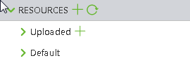
6. Next, add images for the buttons we want to add. Click the green + icon next to RESOURCES.
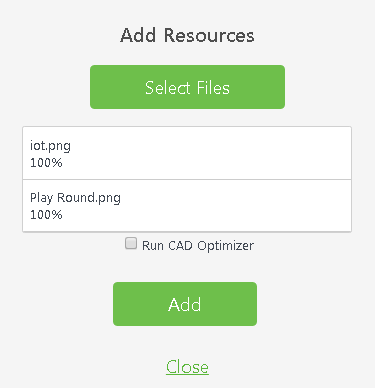
7. The Add Resource window appears.
8. Navigate to the location where you extracted the contents of the RaspberryPiKit.zip file.
9. Use the Ctrl key to select the following files:
◦ Play Round.png—the image used to start the two-stage disassembly sequence
◦ iot.png—the image used to display or hide the 3D label
10. Click Open.
11. Click Add on the Add Resource window.
12. Click Close on the Add Resources window.
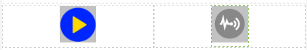
13. Drag and drop a Toggle Button widget into the left and right columns.
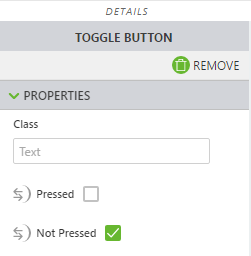
14. Click the toggle button in the first column to select it. In the DETAILS pane, select the Play Round.png file for both the Image when Pressed and Image when Not Pressed fields.
15. Click the toggle button in the second column to select it. In the DETAILS pane, select the iot.png file for both the Image when Pressed and Image when Not Pressed fields.
16. Your bottom panel will look similar to this:
Bind Data to the 2D Buttons
Now that you have the 2D buttons in your experience, we’ll bind data to them so they can be used to perform actions in the experience.
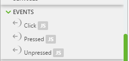
1. With the play button selected, scroll down in the
DETAILS pane, scroll down to the
Click event and drag the binding icon
next to the
Click event and drop it onto
model-1 in the project tree.
2. Select Play on the Select Binding Target window.
Now, when the “play” toggle button is pressed in Vuforia View, the Raspberry Pi disassembly sequence plays.
3. Next, click the iot.png in the second column to select it.
4. With the IoT button selected, find the
Pressed property in the
DETAILS pane, and drag the binding icon

and drop it onto
3DLabel-1 in the project tree.
5. Select Visible on the Select Binding Target window. When the “IoT” toggle button is pressed in Vuforia View, the 3D label is displayed or hidden.
Add 2D Widgets for Sensors (Optional)
Depending on the additional sensors you have for your Raspberry Pi, you can want to add other 2D widgets for those.
• If you are using the HC-SR04 distance sensor, you could place another Gauge widget in the left panel and bind the Distance property to it.
• If you are using the DHT11 temp/humidity sensor, you could add another Gauge or Text Area widget to display the external Prop_Temperature or Prop_Humidity.