Slider Widget (Themable)
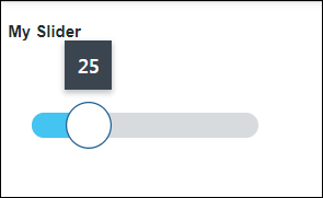
The Slider widget displays a slider that controls numerical value input in a mashup.
 |
The Slider widget is available as a standard widget in the platform and as a web component that you can import from an SDK.
|
The properties of the Slider widget are listed in the following table.
|
Property Name
|
Description
|
Base Type
|
Default Value
|
Bindable? (Y/N)
|
Localizable? (Y/N)
|
||
|---|---|---|---|---|---|---|---|
|
Label
|
The text that appears in the label of the slider.
|
STRING
|
n/a
|
Y
|
Y
|
||
|
LabelAlignment
|
Aligns the widget label to the Left, Right, or Center.
|
STRING
|
Left
|
Y
|
N
|
||
|
LabelType
|
Sets the label type as Header, Sub-Header, Label, or Body.
|
STRING
|
Label
|
Y
|
N
|
||
|
Value
|
Sets or binds the slider value.
|
NUMBER
|
n/a
|
Y
|
N
|
||
|
CustomClass
|
Defines the CSS to the top div of the widget. When entering multiple classes, separate each class with a space.
|
STRING
|
n/a
|
Y
|
N
|
||
|
TabSequence
|
Sets the sequence in which a widget is highlighted when you press TAB.
|
NUMBER
|
n/a
|
N
|
N
|
||
|
EndValue
|
The slider value for the second handle when in range selection mode.
|
NUMBER
|
n/a
|
Y
|
N
|
||
|
EndValueChanged
|
Triggers an event when the end value for the slider is changed.
|
n/a
|
n/a
|
Y
|
N
|
||
|
Minimum
|
Sets the minimum value for the slider.
|
NUMBER
|
0
|
Y
|
N
|
||
|
Maximum
|
Sets the maximum value for the slider.
|
NUMBER
|
100
|
Y
|
N
|
||
|
SteppingMode
|
Select to move the slider by a specific number of steps for each click.
|
BOOLEAN
|
False
|
N
|
N
|
||
|
StepSize
|
Sets the change in value for each step the slider moves.
|
NUMBER
|
n/a
|
Y
|
N
|
||
|
NumberOf Steps
|
Sets the number of steps the slider moves for each click.
|
NUMBER
|
n/a
|
Y
|
N
|
||
|
ValuePrecision
|
Sets the number of digits to show after the decimal point for the slider value.
|
NUMBER
|
n/a
|
N
|
N
|
||
|
DisplayValueLabel
|
Sets a display option for the slider value label to Yes, No, or On Drag.
|
STRING
|
Yes
|
N
|
N
|
||
|
EditableValue
|
Moves the handle by editing the value label in the mashup.
|
BOOLEAN
|
False
|
N
|
N
|
||
|
DisplayMinMaxLabels
|
Displays the labels of the minimum and maximum values.
|
BOOLEAN
|
True
|
N
|
N
|
||
|
HandleSize
|
Sets the handle size in pixels.
|
NUMBER
|
n/a
|
N
|
N
|
||
|
TrackSize
|
Sets the track size in pixels.
|
NUMBER
|
n/a
|
N
|
N
|
||
|
TrackAlignment
|
Aligns the track on the Center, Start, or End of the slider.
|
STRING
|
Center
|
N
|
N
|
||
|
FullTrack
|
Extends the slider track to fully contain the handle icon.
|
BOOLEAN
|
False
|
Y
|
N
|
||
|
MinValueLabel
|
Enters a label for the minimum value.
|
STRING
|
MIN
|
Y
|
Y
|
||
|
MaxValueLabel
|
Enters a label for the maximum value.
|
STRING
|
MAX
|
Y
|
Y
|
||
|
HandleIcon
|
Selects a media entity for the handle icon as None, Circle or Split.
|
STRING
|
Circle
|
N
|
N
|
||
|
SecondHandleIcon
|
Selects a media entity for the second handle icon as None, Circle or Split.
|
STRING
|
Circle
|
N
|
N
|
||
|
MinSideIcon
|
Selects an icon for the minimum side.
|
MEDIA ENTITY
|
n/a
|
N
|
N
|
||
|
MinIconSize
|
Selects a size of Small, Medium, Large, or XLarge for the minimum icon.
|
STRING
|
Medium
|
Y
|
N
|
||
|
MaxSideIcon
|
Selects an icon for the maximum side.
|
MEDIA ENTITY
|
n/a
|
N
|
N
|
||
|
MaxIconSize
|
Selects a size of Small, Medium, Large, or XLarge for the maximum icon.
|
STRING
|
n/a
|
Y
|
N
|
||
|
RangeSelection
|
Adds a second handle and enables range selection on the slider.
|
BOOLEAN
|
False
|
N
|
N
|
||
|
VerticalSlider
|
Changes the slider orientation to vertical.
|
BOOLEAN
|
False
|
N
|
N
|
||
|
ReverseMinMaxValues
|
Reverses the position of the minimum and maximum values.
|
BOOLEAN
|
False
|
N
|
N
|
||
|
ReverseLabelPosition
|
Reverses the label positions of the minimum and maximum values.
|
BOOLEAN
|
False
|
N
|
N
|
||
|
OverlapHandle
|
Overlaps the two slider handles.
|
BOOLEAN
|
False
|
N
|
N
|
||
|
ValueChanged
|
Triggers an event when the slider value is changed.
|
n/a
|
n/a
|
Y
|
N
|
||
|
Increment
|
A bindable service that increments the slider value.
|
n/a
|
n/a
|
Y
|
N
|
||
|
Decrement
|
A bindable service that decrements the slider value.
|
n/a
|
n/a
|
Y
|
N
|
||
|
IncrementSecondHandle
|
A bindable service that increments the value of the second handle when range selection mode is enabled.
|
n/a
|
n/a
|
Y
|
N
|
||
|
DecrementSecondHandle
|
A bindable service that decrements the value of the second handle when range selection mode is enabled.
|
n/a
|
n/a
|
Y
|
N
|
||
|
Disabled
|
Disables the widget in the mashup. The widget appears but it is not available to use.
|
BOOLEAN
|
False
|
Y
|
N
|