Progress Gauge Widget
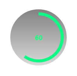
The Progress Gauge Widget is a gauge that uses an 'analog' circular fill band to show value. The Gauge can have intervals with different color schemes for each interval.
 |
This widget is included in an Progress Gauge extension that must be imported.
|
|
|
Styles and common widget properties are not included in the table below.
|
|
Property Name
|
Description
|
Base Type
|
Default Value
|
Bindable? (Y/N)
|
Localizable? (Y/N)
|
|---|---|---|---|---|---|
|
Data
|
Data source (a single numeric value as opposed to a complete data set / InfoTable)
|
NUMBER
|
n/a
|
Y
|
N
|
|
MinValue
|
Minimum value for the gauge.
|
NUMBER
|
0
|
Y
|
N
|
|
MaxValue
|
Maximum value for the gauge.
|
NUMBER
|
100
|
Y
|
N
|
|
ProgressFormatter
|
Applies State Formatting to the Progress Fill.
|
STATEFORMATTING
|
State Formatting
|
N
|
N
|
|
ValueFormatter
|
Applies State Formatting to the value.
|
STATEFORMATTING
|
State Formatting
|
N
|
N
|
|
ValueDigits
|
The number of digits used to display the values.
|
NUMBER
|
3
|
N
|
N
|
|
ValueDecimals
|
The number of decimals used to display the values.
|
NUMBER
|
0
|
N
|
N
|
|
ReferenceAngle
|
The angle that controls the gauge orientation (degrees).
|
NUMBER
|
0
|
N
|
N
|
|
Aperture
|
The angle that controls the gauge size (degrees).
|
NUMBER
|
360
|
N
|
N
|
|
GaugeBorder
|
The width/thickness of the gauge border (pixels).
|
NUMBER
|
20
|
N
|
N
|
|
RingWidth
|
The width/thickness of the gauge ring (pixels).
|
NUMBER
|
10
|
N
|
N
|