Pie Chart Widget
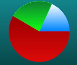
Displays a series of data points in a pie chart.
 |
Styles and common widget properties are not included in the table below.
|
|
Property Name
|
Description
|
Base Type
|
Default Value
|
Bindable? (Y/N)
|
Localizable? (Y/N)
|
|---|---|---|---|---|---|
|
CustomClass
|
User defined CSS class to apply to the top div of the widget. Multiple classes can be entered, separated by a space.
|
STRING
|
n/a
|
Y
|
N
|
|
Data
|
Data source for the pie chart widget.
|
INFOTABLE
|
n/a
|
Y
|
N
|
|
LabelField
|
The data input for the label field.
|
FIELDNAME
|
n/a
|
Y
|
N
|
|
ValueField
|
The data input for the value field.
|
FIELDNAME
|
n/a
|
Y
|
N
|
|
ColorFormat
|
Allows you to change the color of the sections in the chart by using state-based formatting.
|
STATEFORMATTING
|
State Formatting
|
N
|
N
|
|
CombineSelectedItemStyle
|
If this is set to true, the selected pie will use the item style combined with the selected item style. If the background and secondary background colors are cleared and the line color is set, the selected pie will be highlighted with that line color.
|
BOOLEAN
|
False
|
N
|
N
|
|
ChartTitle
|
The title of the chart.
|
STRING
|
n/a
|
Y
|
Y
|
|
ShowLegend
|
Displays or hides the chart legend.
|
BOOLEAN
|
True
|
N
|
N
|
|
LegendWidth
|
The width of the legend.
|
NUMBER
|
0
|
N
|
N
|
|
LegendLocation
|
The location of the legend (Right, Top, Bottom, or Left).
|
STRING
|
Right
|
N
|
N
|
|
LegendOrientation
|
The orientation of the legend (Vertical or Horizontal).
|
STRING
|
Vertical
|
N
|
N
|
|
LabelFormat
|
The format for the label.
|
STRING
|
n/a
|
N
|
N
|
|
LabelType
|
The label type (String, Numeric, or Date/Time).
|
STRING
|
String
|
N
|
N
|
|
ValueFormat
|
The format type for numerical values.
|
STRING
|
0000.0
|
N
|
N
|
|
AllowSelection
|
Allow the selection of an item.
|
BOOLEAN
|
True
|
N
|
N
|
|
EnableHover
|
Allow the display of values when they are hovered over.
|
BOOLEAN
|
True
|
N
|
N
|
|
DoubleClicked
|
Event. Allows you to have a single click select on the data object, but still use a double-click for another event, such as linking a double click to trigger a navigation link.
|
n/a
|
n/a
|
Y
|
N
|