Dynamic Panel Widget (Themable)
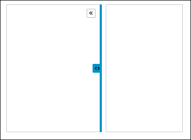
You can use the Dynamic Panel widget to show or hide a container. A dynamic panel provides supplemental information or form inputs that relate to the primary container. The dynamic panel can anchor to the left, right, top, or bottom of the parent container.
Dynamic Panel has 2 container widgets. If the Dynamic Panel is created in a responsive layout, the containers are a responsive container. If the Dynamic Panel is created in legacy layouts, then the containers are flex containers.
 |
The Dynamic Panel is available as a standard widget in the platform and as a web component that you can import from an SDK.
|
The properties of the Dynamic Panel widget follow:
|
Property Name
|
Description
|
Base Type
|
Default Value
|
Bindable? (Y/N)
|
Localizable? (Y/N)
|
|---|---|---|---|---|---|
|
TabSequence
|
Sets the sequence in which the widget is highlighted when you press TAB.
|
NUMBER
|
n/a
|
N
|
N
|
|
HideTriggerButton
|
Hides the trigger button.
|
BOOLEAN
|
False
|
N
|
N
|
|
HideDragHandle
|
Hides the dragging handle.
|
BOOLEAN
|
False
|
N
|
N
|
|
Disabled
|
Disables the widget in the mashup. The widget appears but it is not available to use.
|
BOOLEAN
|
False
|
Y
|
N
|
|
CustomClass
|
Defines the CSS to the top div of the widget. When entering multiple classes, separate each class with a space.
|
STRING
|
n/a
|
Y
|
N
|
|
PanelSize
|
Sets the panel size.
|
STRING
|
n/a
|
Y
|
N
|
|
ClickOutsideToClose
|
Closes the panel when you click outside the panel.
|
BOOLEAN
|
False
|
Y
|
N
|
|
Behavior
|
Sets the panel to Push Content or Flyover.
|
STRING
|
Push Content
|
Y
|
N
|
|
AnimationSpeed
|
Sets the speed of the animation of the panel that expands and collapses as Fast, Medium or Slow.
|
STRING
|
Medium
|
Y
|
N
|
|
MinSizeWhenExpanded
|
Sets the minimum width of the panel when expanded along the horizontal axis.
If the panel is at the top, this property defines the height along the vertical axis.
|
STRING
|
n/a
|
Y
|
N
|
|
MaxSizeWhenExpanded
|
Sets the maximum width of the panel when expanded along the horizontal axis.
If the panel is at the top, this property defines the height along the vertical axis.
|
STRING
|
n/a
|
Y
|
N
|
|
SizeWhenCollapsed
|
Sets the width of the panel when collapsed along the horizontal axis.
If the panel is at the top, this property defines the height along the vertical axis.
|
STRING
|
n/a
|
Y
|
N
|
|
AnchorLocation
|
Sets the location of the anchor as Left, Top, Right, or Bottom in the panel.
|
STRING
|
Left
|
Y
|
N
|
|
CollapseByDefault
|
Sets the panel to collapse by default when the mashup is loaded.
|
BOOLEAN
|
False
|
Y
|
N
|
|
TriggerButtonLocation
|
Sets the location of the trigger button to Top, Center, Bottom, Panel, or None.
|
STRING
|
Top
|
Y
|
N
|
|
TriggerButtonType
|
Sets the type of the trigger button to Double Carets, Single Caret, Plus/Minus, or Close.
|
STRING
|
Double Carets
|
Y
|
N
|
|
ToggleExpandCollapse
|
When triggered, expands the panel if it is in a collapsed state or it collapses the panel if it is in an expanded state.
|
n/a
|
n/a
|
Y
|
N
|
|
Expand
|
When triggered, expands the dynamic panel.
|
n/a
|
n/a
|
Y
|
N
|
|
Collapse
|
When triggered, collapses the dynamic panel.
|
n/a
|
n/a
|
Y
|
N
|
|
ResetToDefaultValue
|
Resets all the contained widgets to their default values.
|
n/a
|
n/a
|
Y
|
N
|
|
ResetInputsToDefaultValue
|
Resets the input for the Dynamic Panel widget to their default values.
|
n/a
|
n/a
|
Y
|
N
|